LOOP - Fashion Service Landing Page
About LOOP:
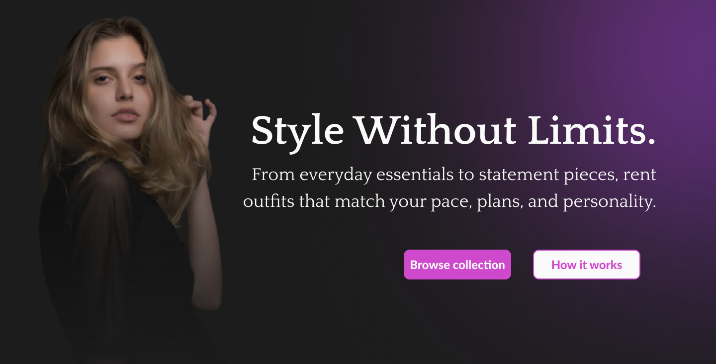
LOOP is a fictional fashion service that redefines fashion through a sustainable, rental-based model. Designed for individuals who value both style and responsibility, LOOP makes high-quality fashion accessible without overconsumption. Every detail is crafted to keep the customers inspired, confident, and part of a more circular fashion future.
Typography:
Lato is chosen for body text because of its semi-rounded letterforms and versatility. Quattrocento is chosen for headings because the serif letterforms give the brand premium feeling.
Color Palette:
- Background Color: Muted Black (#1C1C1C) feels premium and allow images to pop even more. It is also more comfortable on the eye than pure black (#000000)
- Primary/Accent Color: Magenta (#CF49CD): Highlights creativity, individuality, and confidence. Ideal for a brand that wants to feel luxury and high-end while still being approachable.
- Neutral Color: Off White (#FAFAFA) provides contrast to the background while not being harsh on the eye to maximize readability.
Landing Page Structure:
- Hero image: To grab attention + propose brand identity
- Value proposition grid: Show why visitors should use LOOP
- How it works: Explaining the process quickly → reduce user friction
- Featured collections → Show users example of collection, Increase chance of conversion and direct path to inventory other than navbar
- Testimonials: Builds user trust + increase chance of conversion
- FAQs: Remove uncertainty and reduce confusion and repetitive inquiries/questions
- Footer
Images used in this project are all acquired from Unsplash (https://unsplash.com/)
Tools used
From brief

Topics
Share
Reviews
2 reviews

Hi Ahmad!
You did a really solid job with the hero section — the image composition works well, the focal point is strong, and the main call to action is clear and easy to follow. The pink–purple gradient against the dark background also creates a nice luxurious feel, which fits the brand direction.
That said, the overall layout still feels a bit too safe and basic. I’d love to see you push the design further with more confidence — don’t be afraid to explore bolder ideas and step outside the standard structure. It would help to do a bit more inspiration research, especially looking at premium fashion or rental platforms, just to gather references for more dynamic layouts and interactions. It's a pity because you put thought into your sections and content and I can tell you that my eyes were not at all attracted/kept on your "why" and "how" sections, because they are too linear/basic.
The typography could also use more exploration. Right now it relies on essentially one style, which makes the page feel uniform, maybe too uniform. Try experimenting with a few different font pairings or weights to give the design more personality and hierarchy.
You could also bring more visual rhythm into the page by alternating background tones between sections, so the flow feels more structured and less like one continuous block.
And for the testimonials slider, it would be helpful to show the intended interaction — for example, how the carousel cuts off on the side, what the scroll/swipe experience looks like, or how the next card peeks in. That kind of detail makes the concept clearer. How is the user supposed to navigate left/right in your carousel?
Overall, if this is one of your first landing pages, it’s a very good start. You clearly have a good eye and a solid foundation. With more exploration and a bit more boldness in your visual decisions, your work can become much more distinctive and strong.
Keep creating, you're doing great!

great job!
You might also like

Accessible Signup Form


Entrant - Analytical Dashboard


Transit Cairo — Digital Mobility Redefined


Babylon Balance - Designing Financial Clarity Through Constraint


Entrant Accessible Signup and Login Forms

CJM x Mindspace case study - Ester Cinelli

Content Strategy Courses

UX Writing


Common Design Patterns


Building Content Design Systems
