Litmus - login/signup review

Design Decisions for the New Litmus Registration Page
Issues with the Current Registration/Login Page:
Lack of Visual Hierarchy: The current page does not effectively guide the user's attention.
Inconsistent Color Palette and Branding: The registration page's colors and branding do not match the landing page, leading to a disjointed user experience.
Ineffective Product Updates Display: Product updates are shown as a static message, which is less engaging.
Unnecessary Chatbot: The presence of a chatbot on this page is not needed.
Missing Persuasive Elements: The page lacks elements to encourage new users to join and explore Litmus.
Proposed Solutions:
Clear Visual Hierarchy:
Increase font sizes for better readability on both desktop and mobile versions, enhancing usability and accessibility.
Consistent Color Palette and Branding:
Define and apply an accent color for interactive elements like the Sign-In and Sign-Up buttons to create a cohesive look and feel.
Engaging Product Updates:
Replace the static message with a short demo video showcasing the product's latest updates and features for a more dynamic presentation.
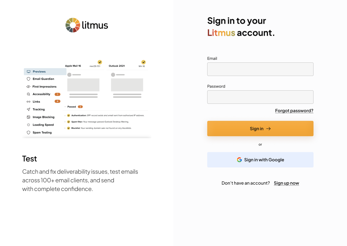
Strategic Layout for Key Features:
Display the main features of Litmus on the left side of the registration page. This will demo the app, showcase how it works, and highlight what users will experience after signing up or signing in.
Use the left side to also highlight the latest product updates and features, making it an informative and persuasive section.
Optimized Mobile Experience:
Remove app screenshots and features from the mobile version to accommodate space constraints and ensure a clean, focused design.
Improved Form Usability:
Add more space to form fields to enhance legibility.
Implement inline validation to provide immediate feedback as users type, improving the input experience.
By addressing these issues and implementing the proposed solutions, the new registration page for Litmus will be more visually appealing, user-friendly, and effective in converting visitors into members.

Reviews
1 review
The login page design is clean and intuitive. However, it would be more comprehensive to include the signup screens and demonstrate how the designs adhere to accessibility standards, as required by the design brief. Additionally, since this is a redesign, including the initial design or a screen of it would allow us, experts, to better evaluate the improvements and work you've done.
You might also like

Pulse — Music Streaming App with Accessible Light & Dark Mode


Islamic E-Learning Platfrom Dashboard

SiteScope - Progress Tracking App


Mobile Button System


FlexPay


CJM for Co-Working Space - WeWork

Visual Design Courses

UX Design Foundations


Introduction to Figma

Design Terminology
