LinguaGo - Empty state page

When I designed these empty states for LinguaGo, I focused on turning what is usually a frustrating “blank” screen into a moment of motivation and delight.
1. Why Empty States?
In a learning app, there are natural points of emptiness:
- When a user hasn’t enrolled in a course yet.
- When a user hasn’t saved any words to review.
- These moments are critical — they can either make the app feel empty and discouraging, or they can inspire the user to take action.
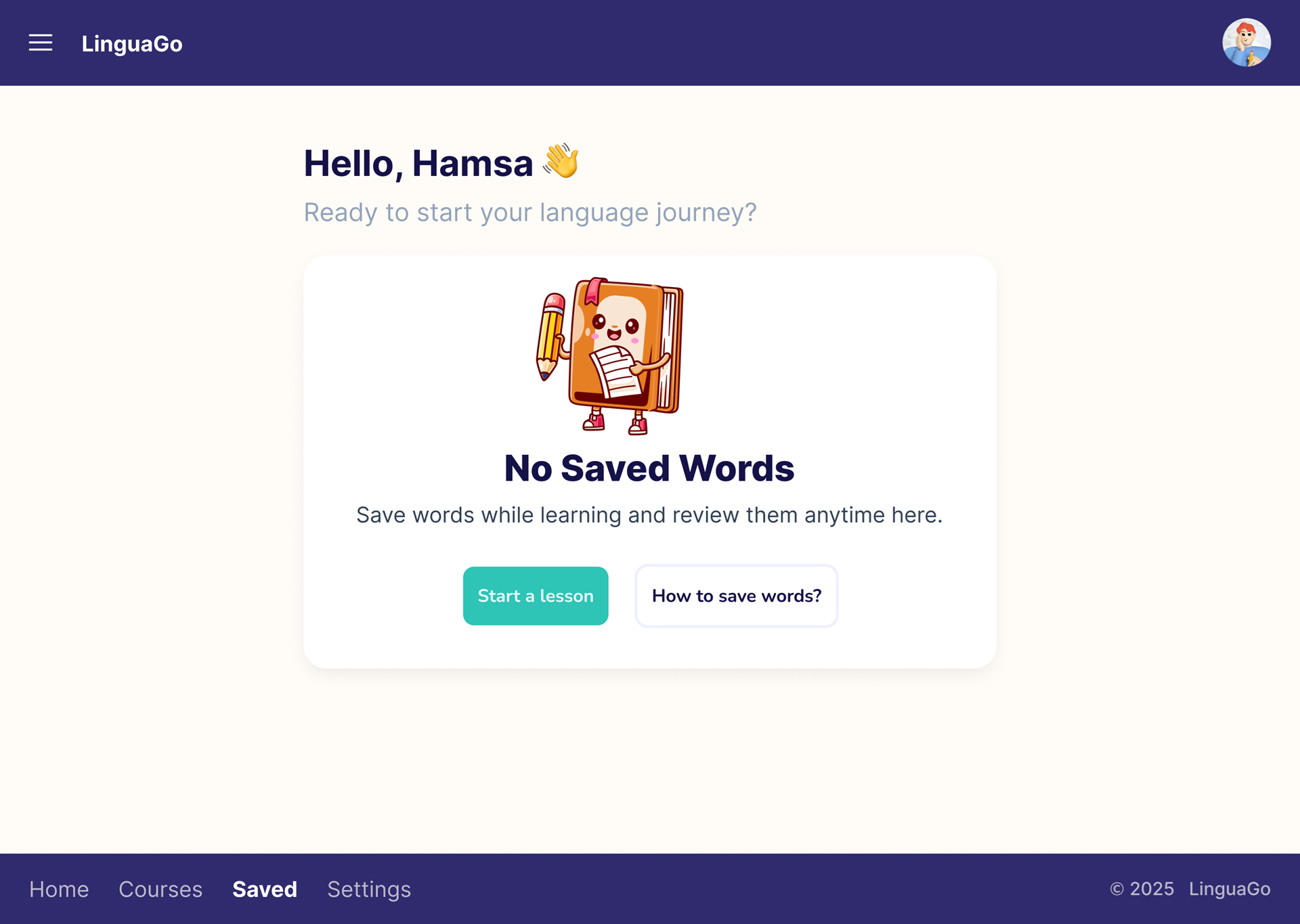
2. No Saved Words
For this state, I used a sleepy book illustration. It adds personality and humor, softening the sense of “nothing here.” Instead of a dead end, the design encourages users:
- Message: “Save words while learning and review them anytime here.”
- Actions: “Start a Lesson” (primary) and “How to save words?” (secondary help link).
- This gives learners both motivation and guidance.
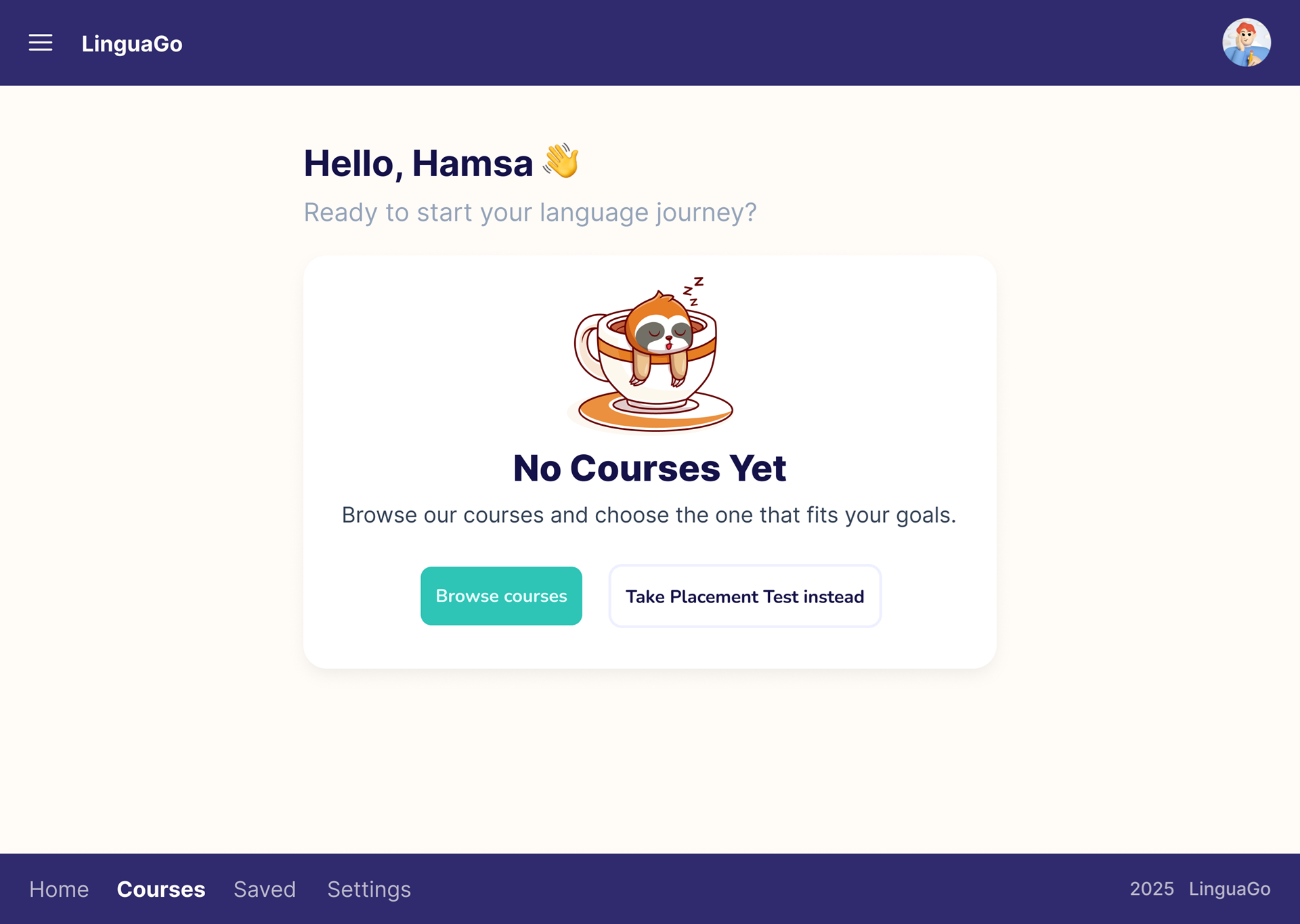
3. No Courses Yet
This state greets new users who haven’t started a course. The goal was to reduce decision paralysis and get them moving quickly.
- Message: “Browse our courses and choose the one that fits your goals.”
- Actions: “Browse Courses” (primary) and “Take Placement Test instead” (secondary).
- Here the design focuses on forward momentum, making it easy to take the first step.
4. Shared Design System
Both screens share the same structure:
- Header & Footer navigation → keeps the user grounded in the app.
- Greeting (“Hello, Hamsa 👋”) → adds a personal, human touch.
- Illustrations → bring warmth, reduce emptiness, and align with brand personality.
- Primary & Secondary actions → clear hierarchy that balances motivation and support.
5. The Outcome
Instead of lifeless screens, the empty states became opportunities to engage. They welcome users, explain the next steps, and make the experience feel supportive, not punishing. Together, these designs show how small details (tone of voice, illustrations, layout) can transform the user experience.
✨ I imagined what it feels like to open an app, excited to learn, and see “nothing yet.” These designs try to speak to that moment with encouragement, humor, and clear direction.

Reviews
5 reviews

This is a thoughtful approach to handling empty states. You turned what could feel discouraging into a supportive and motivating moment for users.
I like how you used illustrations and friendly copy to bring warmth and personality. The clear hierarchy of primary and secondary actions makes it easy for users to know what to do next.
As a mentor, I would say this is a strong example of how small details can improve user experience. If you expand further, you could show how these states connect with the overall learning journey in the app.

Hamsa, I really like how you turned empty states into motivating moments, and tightening small details like button copy or color contrast will make them shine even more, but overall this is such a thoughtful and user-friendly design!

This is truly engaging and helpful, Hamsa!
The “Take placement test instead” part feels a bit stretched. When it’s built as part of a system, I’m not sure if the font size can fluidly change like that. If you know, let me know! But yeah, it’s one of those trade-offs, either customize the button length, truncate the text, or change the copy.
Are you using the same text color for the greeting and the footer nav? The hierarchy is clear, but I think you could make the color just a pinch darker to avoid ineligibility.
How many words have you saved so far, and which one is your favorite?

I like your image, but the buttons I feel like they are unbalanced.

perfect hamsa i see it awosome and you can change the image to the same main color
You might also like

Smartwatch Design for Messenger App


Bridge: UI/UX Rebrand of a Blockchain SCM Product


Pulse Music App - Light/Dark Mode


Monetization Strategy


Designing A Better Co-Working Experience Through CJM


Design a Settings Page for Mobile
Content Strategy Courses

UX Writing


Common UX/UI Design Patterns & Flows


Building Content Design Systems
