Landing Page UI/UX Design for Construction Company


Tools used
From brief

Topics
Share
Reviews
2 reviews

Hey Yuni,
I had the opportunity to review your submission and would love to share some feedback:
What You Did Well:
- I really like the color palette you've chosen and how consistently it's used across the webpages.
- The small architectural shapes around the stock images add a nice touch and enhance the overall theme beautifully.
Areas for Improvement:
- The paragraph font size could be slightly increased to improve readability.
- I noticed some inconsistency in the heading styles — some sections use Title Case, while others use Sentence case. Maintaining consistency throughout would make the design feel even more polished.
- The bullet points after the paragraphs seem slightly misaligned. Using either rounded bullets or a vertical line could improve alignment and create a cleaner look.
Final Thoughts:
I genuinely enjoyed reviewing your project and appreciate the attention to detail you’ve shown. With a few small refinements, the usability and visual consistency will be even stronger. Keep up the amazing work — I’m excited to see more of your designs in the future. Best of luck! 😊

nice effort but with more effort it can be more appealing.
5 Claps
Average 2.5 by 2 people
You might also like

Project
Portfolio website

For this update, the objective of the portfolio is to achieve a cleaner and more structured layout while remaining fully aligned with the br

Project
Notification microcopy - Project

This project focuses on writing clear, concise push notification microcopy for a mobile e‑commerce app. The goal is to improve the user expe

Project
El Mandoub-GovTech App

Mandoob is a Qatar-based, subscription-driven GovTech app that simplifies government procedures for individuals and businesses.The platform

Project
MalishaEdu Counselor Workspace

Context MalishaEdu is a student consultancy management platform used by counselors and branch teams to manage leads, applications, documents

Project
Goal Creation Flow

Project
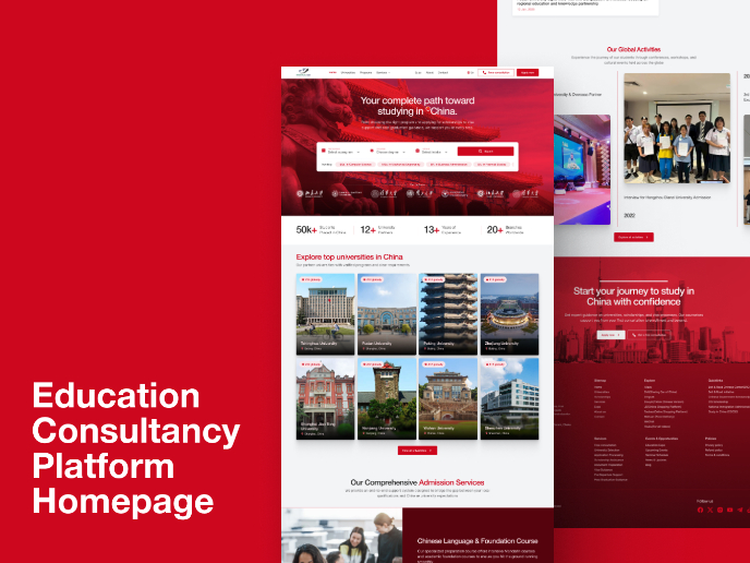
MalishaEdu - Website Design
MalishaEdu is an international education consultancy platform helping students study in China through end-to-end guidance, from program sele
Visual Design Courses

Course
UX Design Foundations

Learn UX design fundamentals and principles that create better products. Build foundational knowledge in design concepts, visual fundamentals, and workflows.

Course
Introduction to Figma
Learn essential Figma tools like layers, styling, typography, and images. Master the basics to create clean, user-friendly designs

Course
Design Terminology

Learn UX terminology and key UX/UI terms that boost collaboration between designers, developers, and stakeholders for smoother, clearer communication.