Landing Page For Fashion Store

I want to present a landing page that invites the user to move to the Fashion Online store. This store specializes in delivering clothes of popular brands throughout Armenia.
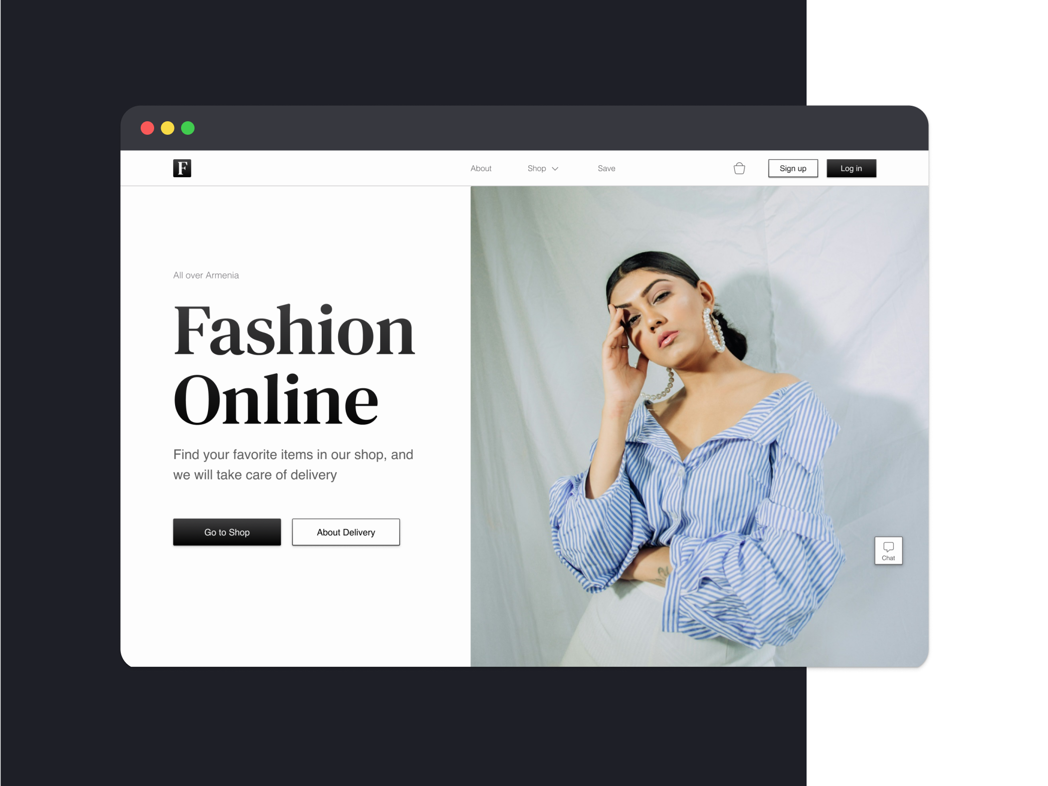
Colors: Black and white colors are often used by clothing stores. They are associated with the fashion industry. I also use a gradient to achieve a glossy look.
Typography: Accent texts are made using a newspaper serif font. Due to it, the page looks like a magazine, which also suits the theme of the site.
Images: As images, I use photographs that are also responsible for the magazine style, quite large in size.
Shadows: I decided to use shadows to highlight the buttons, because I refused bright colors.
Buttons: I use a primary button with a fill, a secondary button with an outline, and a fixed button with an outline and an icon that opens a chat with support.

Reviews
1 review

You're off to a solid start, and your design has great potential!
Here are a few suggestions to help you refine and enhance your work:
- Improving text hierarchy is crucial for guiding users through your content. Consider using smaller headings and adjusting paragraph text to create a clearer distinction between different levels of information. Additionally, improving line height will enhance readability, making the text easier on the eyes.
- Including sections with products for sale will not only add value to the landing page but also create a more engaging experience for users. Highlight key products or services with compelling images and descriptions to draw the user's attention.
- White space is your friend when it comes to making a design feel open and organized. I suggest adding more horizontal space between elements to prevent the design from feeling cluttered. This will help each section stand out more clearly and make the page easier to navigate.
- The navigation bar could benefit from better balance. Try reducing the size of the icons and buttons, and aligning them more precisely. This will create a cleaner, more professional appearance, making it easier for users to find what they need.
The overall landing page currently feels a bit too general. To make it more effective, think about who your target user is and what they are looking for. Tailor the content, imagery, and CTAs to meet their specific needs and preferences.
Keep up the great work, and continue refining your skills—you’re on the right track!
You might also like
SiteScope - Progress Tracking App


FlexPay


Mobile Button System


CJM for Co-Working Space - WeWork


Ubani Design System


Accessible Signup Form for SaaS Platform
Content Strategy Courses

UX Writing


Common UX/UI Design Patterns & Flows


Building Content Design Systems
