Landing Page for BeYou

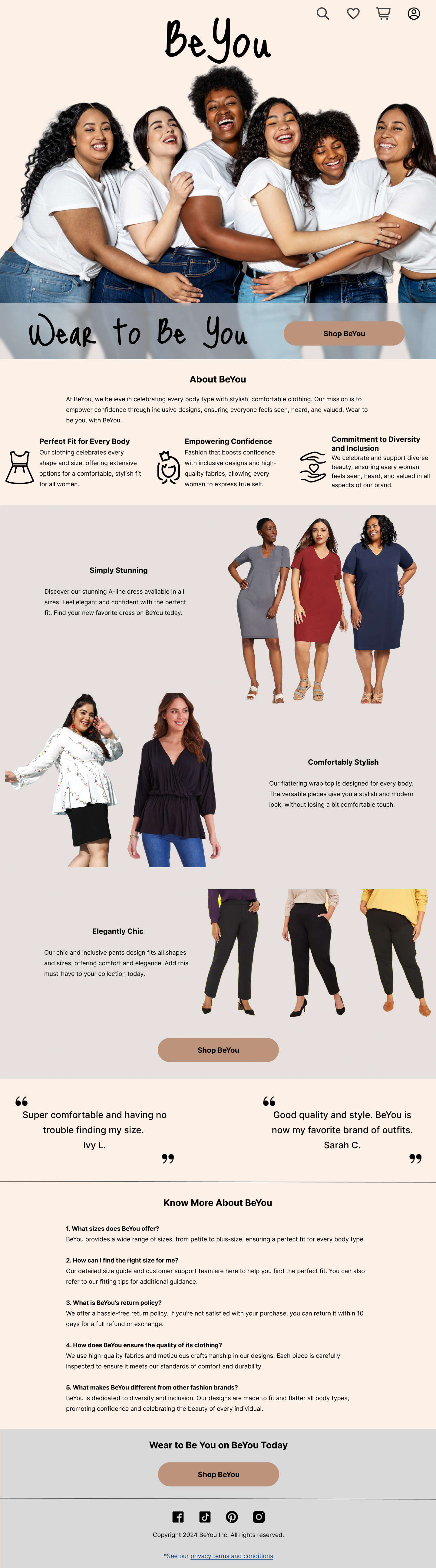
This landing page is for a fictional fashion brand called “BeYou”, providing comfortable and stylish clothing for diverse body size.
Design Rationale
Although inclusiveness and diversity has become common values in modern society, the term “fashion” still often links to models with perfect and slim body. To break this stereotype, a fictional brand “BeYou” is created to advocate ”wear to be you”, helping everyone feels comfortable to be themselves in terms of wearing.
Design Process
- Research on existing major fashion brands to understand their value propositions.
- Create a fictional brand and define three core brand values:
- Perfect Fit for Every Body
- Empowering Confidence
- Commitment to Diversity and Inclusion
3. Design the layout of the landing page.
4. Craft the copywriting to match and deliver these values.
Tools used
From brief

Topics
Share
Reviews
1 review
The inclusivity in your work is outstanding—well done! However, I find the purpose of this landing page a bit unclear. It seems the CTA leads to a catalog, but is this catalog part of a separate website? If so, what is the goal of splitting them?
Generally, the landing page lacks an "About Us" section and maybe an FAQ. The absence of navigation is quite confusing, which might make users feel lost and question the viability of your website. If this website includes a catalog, then many essential elements are missing, such as a shopping cart, personal profile, return policy information, etc.
With these considerations, your landing page could be even more effective and user-friendly. Keep up the great work!
You might also like

Entrant Accessible Signup and Login Forms

A/B Testing for Bumble's Onboarding Process


CJM x Mindspace case study - Ester Cinelli

Dark mode Main page
LUMÉRA - Checkout Flow


Tripit's Login and Sign Up Flow

Content Strategy Courses

UX Writing


Common Design Patterns


Building Content Design Systems
