Landing Page for a Fashion Service

Hello! Welcome to my presentation of a Design challenge! I created a Landing page, and documented some steps below. Please provide me with feedback!
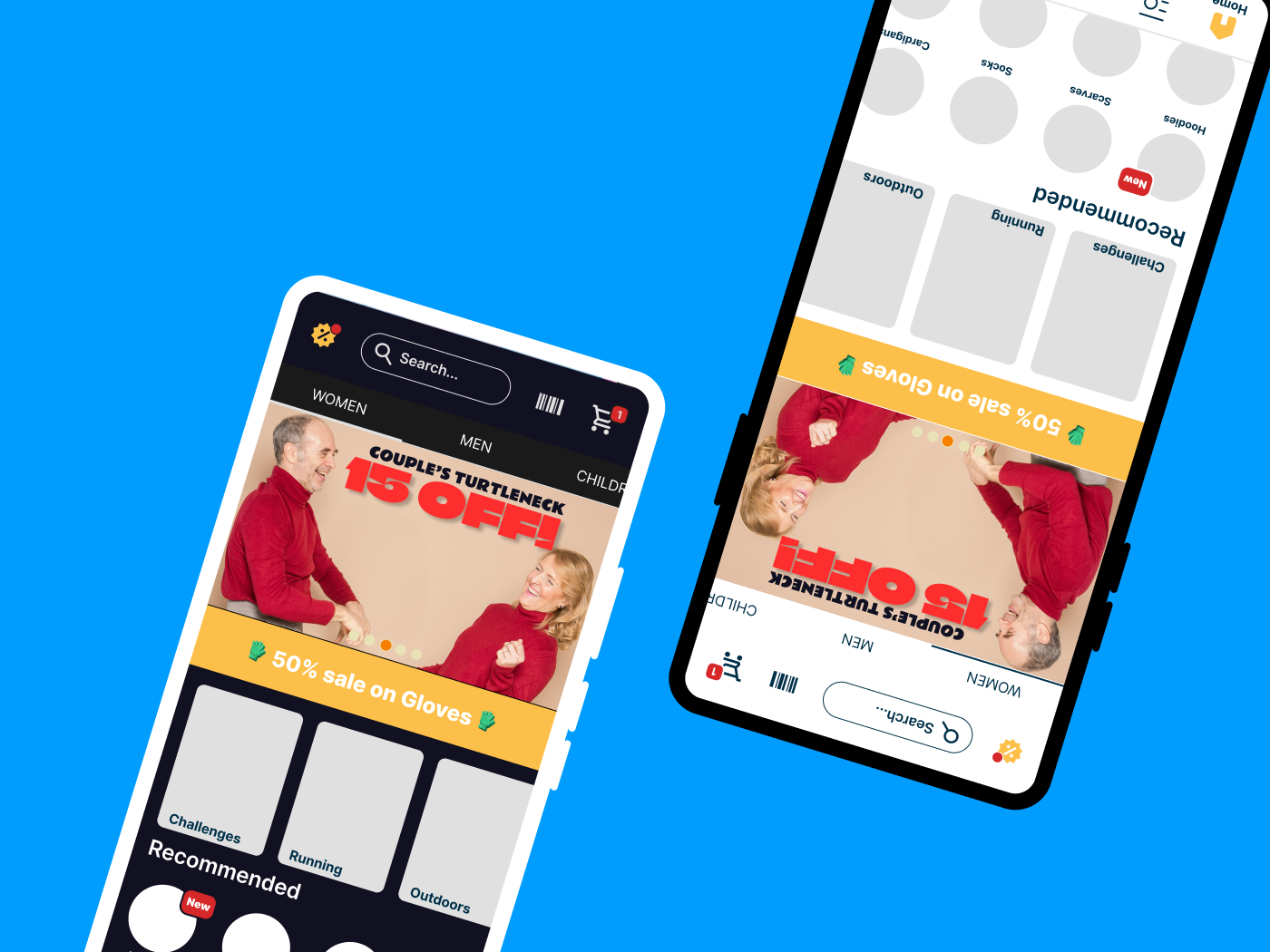
First I started by creating a Wireframe, and selecting some colors for Dark and Light mode. I decided to add multiple quick shortcuts, to categories, types and a carrousel that goes through some sales.
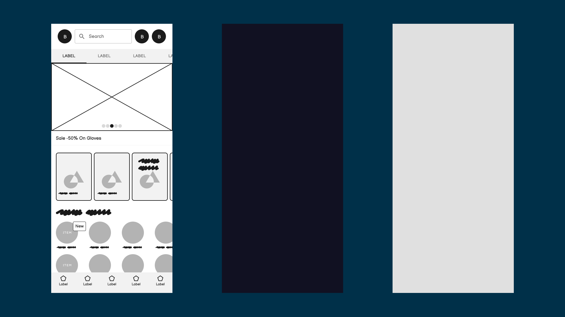
The dark mode app started to get developed, with throwing some ideas towards it, like a calendar, that shows sales, but I decided to just add a "Sales" icon, in order to make it more clear. The barcode should direct the users to their User specific ID, that collects their points. In my idea, this store is a physical store, but can also process online shopping.
I played around a bit with colors, and added some elements, in order to populate the screen.
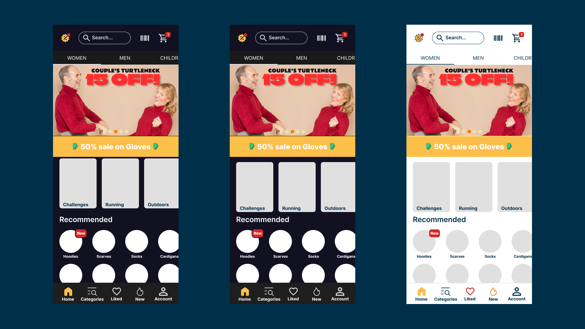
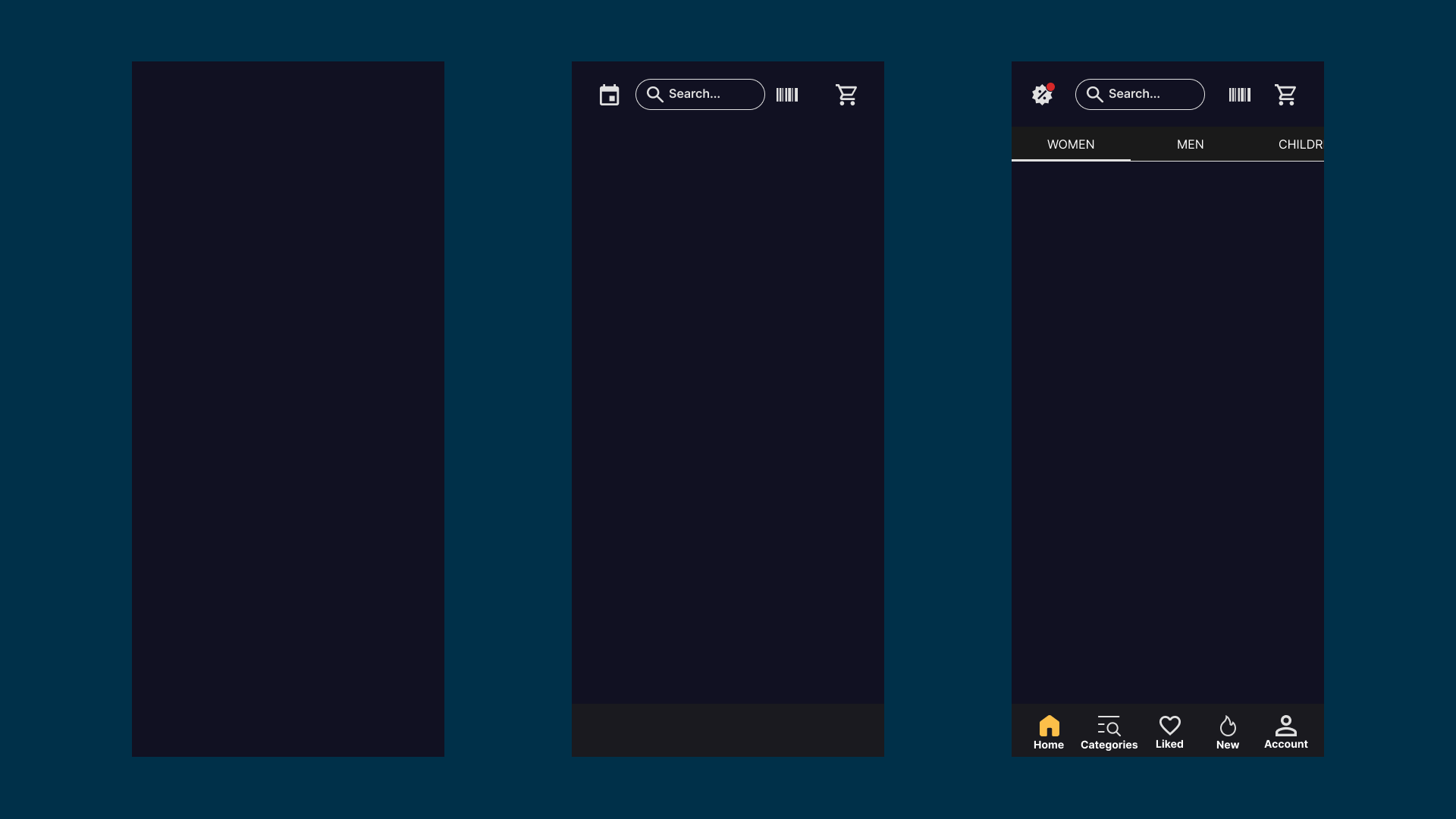
The Dark mode contains less colors, and the icons gain color when pressed. On the Light mode, we play a bit more with color.
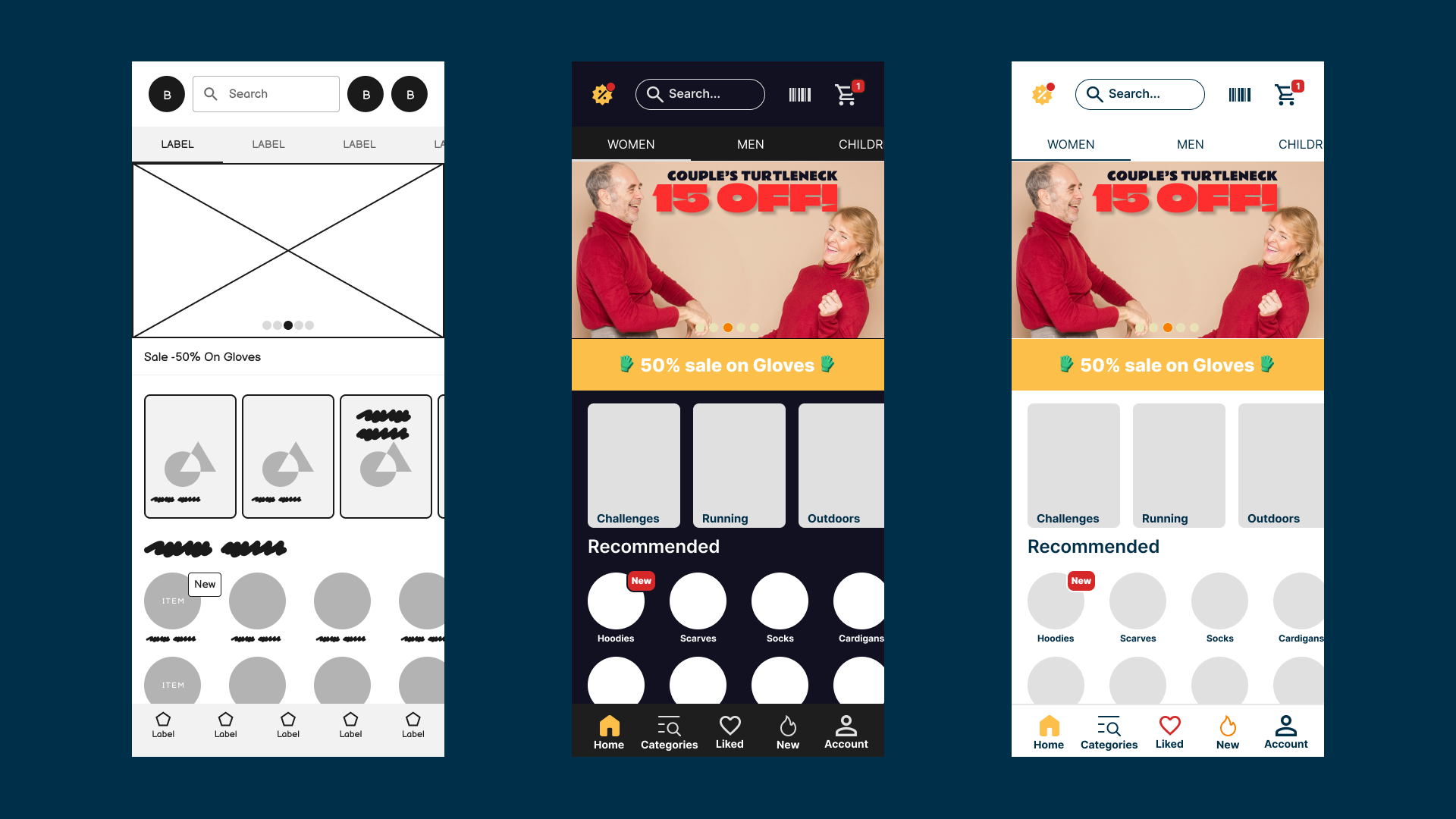
A final screen, providing the first step and the outcomes.
Things I did not take into account for this challenge, but should've: Accesibility related color picking, better mockup pictures, and so on.
The picture of the couple is provided by Alex Green - Photography, hopefully free to use. I do not claim that the pictures are my designs.

Reviews
1 review

Hello, Norbert,
Your design process is well-structured, and I really appreciate how you’ve documented each step in detail. The inclusion of both dark and light modes is a great approach to providing flexibility for users.
I have a few suggestions to further enhance the readability and usability of your design:
The large "15" is difficult to distinguish from "13" at a glance. In addition to adjusting the font weight, you might also consider changing the typeface altogether to one that offers better clarity for numerical characters.
The discount label with white text on a yellow background lacks sufficient contrast, making it hard to read. A darker text color or an alternative background shade could improve legibility.
When designing for readability, it's crucial to ensure proper WCAG contrast compliance. Tools like the Contrast plugin in Figma can help verify this.
Additionally, refining the spacing between key UI elements can improve touch accuracy and overall usability.
Your work demonstrates a well-thought-out design process, and with these refinements, it can provide an even better user experience. Keep up the great work!
You might also like

HealthFlow: Designing a Simple and Insightful Wellness Dashboard


Improving Dating App Onboarding: A/B Test Design

FORM Checkout Flow - Mobile


A/B Test for Hinge's Onboarding Flow


Accessibility Asse

Uxcel Halloween Icon Pack

Content Strategy Courses

UX Writing


Common UX/UI Design Patterns & Flows


Building Content Design Systems
