Landing Page Design

Landing Page design for a client. For a complete branding showcase, you can check out the mentioned project URL.
Share
Reviews
1 review

Hello,
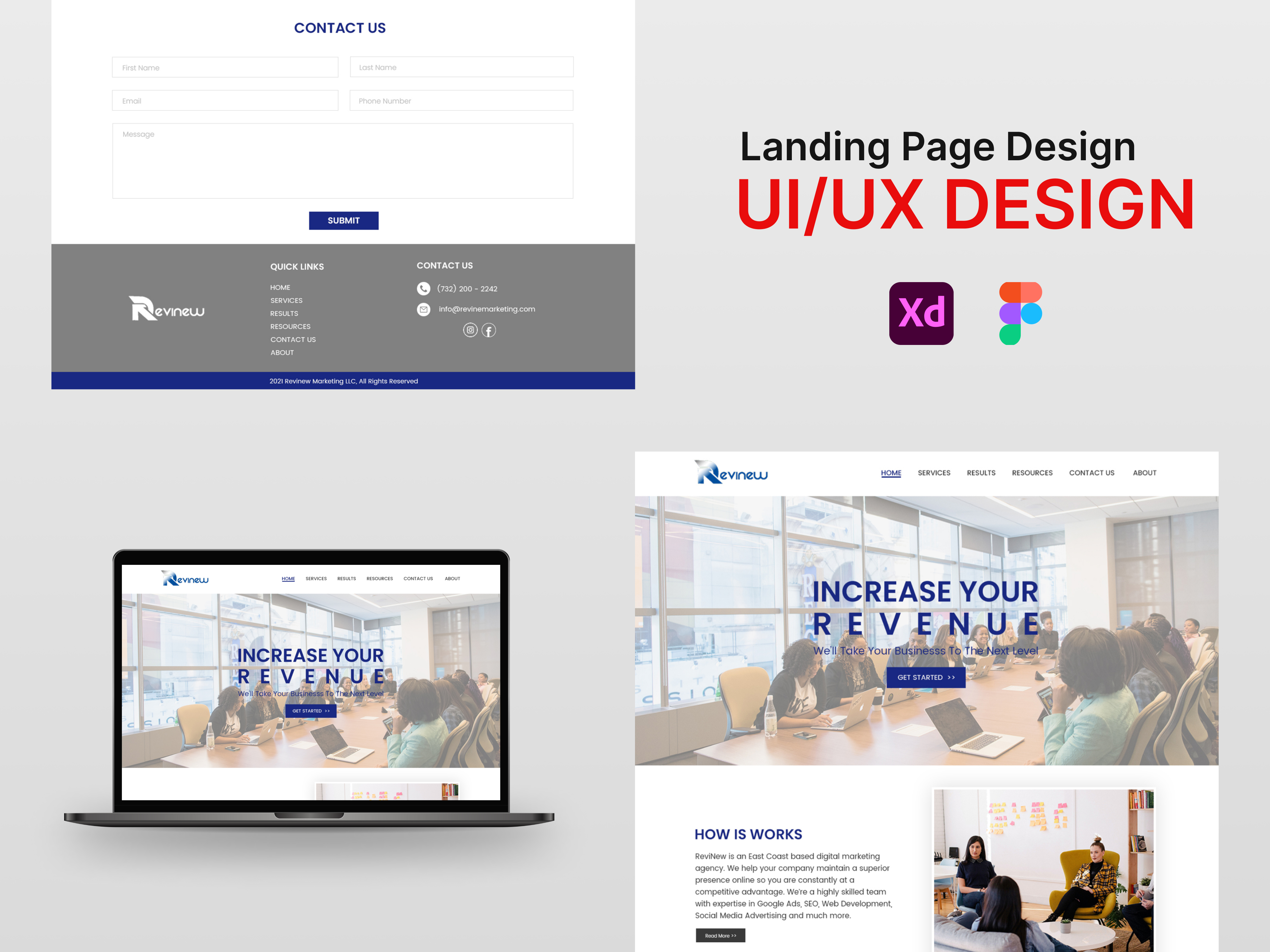
Your project is truly promising and demonstrates a strong intention to create a clear and professional landing page. However, upon closer inspection, there are a few details that could be optimized to improve the user experience and overall visual impact.
One aspect that could be revised is the contrast in the contact form. Currently, the input fields and the "Submit" button blend a bit too much with the background, which could cause accessibility issues. By increasing the contrast—using more prominent colors or adding more visible borders—you could make this section much more intuitive and easier for users to interact with. This is a simple improvement but can make a significant difference, especially for such a critical section as the contact form.
Regarding the typography on the homepage, it is functional and readable, which is a positive point, but it lacks a bit of character to truly grab attention. A slightly more modern font, with distinct styles for headings and body text, would bring more dynamism. Moreover, the letter spacing is slightly too tight, particularly in the main headline. Adding a bit of tracking (letter spacing) would improve the readability of your titles and give them a more professional appearance.
Another point to highlight is the "How It Works" section. While the paragraphs are well-structured, they appear visually a bit flat. By combining alignment adjustments, icons, or even formatting changes (like bolding keywords), you could enhance the visual impact and draw more attention to key information. Adding illustrations, such as icons or visuals that explain the process in a few steps, would also add a dynamic touch that would capture the visitor's eye.
Despite these minor points of improvement, your project shows a strong ability to structure a landing page with a clear objective and smooth navigation. This is an excellent starting point, and it’s evident that you already have a solid understanding of UX/UI principles. With a few tweaks to contrast, typography, and some visual details, this landing page could become even more engaging and memorable.
You might also like

Pulse — Music Streaming App with Accessible Light & Dark Mode


Islamic E-Learning Platfrom Dashboard

SiteScope - Progress Tracking App


Mobile Button System


FlexPay


CJM for Co-Working Space - WeWork

Popular Courses

UX Design Foundations


Introduction to Figma

Design Terminology
