Landing Page

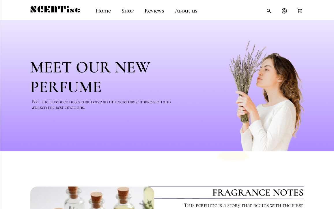
In this Design brief, a desktop-oriented landing page was created for a fictional company SCENTist, which specializes in perfumes. The goal is to promote a new fragrance. Purple was chosen as the main color because it conveys a feeling of sophistication and interlaces with the main note of perfume: lavender.
Note. Still getting to know Figma; the FAQs section may overlap the footer when all accordion sections are open.
Tools used
From brief

Topics
Share
Reviews
2 reviews

Hey Ksenia! Nice start! 🙏 Let me list some of the tips and key things to improve in your designs that could become useful for the future as well
The page feels a but cluttered: the multiple "Buy now" buttons, overlapping text, and inconsistent spacing create a sense of visual noise. you can simplify the layout by prioritizing key information and ctas. You should probably consider using whitespace more effectively to create breathing room and guide the user's eye.
The navigation bar ("Home Rewievs Anout us") has a typo ("Rewievs") and is not visually prominent. Correct the typo and make sure the navigation is easily noticeable and accessible. Maybe these elements can have different typeface? Consider using standard navigation patterns and clear visual cues to indicate the user's current location.
Repetitive and Unclear Messaging: The repeated "Buy now" buttons and phrases like "FRAGRANCE FOR CONFIDENT PEOPLE" and "FRAGRANCE THAT INSPIRES" lack specificity and impact. Refine the messaging to be more concise, compelling, and benefit-oriented. Focus on what makes the fragrance unique and appealing to the target audience.
The images can benefit with different layout, maybe try zig zag.
Inconsistent Button Styling should be addressed as well, The "Buy now" buttons have inconsistent styling and placement. Standardize the button design and ensure they are visually prominent and easy to click. Consider using contrasting colors. It should follow WCAG guidelines.
Overall lets say:
Simplify and declutter the layout.
Improve the navigation and ensure it's user-friendly.
Refine the messaging to be more compelling and specific.
Standardize button styling and placement.
Clearly communicate the value proposition.

While this is definitely a solid foundation to build on, I've got some thoughts on areas that could be improved. The typeface you've chosen is making the content a bit hard to read, especially in those longer sections, so you might want to look at alternatives there. I noticed the hero section could use some work too, the image feels a bit ambiguous for what you're selling, and the headline could be more specific and action-oriented to really grab attention. The call-to-action buttons are getting a bit lost on the page, try and make them stand out more and think carefully about where they're placed. I also noticed the page is missing some key pricing details that customers will want to see right away. One last thing, it would be really helpful to add a FAQ section covering common questions, especially around shipping times since customers always want to know when they'll get their items.
You might also like

Smartwatch Design for Messenger App


Bridge: UI/UX Rebrand of a Blockchain SCM Product


Pulse Music App - Light/Dark Mode


Monetization Strategy


Designing A Better Co-Working Experience Through CJM


Design a Settings Page for Mobile
Content Strategy Courses

UX Writing


Common UX/UI Design Patterns & Flows


Building Content Design Systems
