Iteration on the Uxcel signup page with accessible-first approach


Uxcel is a leading platform in the software design education space. I assume you might already know that 😄
I love my experience so far and the accessibility lesson is a true gem, but the platform’s signup page has a few issues that could be improved. I will propose a new version as a part of the design brief on form accessibility.
Let’s drill down into it.
General UX
To start with the positives, the signup page is simple, clear and straightforward. No clutter, no distractions, very conversion oriented and well fitting with the platforms’ simple visual aesthetic. I like that.
Still there is a few minor things I would improve:
- Add the full logo. The page is obviously used by new users, so the brand should be better established.
- Solidify the value proposition one last time. Just a sentence to remind users why they should fill this form.
- Open the email sign up for by default. As the most common way to sign up for a platform it should have a more primary position. This also means to add an H2 to that section.
- Offer a way back. The page should not be a dead end without any links back to the website.
- Make it more clear what to expect next. After the form is filled Uxcel offers an unskippable survey to get to know the customer better and offer a more targeted experience. That's a great idea, but this is a friction point that's not really communicated before that.
Form accessibility
On the accessibility side I think there is plenty of good foundation, like the good copy contrast, blue links, CTA contrast and so on, but I can still improve a few things:
- Add labels to the email and password fields. Currently the form uses only placeholders to communicate the fields' purpose, which is a big no-no from accessibility point of view.
- Currently the page is not tab-navigatable. This is a must do improvement for users with screen readers.
- Improve the sign-up form validation. Color blind users would have a hard time understanding they made a mistake as Uxcel currently only rely on color to communicate the error state.
- Make the buttons stand out a bit more by increasing the borders contrast.
- Make the password requirements clear. Currently there is no indication of what password format the user should follow.
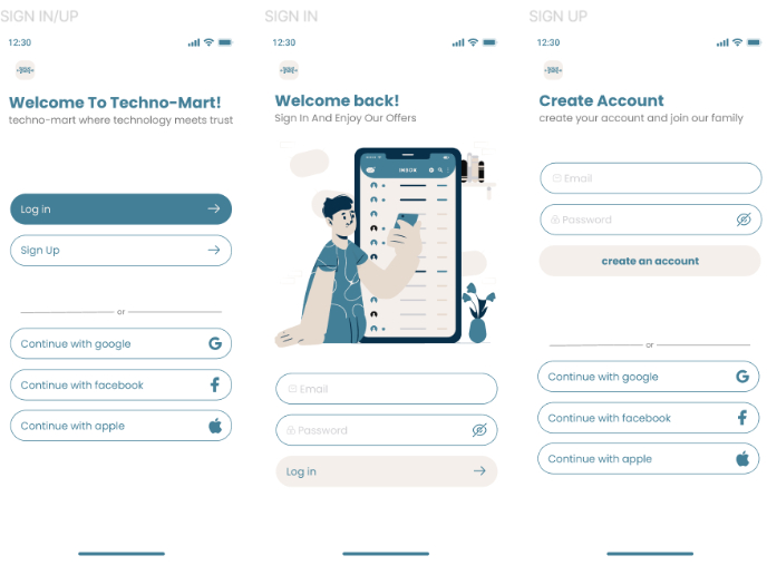
The redesigned version

The error handling also needs an improvement to make sure:
- We use an icon to communicate the error state. Color alone is not enough.
- Give a better explanation of why the password did not work.

Conclusion
This is what the page looks like after the redesign. There is a lot more elements to it, which could increase cognitive load, pageload time and effect conversion.
As a next step I would recommend running series of experiments and AB tests to figure out which improvements actually make sense for Uxcel's real world users and improve the performance of the page in a measurable way.
PS. I used the Uxcel UI kit for this. Awesome work, guys.
Tools used
From brief

Topics
Share
Reviews
6 reviews

Peter, your redesign of the Uxcel signup page is a commendable effort towards enhancing accessibility and user experience. Your attention to detail and adherence to WCAG standards is evident in the thoughtful changes you've implemented.
Your suggestions to add the entire logo, solidify the value proposition, and open the email signup by default are valid and contribute to a more user-friendly experience. Offering a way back and setting clear expectations for what comes next is also crucial for reducing friction in the signup process.
Your focus on accessibility is particularly impressive. Adding labels to form fields, making the page tab-navigable, and improving error handling for colourblind users are essential for ensuring that all users can easily access and use the platform.
However, I have one minor suggestion regarding using a stepper in the signup process. While steppers can help guide users through complex multi-step forms, they might be unnecessary for a simple signup like Uxcel's. In this case, a stepper could introduce unnecessary clutter, potentially confusing users and might not align with the platform's minimalist aesthetic. Managing user expectations on the subsequent page could be a more streamlined and practical approach.
Overall, your redesign is a well-executed improvement that prioritizes accessibility and user experience. 💎
Keep up the great work and happy design. ✌️

Great work you've done here, Peter!
I would love to hear more about this
- Improve the sign-up form validation. Color blind users would have a hard time understanding they made a mistake as Uxcel currently only rely on color to communicate the error state.
Hello Peter,
Your design considerations and final redesign result of UXCEL log-in page demonstrate your efforts in enhancing UXCEL value proposition, accessibility and overall user experience. Brilliant job!
However, the stepper design in log-in page appears to be rare in the digital world, might mislead users.
Regarding the "Back" button, your consideration is thoughtful. Another way of improvement on this could be: making the site navigation to be sticky. This would allow users to see where they are and enable them more intuitively to navigate to other pages in the site whenever needed.
All in all, thank for sharing your great design work.

Great iteration, Peter 👏 You balanced UX clarity with accessibility improvements really well — especially adding field labels, tab navigation, and clearer error states. Also liked your callout on setting user expectations after signup. Smart, practical changes that make the flow both more inclusive and user-friendly. 🚀

You did very well

1/ In case of form, it's more natural to place input fields above the third service sign-up choices.
2/ Brand color of Uxcel is purple.
3/ It would be better if you add more space between the latter input field and the button, and a subtle visual cues like mail icon. Otherwise, creating another level of button color would enhance the visibility if manipulating to sign up by Google account is your intention
4/ "Learn" is quite obscure in terms of meaning.
You might also like
A/B Testing for Bumble's Onboarding Process

Dark mode Main page

Tripit's Login and Sign Up Flow

sign in up

ReWash

CJM for Leo

Visual Design Courses

UX Design Foundations


Introduction to Figma

Design Terminology
