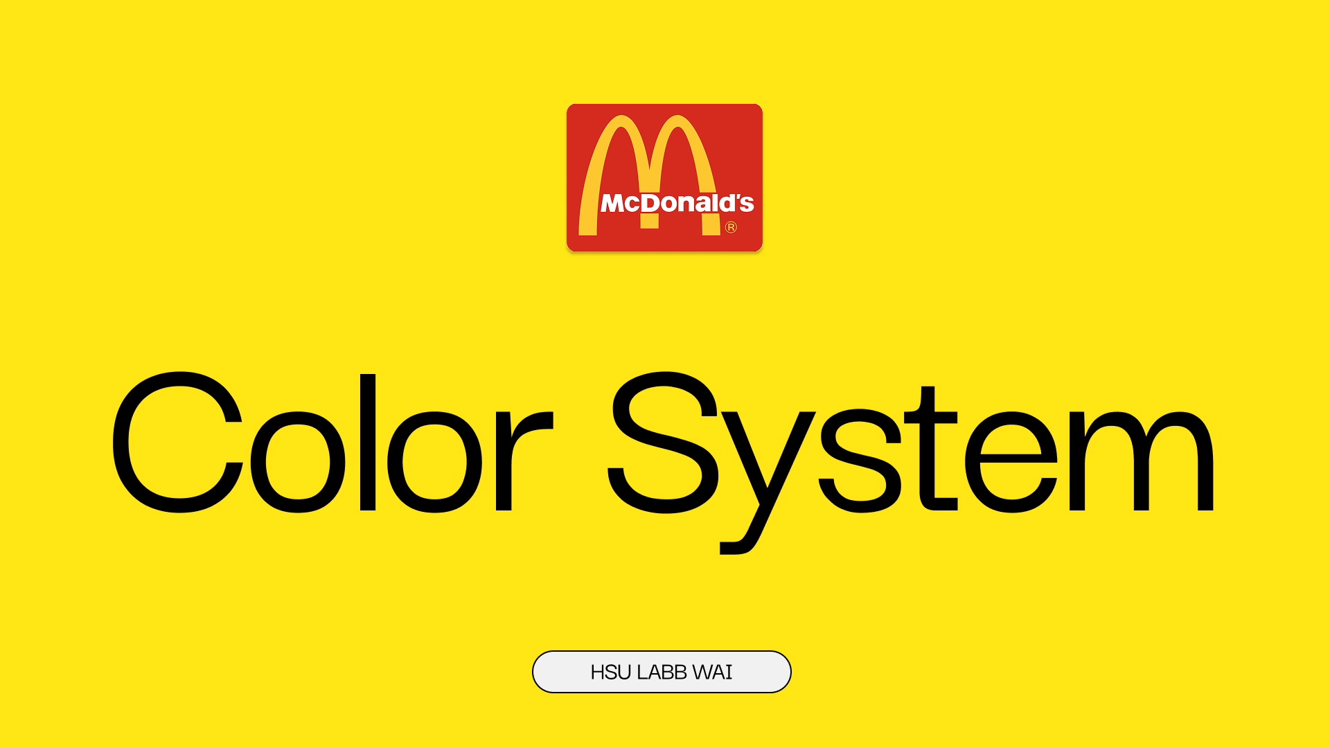
"I'm McLovin' It"
Hey everyone! 👋
This is my first color system project on Uxcel, inspired by McDonald’s classic brand colors. 🍟❤️💛
I designed this in Figma, focusing on how the brand’s primary, secondary, and tertiary colors can work together in a clean, accessible UI system.
I really hope you enjoy checking it out and I’d love to hear your feedback or suggestions!
Thanks so much for taking the time to view my project! 🙏✨
Tools used
From brief
Topics
Share
Reviews
2 reviews
Hey Laura,
Your submission is very clearly presented and you did a good job at making an inventory of McDonald's brand colors, assigning them to categories and explaining their rationale. Nice job there!
I would have liked to see a bit more exploration on how the system fares in terms of WCAG guidelines, because you only tested both primary colors as background colors against white & black text (and there's plenty more colors on your system), but what's mostly missing in your submission for me is how would you apply the color system to a work management platform of your choice - that was the key piece of work of the assignment.
Thanks for sharing, and keep it up! 🙌
Hello Hsu Labb Wai,
Your project provides a comprehensive colour system based on the McDonald's brand, aiming for a fresh look for a digital work management tool.
The best parts in your project includes
- You correctly identified and displayed all required colour categories: Primary, Secondary, Tertiary, Neutral (implied by the black/white in Secondary), and System colours (Error, Success, Information, Warning). This shows an organized approach to creating a complete design system.
- The submission effectively links the colors to emotions and brand principles (e.g., Red for "energy, excitement," Yellow for "happiness, warmth"). This fulfils the requirement to outline the brand principles and targeted emotions.
- The inclusion of specific WCAG status (AA, AAA) for colour combinations is a strong point, directly addressing the Accessibility criterion.
Areas of improvement:
- A clearer rationale for why a high-saturation, high-energy palette is suitable for a Work Management Tool over a calmer palette (e.g., blues, greens, or muted tones) that encourages sustained focus.
- Define the functional role of the Primary Color in the UI. For example, "Primary Red is reserved only for key CTAs (Call to Action) and critical task highlights, while Primary Yellow is used for alerts that require immediate attention but are not errors."
- Consider introducing 3-5 shades of a tertiary grey (e.g., for backgrounds, secondary text, borders, shadows) is critical for Visual Design in complex UIs. This ensures text readability, differentiates layers, and provides visual hierarchy without relying heavily on the high-energy primary colours.
Amazing start with Uxcel project Hsua!! Looking forward to more submissions from you !!
Have a beautiful day.
You might also like
Accessible Signup & Login Experience — Brainex
Mobile Onboarding: Casa di Pasta
Accessible Signup Form
Auction
Entrant - Analytical Dashboard
Babylon Balance - Designing Financial Clarity Through Constraint
Visual Design Courses

UX Design Foundations

Introduction to Figma


