Heuristics evaluation HomeExchange (iOS app)
For this design brief, I did a heuristics evaluation of the Home Exchange app on iOS.
Tools used
From brief
Topics
Share
Reviews
1 review
Noortje, your heuristic evaluation of the HomeExchange iOS app is very insightful. You've effectively identified several usability issues that could hinder the user experience, particularly in the booking flow.
Your recommendations are clear and actionable and demonstrate a good understanding of usability principles.
Here are a few suggestions to further enhance your case study:
- Streamline the Presentation: While showcasing screens without issues can be informative, consider focusing primarily on those with identified problems. This streamlines the presentation and allows a more focused discussion of the essential usability challenges.
- Enhance Readability: Adding extra white space between screens can significantly improve your case study's visual clarity and readability. This will make it easier for readers to navigate and process the information you present.
- Severity Ratings: While you've categorized some issues as "critical," "moderate," or "cosmetic," providing more explicit explanations for these ratings would be helpful. This would clarify the potential impact of each issue on the user experience.
- Include a Conclusion: Concluding your case study with a brief summary of your overall experience as a user interacting with the app would provide valuable context for your findings. This could include your impressions of the app's overall usability, any positive aspects you observed, and your final thoughts on the potential impact of your recommendations.
Keep up the great work, and happy design! ✌️
4 Claps
Average 4.0 by 1 person
You might also like

Project
Islamic E-Learning Platfrom Dashboard
Visual Language & Color I wanted the interface to feel like a quiet room you'd actually want to sit in and study. The warm neutrals - off-wh

Project
Pulse — Music Streaming App with Accessible Light & Dark Mode
Platform & DeviceFor this project, I designed Pulse, a mobile music streaming application for iOS devices (using the provided mobile templat
Project
SiteScope - Progress Tracking App
🧩 Project OverviewThis project showcases the design of a mobile login and sign up experience for a construction progress tracking app. The

Project
Mobile Button System
As my first ever ux design attempt, I tried to go with a simplified approach with only a few button types and states. I kept the color palle

Project
FlexPay
The onboarding was designed to reduce financial anxiety, create a sense of instant reward, and encourage early action. Instead of overwhelmi

Project
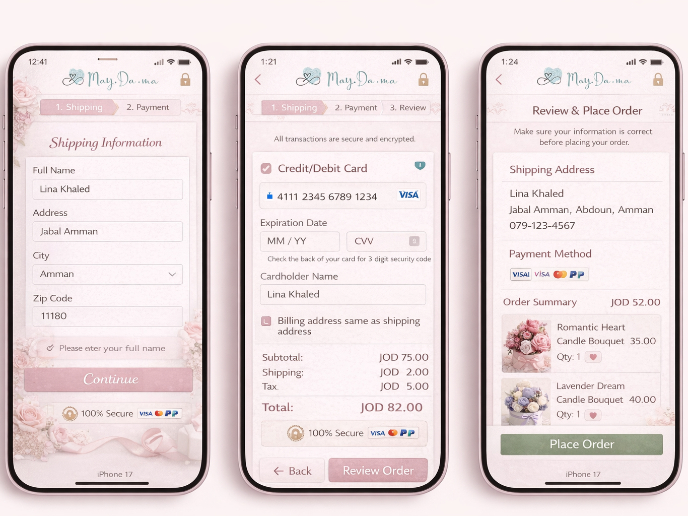
May.Da.Ma Candles & more
User Research Courses

Course
Ethical & Responsible Product Design
Learn to build products that respect users, society, and the planet while driving sustainable business growth

Course
The Product Development Lifecycle & Methodologies
Master the complete product development lifecycle and learn how to validate ideas, design MVPs, test prototypes, and build user-centered products with proven methods and strategies.

Course
Writing Effective Product Specs
Learn to write clear, actionable product specs that turn ideas into successful products.


