Headphone Selling E comarce Landing page

Figma File
Reviews
2 reviews

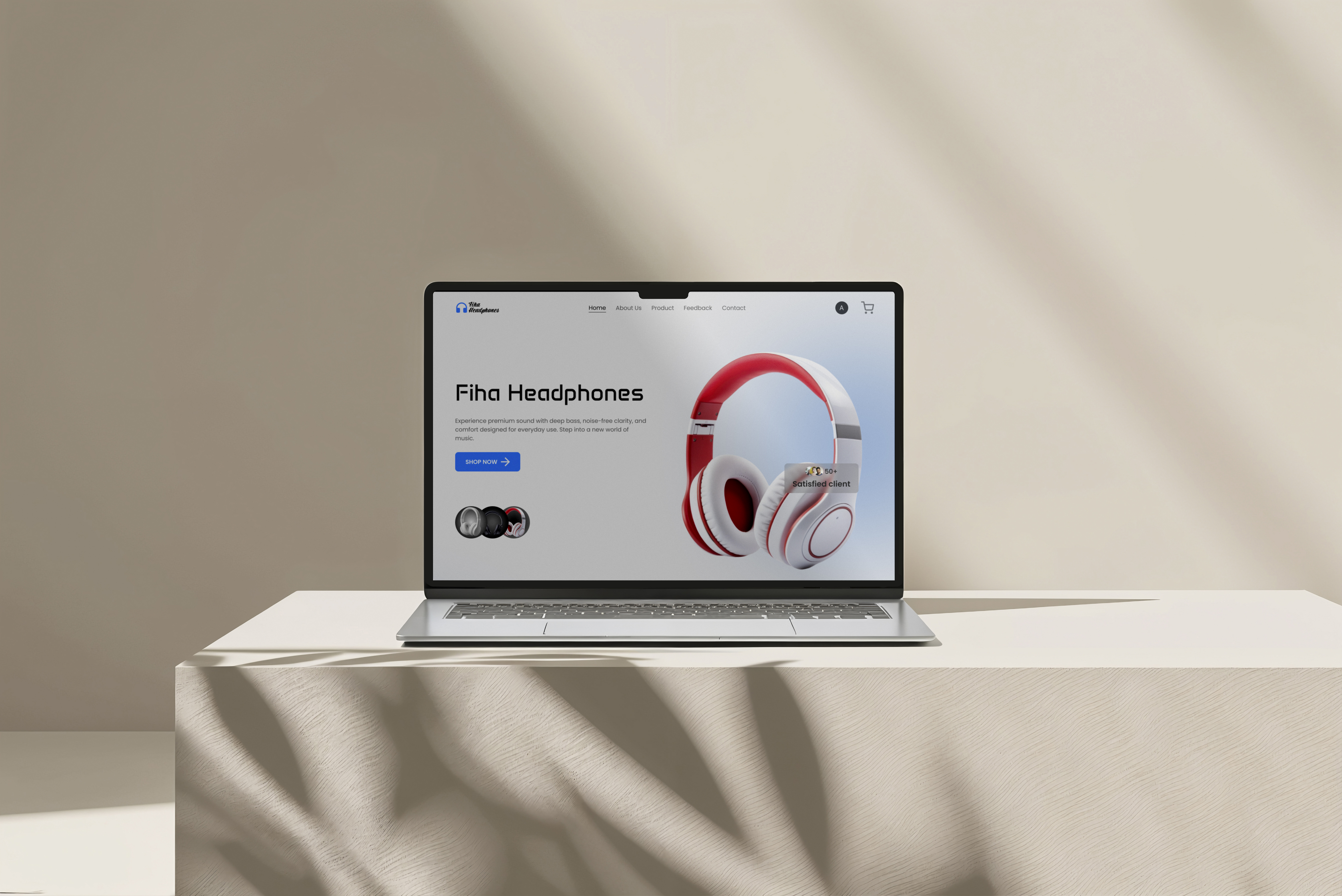
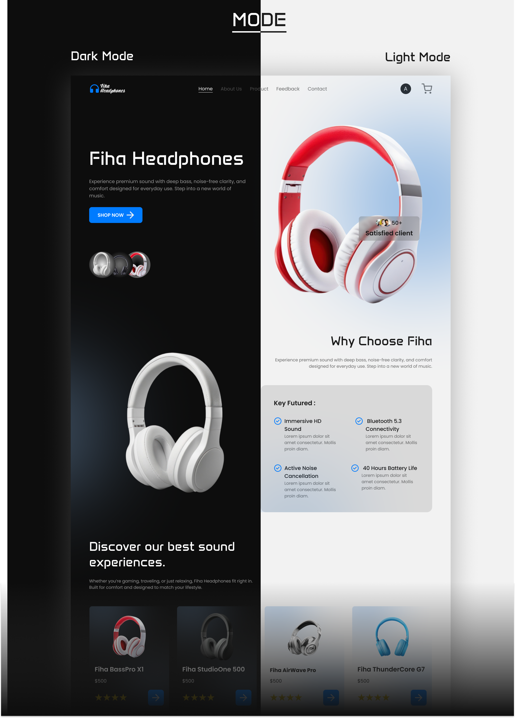
Thank you for sharing your landing page—clean, bold, and product‑first. The hero shows the headphones clearly, the pricing/CTA are easy to find, and the color palette feels energetic without being noisy. Typographic hierarchy is clear, so the page reads fast and feels modern.
Suggestions to make it even stronger:
- Use an 8px spacing grid to tighten rhythm across sections (hero, features, reviews). It will make alignment cleaner and help developers implement faster.
- Check CTA contrast on all backgrounds. If you’re using light tints behind buttons, increase contrast or switch the label color to meet accessibility.
- Keep one dominant CTA per fold (“Buy now” or “Add to cart”) and give secondary actions lower emphasis to reduce decision friction.
- Ensure image weight and shadows don’t compete with the product. Softer shadows and slightly smaller glow around the headphones will keep attention on the CTA and price.
- For specs, use a consistent comparison pattern (icon + short label + one key benefit) and keep the order the same across cards to speed up scanning.
- Add trust boosters near the CTA: shipping/return policy, warranty length, and a short review rating. These small cues often lift conversion.
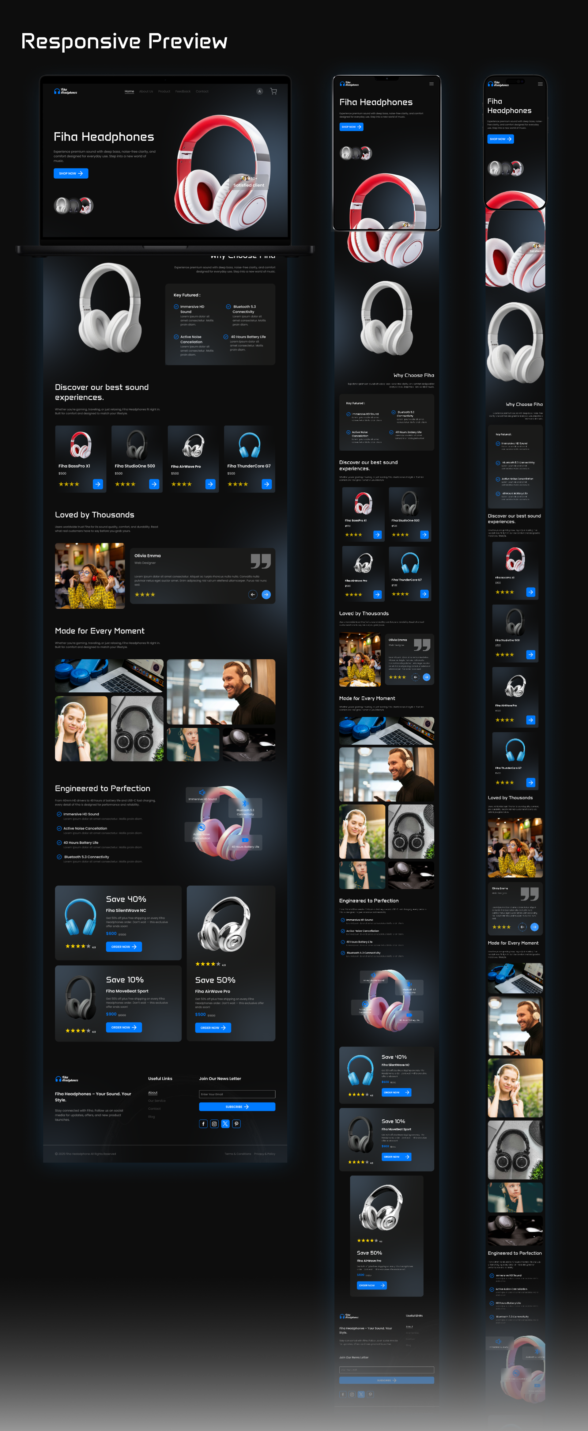
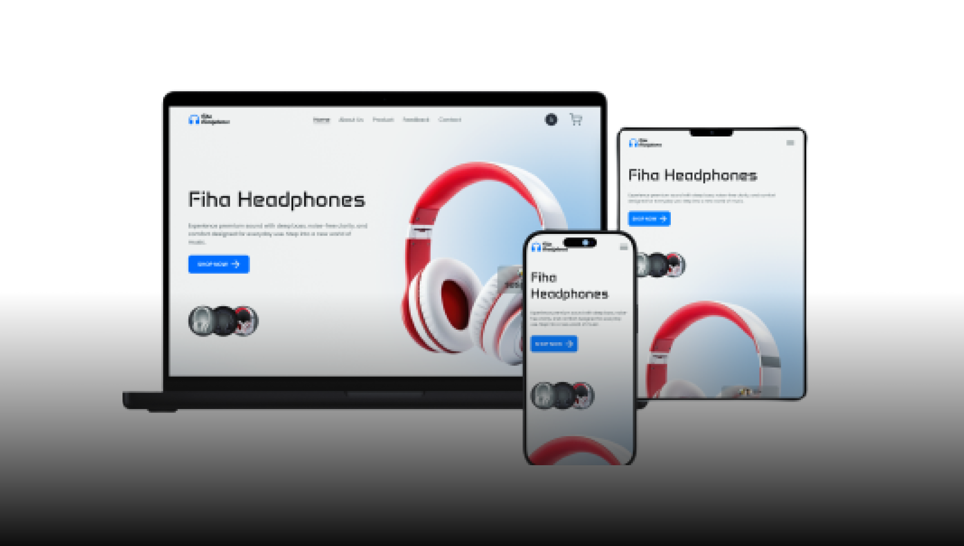
- Optimize for mobile: make the sticky CTA bar 48–56 px tall, set button text to 16–18 px, and keep tap targets at least 44 px.
Overall, strong direction—crisp visuals, clear structure, and solid product focus. With tighter spacing, sharper CTA contrast, and a bit more social proof near the purchase action, this page will feel even more premium and conversion‑ready. Keep going!

Cool project, Jiddi!
I really like the colors you used.
At first glance, I’d just suggest reviewing the mobile version once more. A few elements look slightly unoptimized for smaller screens or appear to be cut off.
Overall, nice work!
You might also like

Smartwatch Design for Messenger App


Bridge: UI/UX Rebrand of a Blockchain SCM Product


Pulse Music App - Light/Dark Mode


Monetization Strategy


Designing A Better Co-Working Experience Through CJM


Design a Settings Page for Mobile
Popular Courses

UX Design Foundations


Introduction to Figma

Design Terminology
