Halloween Icon Set for Telegram
I created a Halloween-themed icon set that could adapt to any app, focusing on icons that serve popular digital functions across platforms. My process began with a search into Halloween aesthetics, as this theme is culturally new to me. This involved understanding Halloween symbolism and basic icon design techniques, as it was my first time creating icons.
The project involved several steps: I researched Halloween motifs, sketched initial ideas, and then digitized the sketches using Adobe Illustrator’s Mesh Tool, iterating multiple times for refinement. To ensure adaptability, I tested the icons at multiple sizes (16x16, 24x24, 32x32, 48x48), carefully adjusting details to maintain recognizability across different scales. Finally, I chose Telegram to showcase the icons in a case study, integrating them within the app to demonstrate their functional alignment.
I prioritized clarity, contrast, and simplicity to ensure the icons remained visually accessible in light and dark modes.
Tools used
From brief
Topics
Share
Reviews
2 reviews
Hi Mariam!
Great job on the Halloween icon set! It’s clear you put a lot of creativity into it, and I especially liked the dark and light mode switch in your presentation—nice touch!
A few of the icons have very thin strokes, like the search and lantern icons, which makes them harder to recognize. Additionally, the tiny details in icons like the notification icon (with the small bat inside) add complexity. Because of this, some icons feel a bit busy, and a few look slightly inconsistent with each other.
While the designs are creative, they don’t quite blend seamlessly with Telegram’s existing icons. I believe simplifying and making them more consistent could really enhance their usability.
I’d also love to learn more about the concept behind each icon! For instance, I’m curious about the choice of the potion bottle to represent privacy and security—what inspired that? Knowing the thought process behind each symbol would make the set even more engaging.Keep up the great work; you’re almost there! 👍
Great job on displaying all the details. Your effort and attention to detail really shine through. Keep up the good work, your progress is impressive!
You might also like
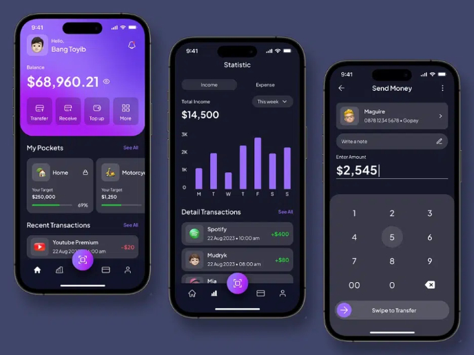
eWallet App Development Project
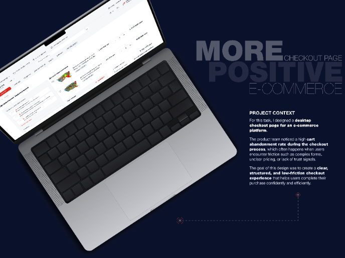
🖥 Desktop Checkout Flow Design

Website CRM Dashboard
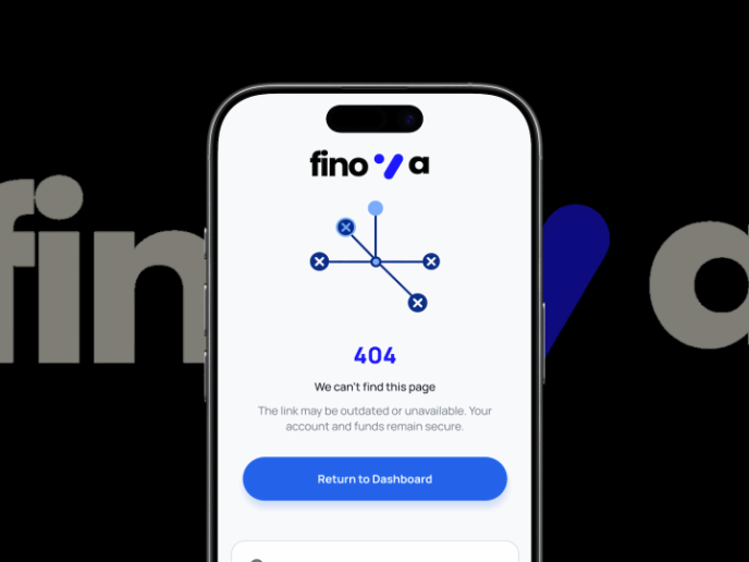
Helpful 404 Error Page for a Fintech Mobile App
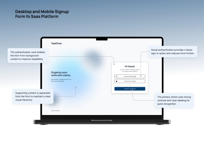
TaskFlow Authentication Flow
Pebble Accessible SAAS Signup Flow
Visual Design Courses

UX Design Foundations

Introduction to Figma


