GTI

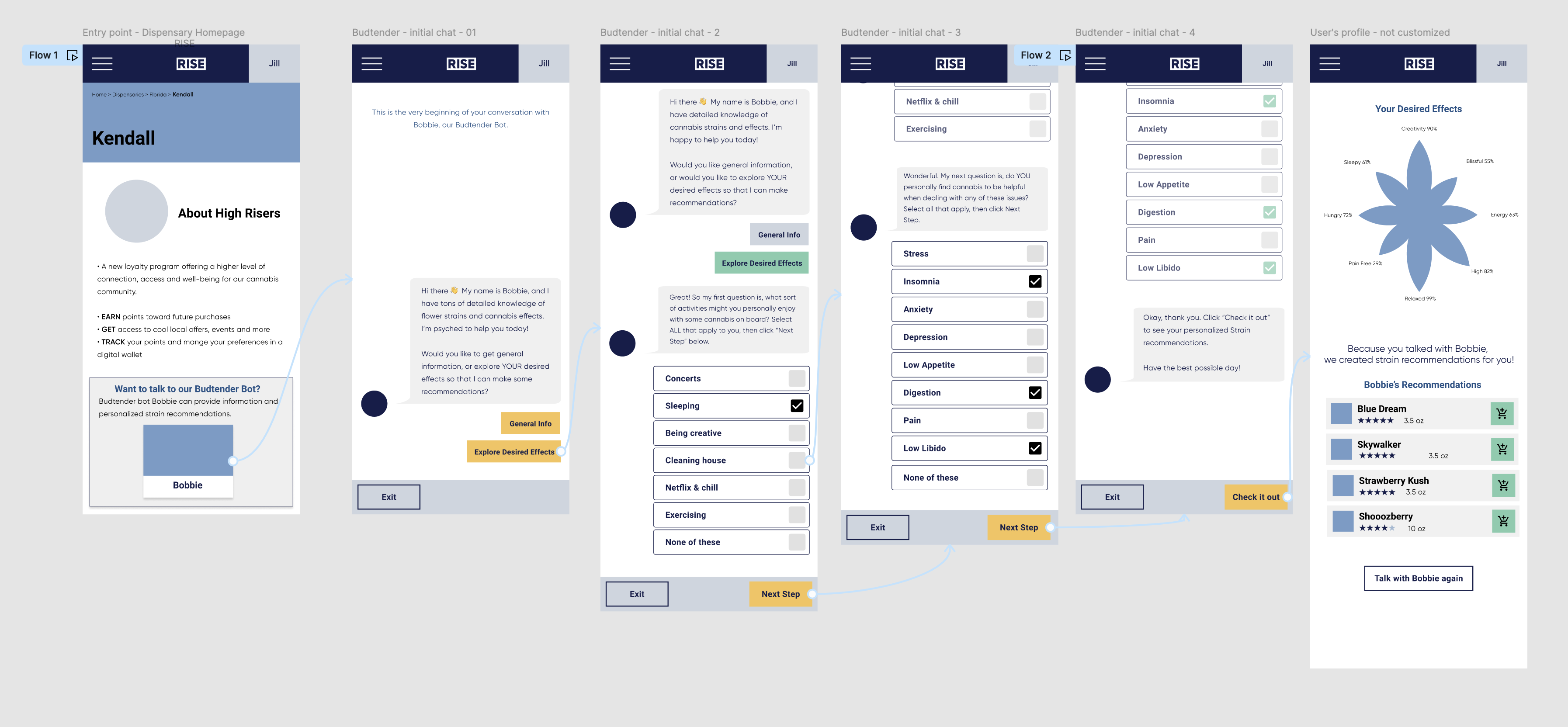
This checkout wireframe involves a AI bot and a different way to help users make sure they are getting the products they need with their own effects and characteristics.
Prototype here: https://www.figma.com/proto/Bc2jTv75HiA637181XQGQt/GTI?page-id=1%3A205793&node-id=1-205822&viewport=1280%2C623%2C0.37&t=GcpfVIZcYqlJMhlE-1&scaling=min-zoom&content-scaling=fixed&starting-point-node-id=1%3A205822&show-proto-sidebar=1

Reviews
1 review

Overall I really like this idea for a bot! Its a great personalised experience for shoppers who want to make informed decisions before making a purchase.
Disclaimer - I will review this as a wireframe so I’m focusing on the flows and concepts more than the fonts and spacing and all the nitty gritty.
Some highlights:
I like the idea of the AI chatbot being used to give the user a more personalised experience so that they’re making a purchase that’s suited to their needs. The steps to get to the final screen is also minimal so the user doesn’t have to do too much to get a result which is great. Giving the chatbot a name also humanises it a bit so the user can feel that the interaction is personal and it’s also just fun! The tone and language of the bot is also friendly and gives the user clear next steps. I enjoyed the strain suggestions at the end in the form of a chart so users can gauge in a single view the kind of strains suited to them. And then finally the products have a direct “Add to cart” feature which is key for conversion as it leads the user exactly to the products they should buy.
Some questions:
I will say that your chatbot is quite different to the benchmarks out there. For example, I expected to see a floating button or modal which will take me to the chatbot. And also the chatbot should follow like a conversation so the buttons at the footer saying “Next” and “Check it out” I would expect to see in the conversation screen and not at the bottom. I also see that the user must rely on buttons to navigate the chat and they cannot at any point write an actual message. I wonder what this means for users who want to ask questions that extend before the preset options you’ve given them. I’m missing some context of course so maybe these are intentional design decisions, if so, feel free to adjust my feedback.
Tiny tip:
After reading the content in your prototypes, I could figure out what was being promoted but adding a short description of the product or the business will give the reviewers of your project some context so they can better follow and understand the design. Alternatively you could also mention the user needs, pain points and goals for what they hope to achieve when using your app.
You might also like

Smartwatch Design for Messenger App


Bridge: UI/UX Rebrand of a Blockchain SCM Product


Pulse Music App - Light/Dark Mode


Monetization Strategy


Designing A Better Co-Working Experience Through CJM


Design a Settings Page for Mobile
Interaction Design Courses

UX Design Foundations


Introduction to Figma

Design Terminology
