GrowSync

🧩 About the Project – GrowSync
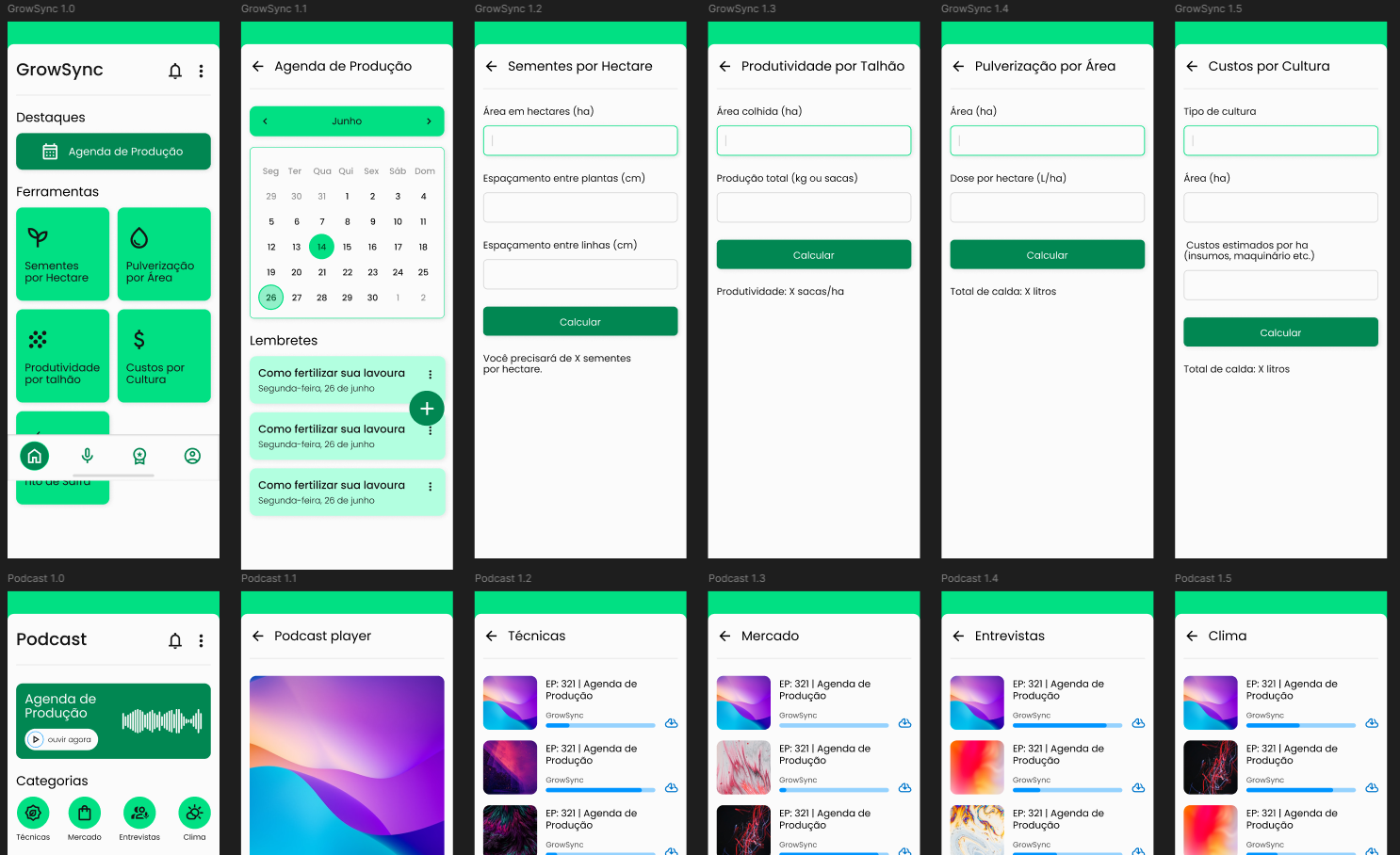
GrowSync is a work management tool designed specifically for the agricultural sector, aiming to improve productivity, organization, and communication among technicians, agronomists, and farm employees.
The app provides key features tailored for the agro environment, such as:
- A technical agenda and productivity tracking
- Crop calculators (for seeds, spraying, yield)
- Local weather updates
- Educational podcasts
- A performance ranking system with gamification to motivate teams
This project focuses on enhancing the user interface by building a cohesive color system, a mobile-first typography guide, and designing key parts of the UI such as the profile and settings screens. The goal was to modernize the brand's visual identity while ensuring clarity, accessibility, and consistency across the experience.
All design decisions were based on usability principles, accessibility (WCAG) compliance, and a deep understanding of the target user: professionals working directly in the field.
⚠️ Note: The project is presented in Portuguese, so some interface elements may require translation for full understanding.
https://www.figma.com/design/Ldmgs018DYTby2knuYKTJJ/GrowSync?m=auto&t=O31NelNeM1Hfh56m-6

Reviews
2 reviews
Nicely well done Tailan! I neither speak Spanish nor Portuguese, but just by looking at the UI, I can understand in general what to expect from the app.
You basically have shown good grasp on common design pattern in mobile design (well done and congrats!). The color is also pretty much consistent across all frames.
What I would suggest to improve is to have the navigation bar stick to the bottom. I assume you have a certain height in mind when designing the frames, so it would be great to keep the height consistent across all frames. By doing it this way, when you are making the prototype interactive, you can test and see if the navigation bar or the plus button sticks on the bottom or not when you scroll up and down.
But for now, pat yourself in the back! This is a really nice project that you've done! :)
Overall, you did a great job. However, I should mention that the green colour is too bright. I would make it less vibrant to create a more comforting effect.
You might also like

Events Managment App


Customer Journey Map — Offsite Co-Working Experience


Mobile Onboarding: Casa di Pasta


Accessible Signup & Login Experience — Brainex


Accessible Signup Form


Accessible Signup Form

Visual Design Courses

UX Design Foundations


Introduction to Figma

Design Terminology
