GoldBelly UX Copy for Push Notifications
Project Overview
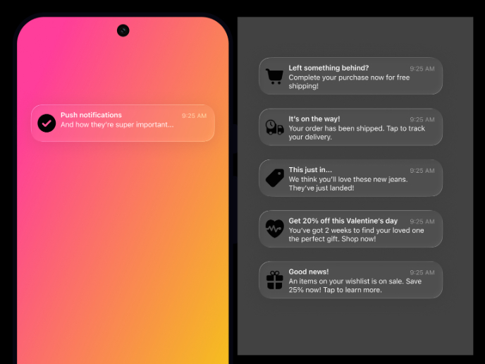
This project showcases five push notifications written for Goldbelly, an e-commerce platform for food lovers.
The goal was to enhance the user experience with short, clear, and delightful notifications that feel personal and on-brand — using witty foodie banter while maintaining clarity and functionality.
Approach & Process
- Began by researching Goldbelly’s tone: playful, indulgent, and nostalgic.
- Defined key UX goals for each message type (e.g., reassure, excite, prompt action).
- Balanced creativity with mobile constraints — all titles under ~38 chars, bodies under ~85.
- Incorporated dynamic tokens like {item_name} and {restaurant_name} to allow scalable personalization.
- Designed realistic iOS mockups to visualize tone, hierarchy, and readability in-context.
Voice & Tone
Playful but never gimmicky. Food-first language (“Slice of the season,” “Don’t ghost your appetite”) conveys warmth and joy while staying useful. The humor supports the experience — it never gets in the way of comprehension.
Outcome
Five notifications that feel unmistakably Goldbelly — concise, branded, actionable, and emotionally resonant. Each one contributes to a seamless and satisfying UX moment, from order to delivery.
Tools used
From brief
Topics
Share
Reviews
1 review
Solid work mate! If I have to add something, may be more constrast between the text and background. Hope to see your next one!
You might also like
Ubani Design System

CJM for Co-Working Space - WeWork
Accessible Signup Form for SaaS Platform
Loginino
Notification microcopy - Project
El Mandoub-GovTech App
Content Strategy Courses

UX Writing

Common Design Patterns

