Gaming Gear 404 Page

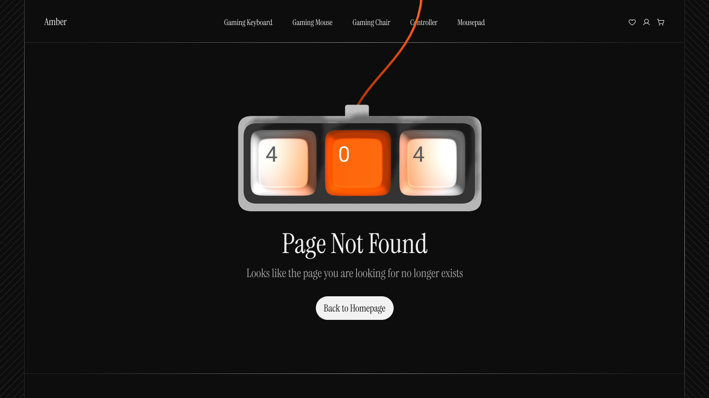
This 404 page is designed to help users quickly recover from hitting a broken or missing link. It uses a gaming keyboard theme (with “404” shown on keys) to match the brand and keep the experience fun.
The page keeps the main menu visible so users can still explore categories like keyboards, mouse, or chairs. It also has a clear message (“Page Not Found”) and one main button (“Back to Homepage”) so users know exactly what to do next.
The dark background with orange highlights makes the important parts stand out. The design is simple, easy to read, and avoids overwhelming the user.
Overall, it turns a frustrating error into a smooth, branded moment that guides people back to shopping instead of leaving the site.
Tools used
From brief

Topics
Share
Reviews
7 reviews

Great job! 🎮 The gaming keyboard “404” is super on-brand and makes the page fun without losing clarity. I like how you kept the menu visible and the CTA simple. Maybe a tiny playful animation could push the experience even further, but overall this is a clean, engaging, and user-friendly design.

Very creative and representative page! I really like the illustration, it adds a lot of personality and makes the design feel engaging.
One small suggestion that could make it even better. For the buttons and menu text, consider using sans-serif fonts. In practice, they’re more visible and easier to read, especially for quick navigation.
Overall, this is a fun and well-executed page

nice!!!!!!

Good job Mandar. The 404 page is fun and fits the gaming brand well. I like how you kept the menu visible and made the “Back to Homepage” button clear it helps users recover quickly.
The dark background with orange highlights works nicely to show important parts. You could also add a small playful animation to make the page feel even more engaging. Overall, simple, clear, and user friendly design.

Fun and on-brand idea with the keyboard theme — maybe simplify font choice for quicker readability, but overall it’s a smart and engaging 404 page!

Looks neat Mandar!
I'm not entirely sure if you want the wire to go over the navigation item, as this reduces readability and I'm also not sure what behavior you'd expect if someone selects that navigation element.
Good job, love the visuals!

I really like how you used the keyboard keys to represent 404; it’s creative and fits the gaming niche perfectly. The dark theme with orange highlights feels modern and matches the gaming vibe. The message is clear, and the navigation button is helpful. One area of improvement could be adding more depth or visuals to balance the empty black space, and making the ‘Page Not Found’ text slightly bolder for stronger hierarchy. Overall, it’s a neat, thematic design!
You might also like
SiteScope - Progress Tracking App


FlexPay


CJM for Co-Working Space - WeWork


Ubani Design System


Accessible Signup Form for SaaS Platform

Loginino

Content Strategy Courses

UX Writing


Common Design Patterns


Building Content Design Systems
