GA Sign In

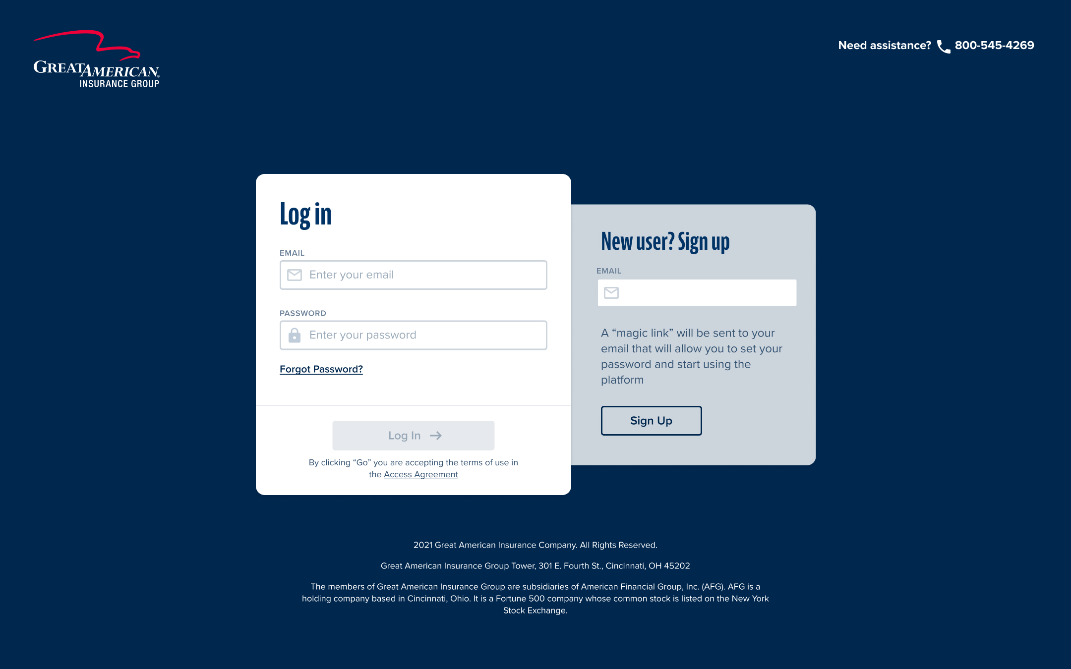
This was a professional project for an Insurance Company I worked for. The design follows the a11y guidelines and we focused on designing in a way that would be practical to sign up and easy to sign in with hints and accessible elements.
The direct link to this design: https://www.figma.com/proto/XQZjPK2wLgA5hNcRiD4I4A/Insured?page-id=2%3A156&node-id=2-21024&viewport=2502%2C3934%2C0.27&t=lFwoMVbNDzJYgbYV-1&scaling=min-zoom&content-scaling=fixed&starting-point-node-id=2%3A21024&show-proto-sidebar=1

Reviews
2 reviews

Hi, Paulo! Congrats on your project; it is very useful, balanced, and easy to understand! And I like the chosen colors and typefaces.
I couldn't access the Figma link because it's asking for a password. I'd like to see the active states when the form is filled, but I'm sure they are great.
The only thing I would change is the "Go" in "By clicking Go..." because the button says Log In. Or change the button text to Go. The rest is excellent!
👏👏

Hey Paulo,
Great work i really like how created a palette, if i were you i would having both the signup and login on the same page and keep it simple just one action per page. The design looks solid though thumbs up!
Cheers.
You might also like

Loginino


Notification microcopy - Project


El Mandoub-GovTech App


MalishaEdu Counselor Workspace


Goal Creation Flow


Portfolio website

Visual Design Courses

UX Design Foundations


Introduction to Figma

Design Terminology
