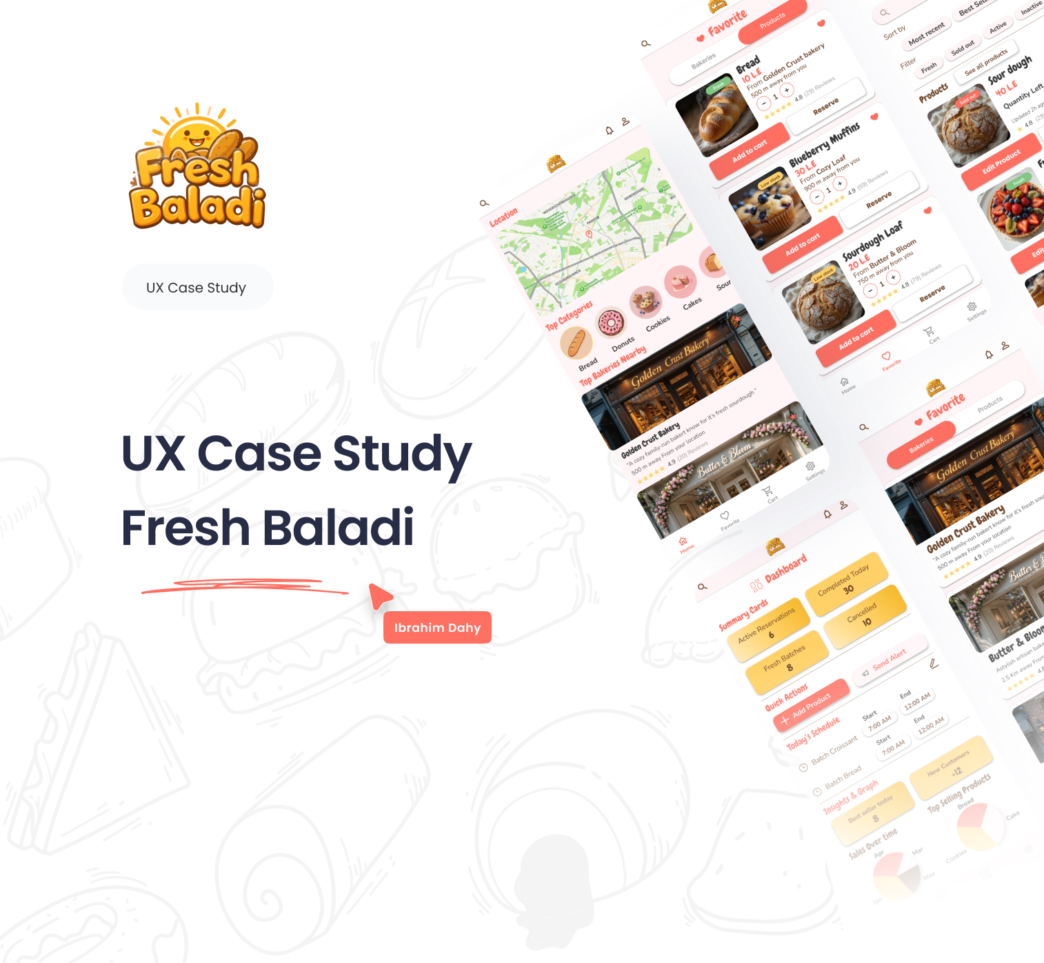
Fresh Baladi | Real-Time Bakery Alerts App | UI UX Case Study

Thank you for taking the time to explore Fresh Baladi
Your feedback and insights are highly valuable - whether about design , user experience , or overall concept .
Tools used
Topics
Share
Reviews
6 reviews

Very detailed process, well done!

Really in-depth overview of the process! Everything is very clearly laid out; the timeline, personas, and design rationale explanations are well done. The UI is very clean and crisp, while also being aesthetically pleasing and charming. Awesome work all around, even the design of the slides that explain the process have quaint illustrations. Bravo!
Overall, it’s well-structured and detail-oriented. I have one suggestion, the case study would look even stronger if you enhanced the overall visual design of the app.

Great case study Ibrahim! You included a lot of useful details and valuable insights.
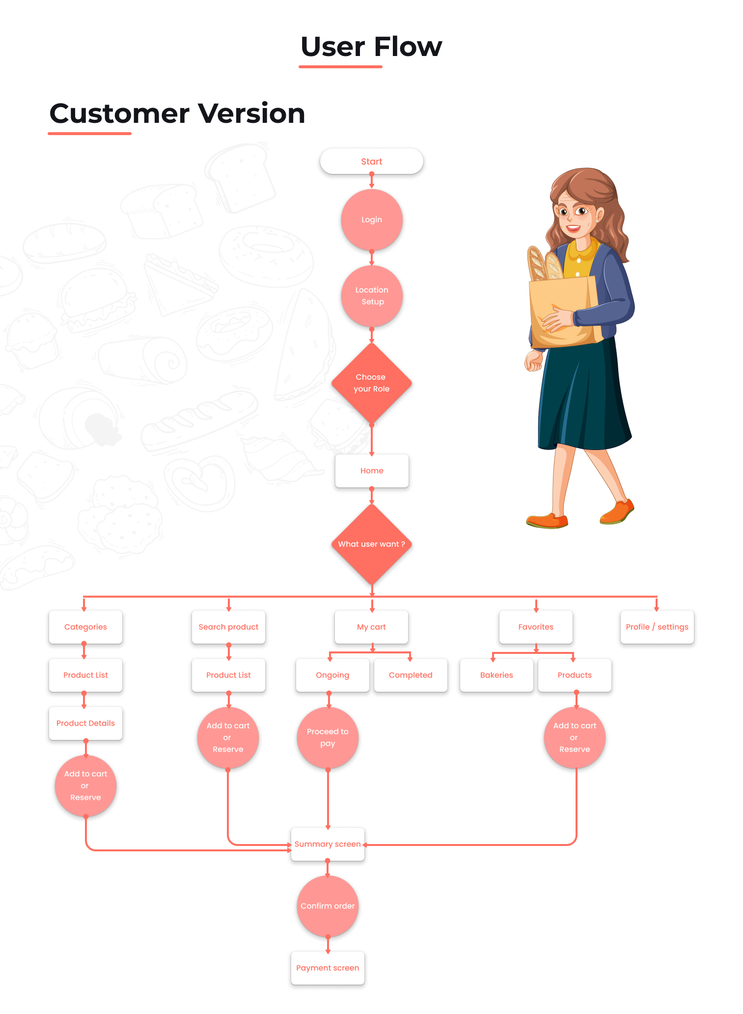
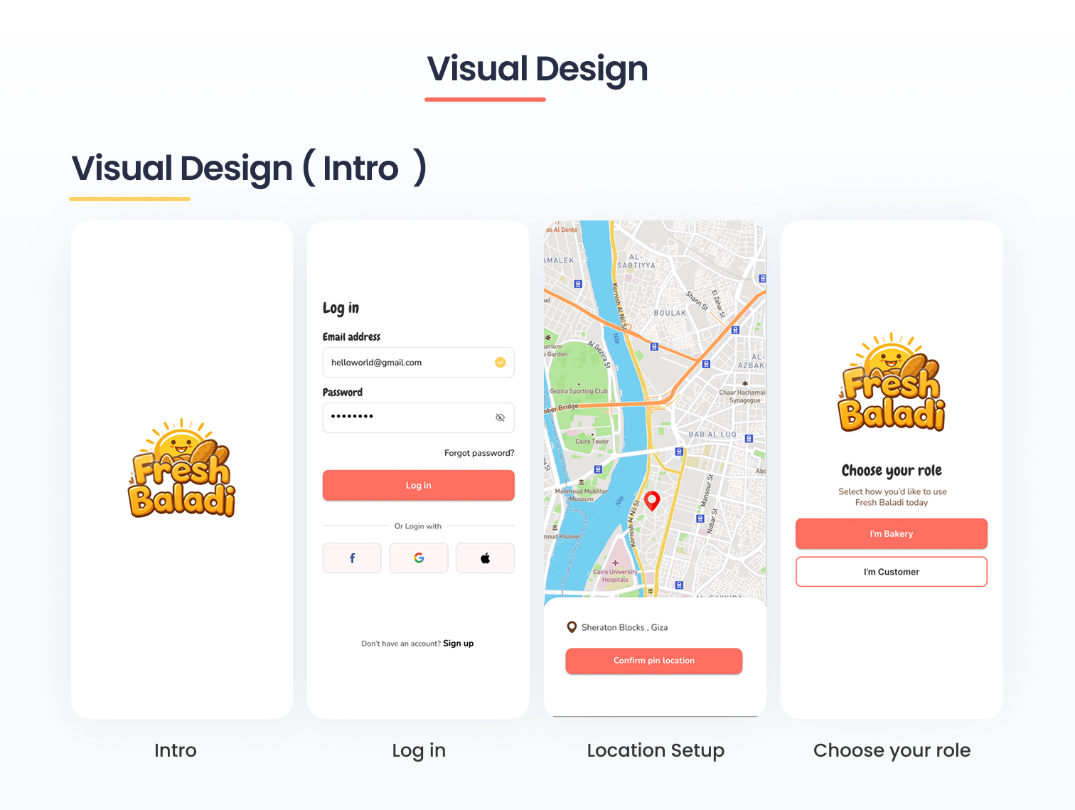
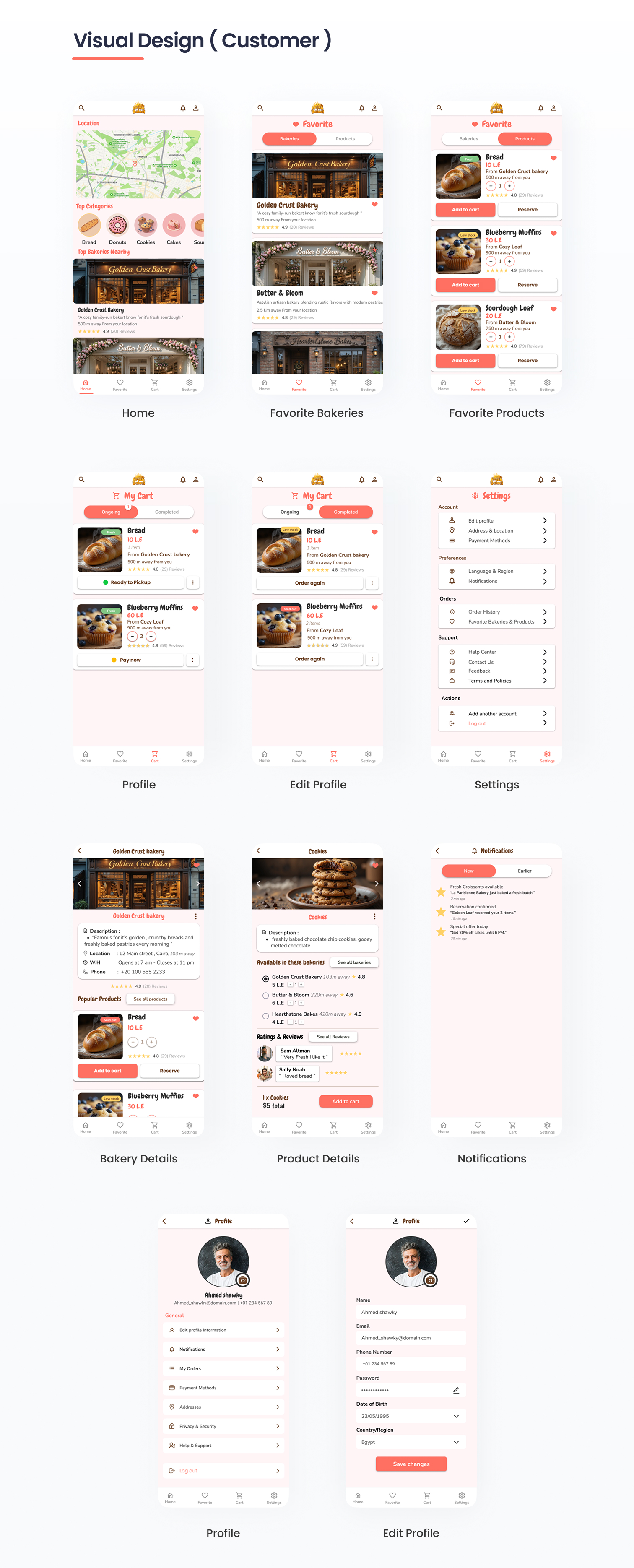
From what I understood, users receive a notification when their product is ready, so they can pick it up right away. But what happens if the user is busy at that moment? I’m also curious about the flow behind the "Add to Cart" and "Reserve" actions, how exactly does that work?
I didn’t notice an option where users can schedule a pickup time. That feature could help reduce uncertainty about when the product will be ready and give users more control. Maybe it’s already part of your flow, but I might have missed it.
From a UI perspective, I noticed that in the Bakery Owner view, your titles are in the primary color. That’s usually not ideal, I’d recommend reserving the primary color for interactive elements instead.
Overall, you clearly put a lot of effort into this, well done!
This is a comprehensive case study illustrating research-informed product design processes. Great work!
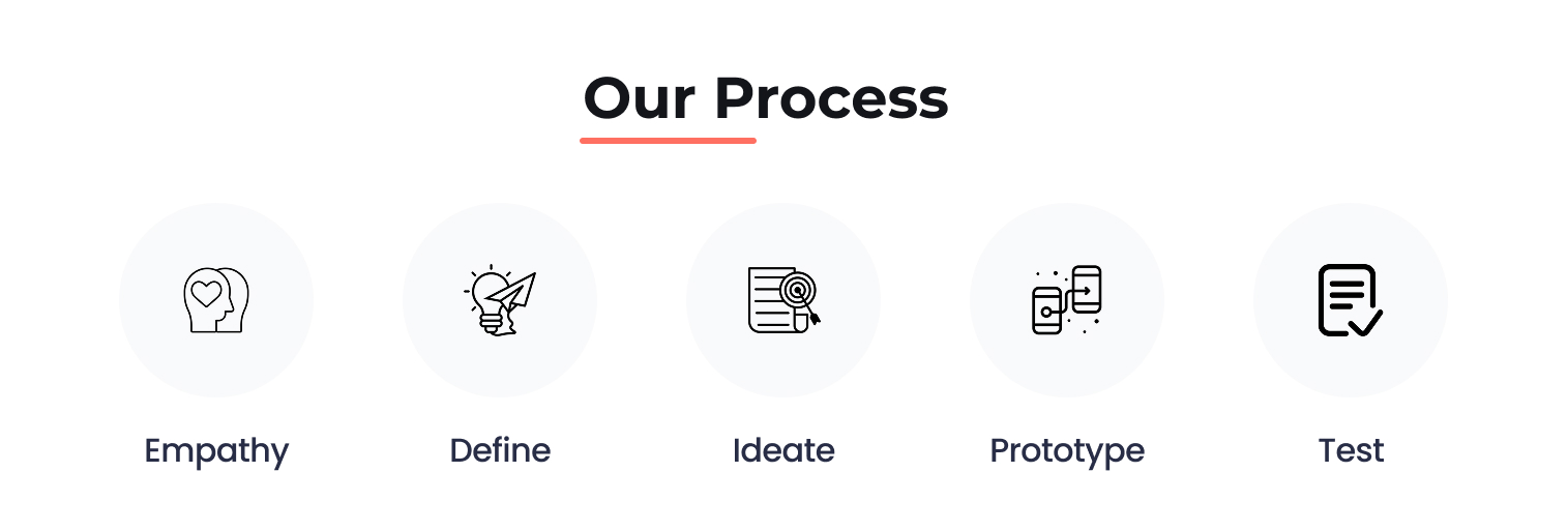
The product is to solve real-world problem. You validate the product idea via user research. You create product features by mapping user's needs/insights. And the wireframes illustrate well key user flows. Last but not least, the visual elements of colors and layouts are well crafted.
And here are two issues to consider further if you have more time:
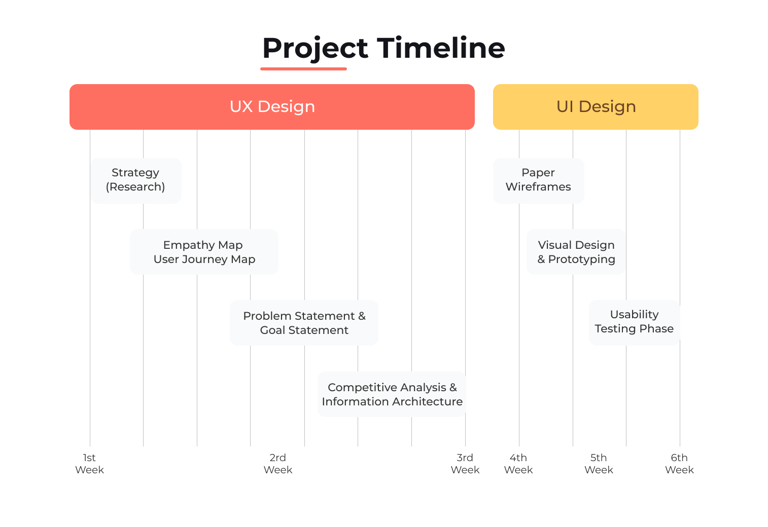
- might be more impactful to share how the quantitative and qualitative research are conducted, what are the research questions. These would help readers to find the connections between your research and insights.
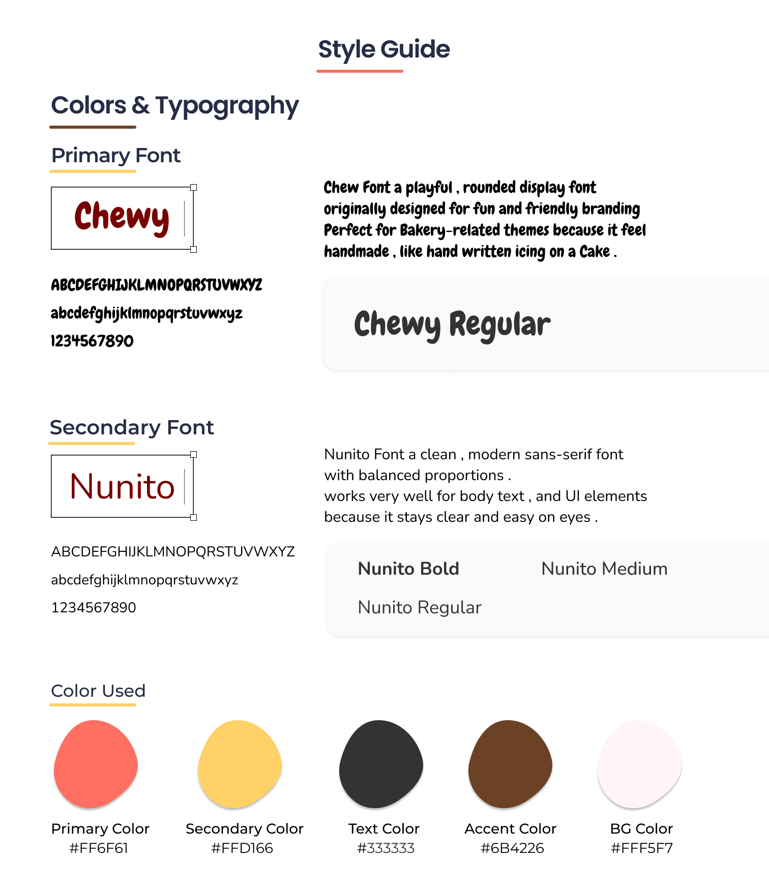
- about the Chew font, it is lively, playful, and friendly to the neurotypical users. On the other hand, for some neurodivergent group(s), this font might be challenging. It would be safer to test it with users of various background so that your product would be more widely accepted in the market.
All in all, your case study, design, and product concepts are well-grounded, and excellent.

My overall impression:
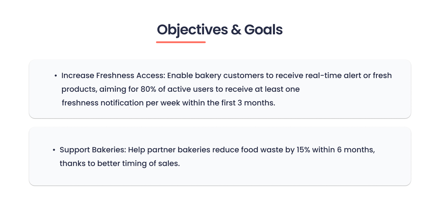
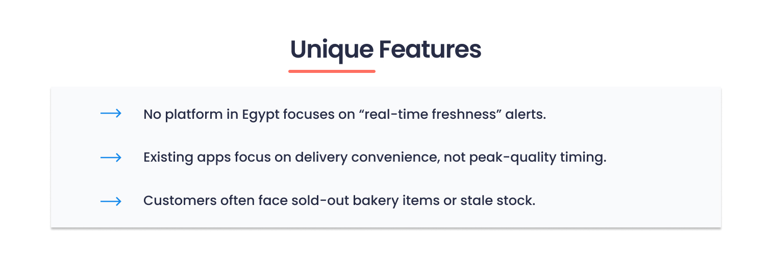
The project has solid foundations – I can see you've put a lot of work into research and defining the problem. The idea of real-time freshness alerts is a really interesting concept that solves a real pain point. However, there are several areas where I see room for improvement.
What works well:
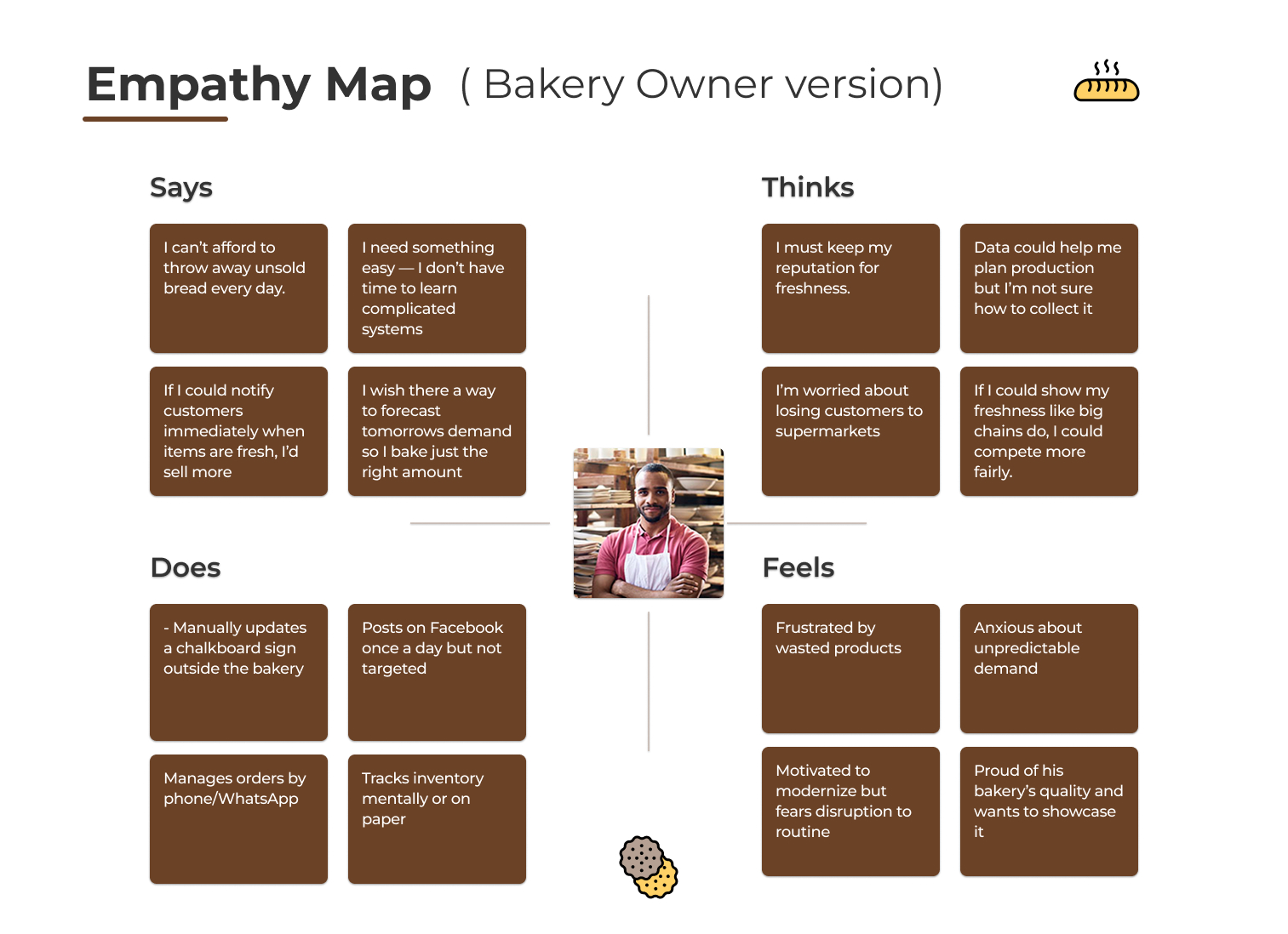
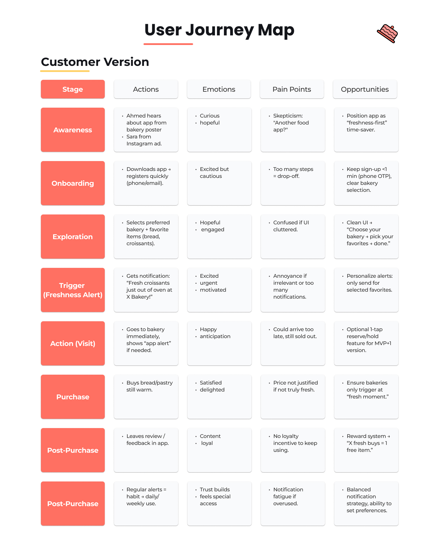
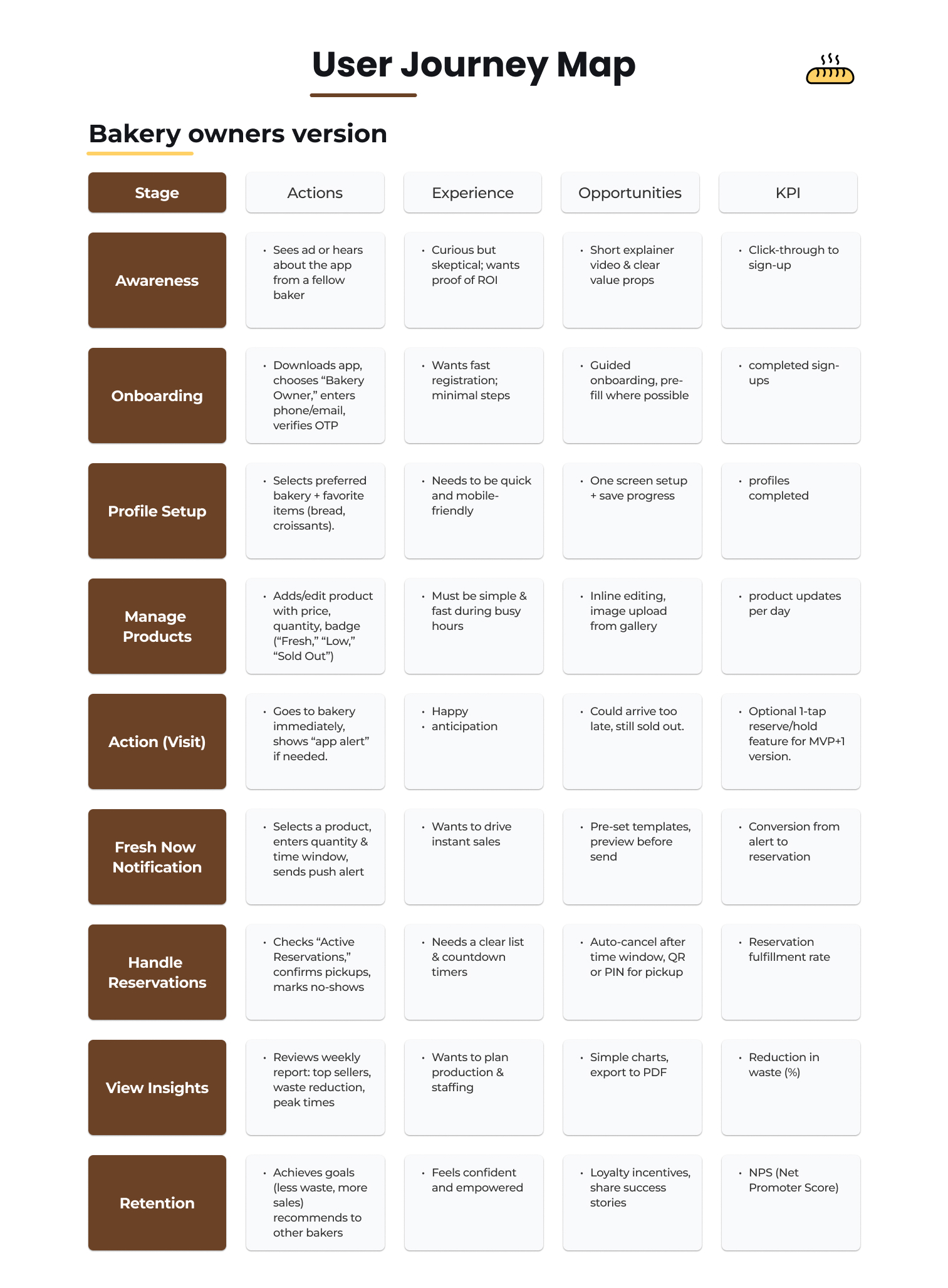
Excellent research – you have concrete numbers and clearly defined personas. That's a solid foundation. The user journey and empathy maps are well thought out and show you understand your users.
Visually, the project is approachable – warm color palette, but typography could be better. The style guide is complete and consistent.
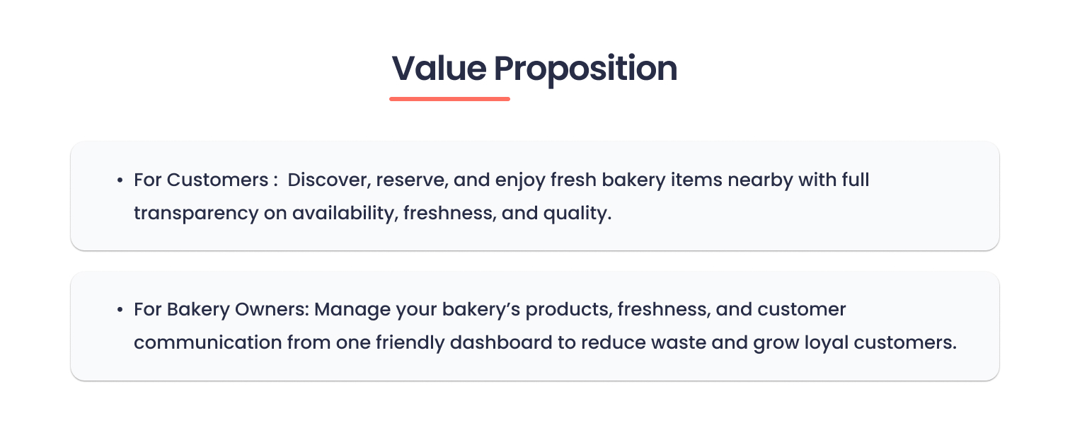
The problem and solution are clearly communicated – there's no doubt about what the app is supposed to do.
Where I see concerns:
1. Information Architecture feels overloaded.
2. Navigation might be confusing.
3. Notification system.
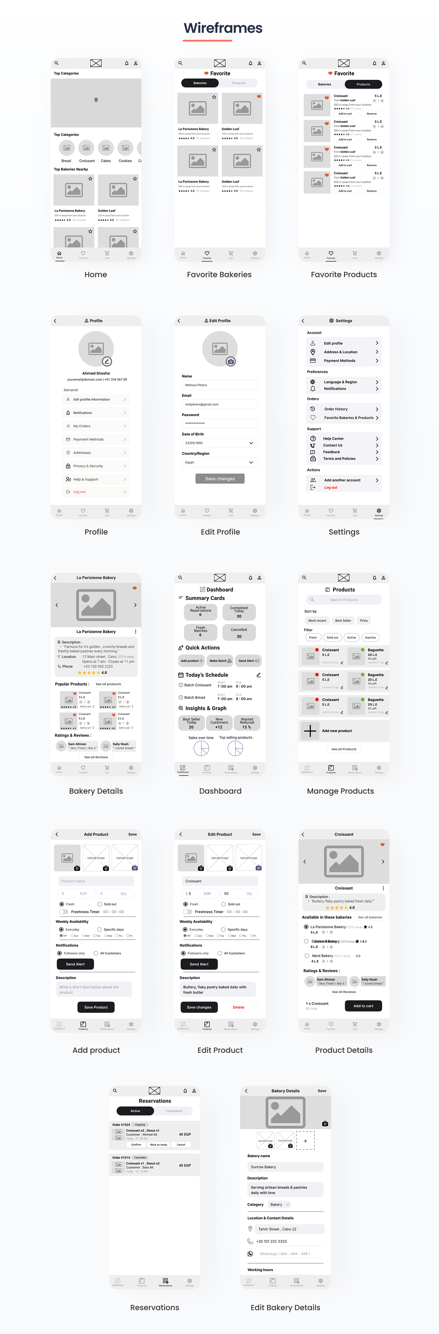
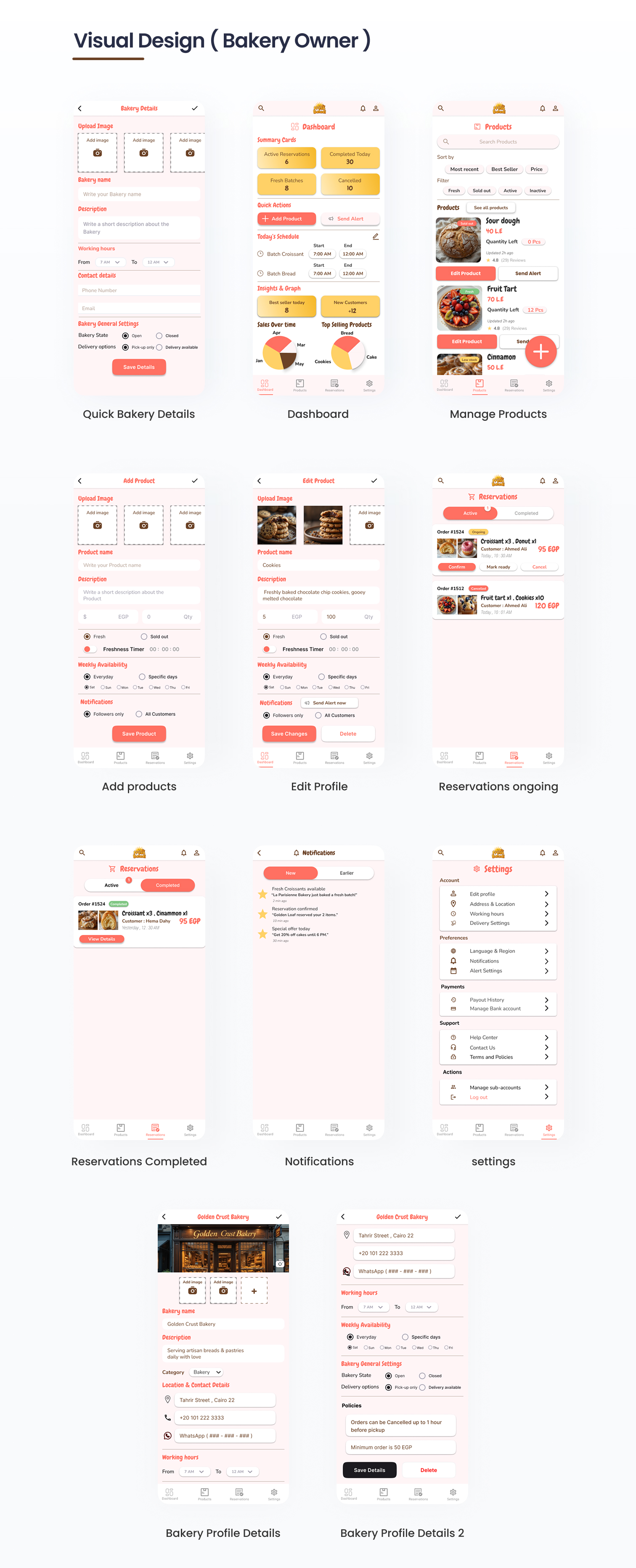
4. Use case for bakery owners. You have personas for both sides (customer + owner), but I only see customer flows and screens. What does the dashboard for owners look like? How do they add products? How do they trigger notifications? This is the second half of the product that seems underdeveloped.
5. Edge cases I don't see solutions for situations like:
- What if the bakery is closed?
- What if the product sells out before the customer arrives?
- How does reservation work – for how long? Is there confirmation?
- What about payments – do you pay online or on-site?
Summary:
You have a good foundation and an interesting idea. Research is solid, visual design is pleasant. But the project feels a bit surface-level – you need to go deeper into user flows, edge cases, and functionality for the other side of the platform (owners).
Hope this helps! Really great work! 💪😊
You might also like
SiteScope - Progress Tracking App


FlexPay


Mobile Button System


CJM for Co-Working Space - WeWork


Ubani Design System


Accessible Signup Form for SaaS Platform
Popular Courses

UX Design Foundations


Introduction to Figma

Design Terminology
