A11Y Sign up Form

Tools used
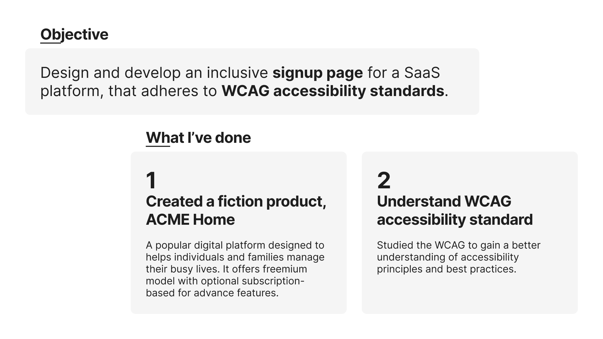
From brief

Topics
Share
Reviews
3 reviews

Hi Jo Lee,
Wonderful job on this design! The form is clean, intuitive, and highly accessible. The clear labels, error feedback, and overall layout make for a user-friendly experience.
The only thing I would address is the alignment of the checkboxes, adjusting this slightly would ensure a polished and cohesive look.
Other than that, everything else is fantastic! I’m giving it 5 claps for such a well-executed design. Keep up the amazing work!

This is a well-thought-out design that shows your commitment to accessibility and usability. Your focus on adhering to WCAG standards is clear, and the attention to detail is impressive. Let’s dive into the areas that stand out and those that could use some refinement.
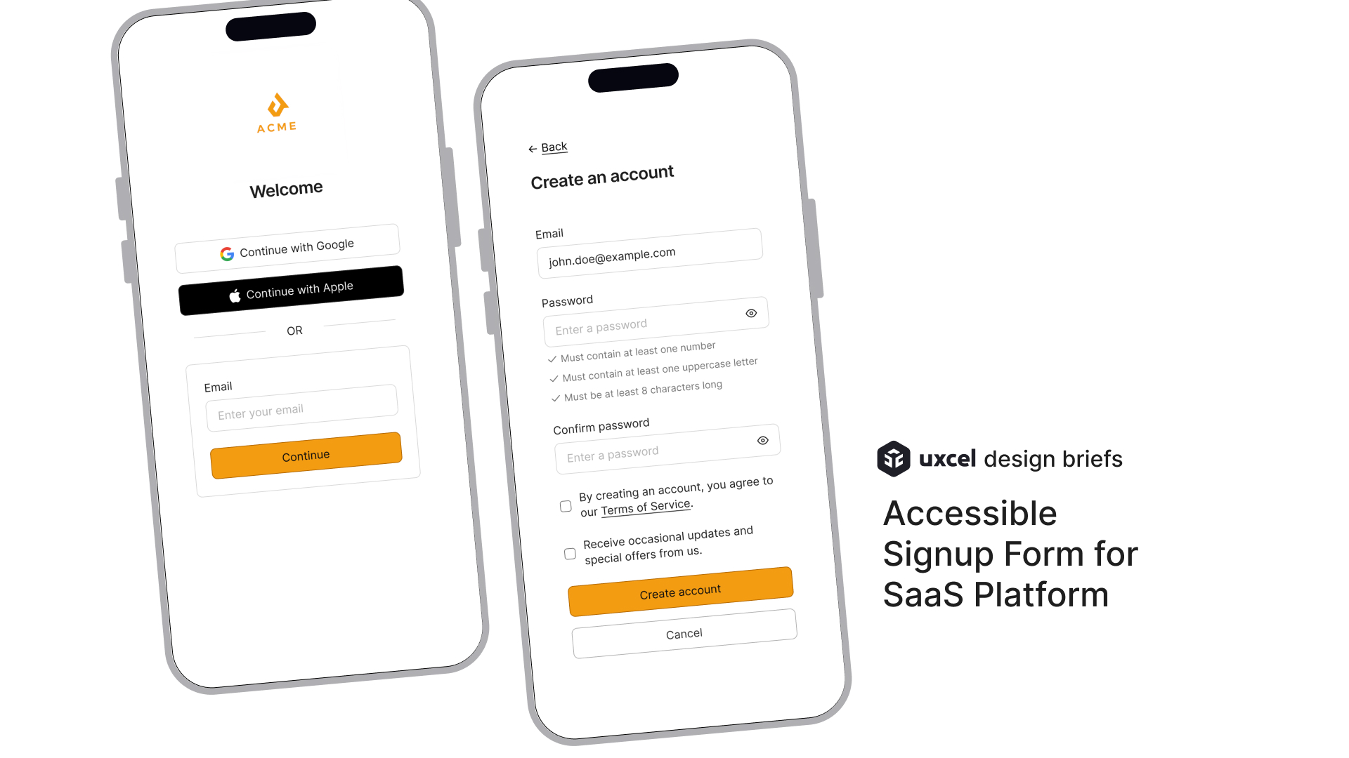
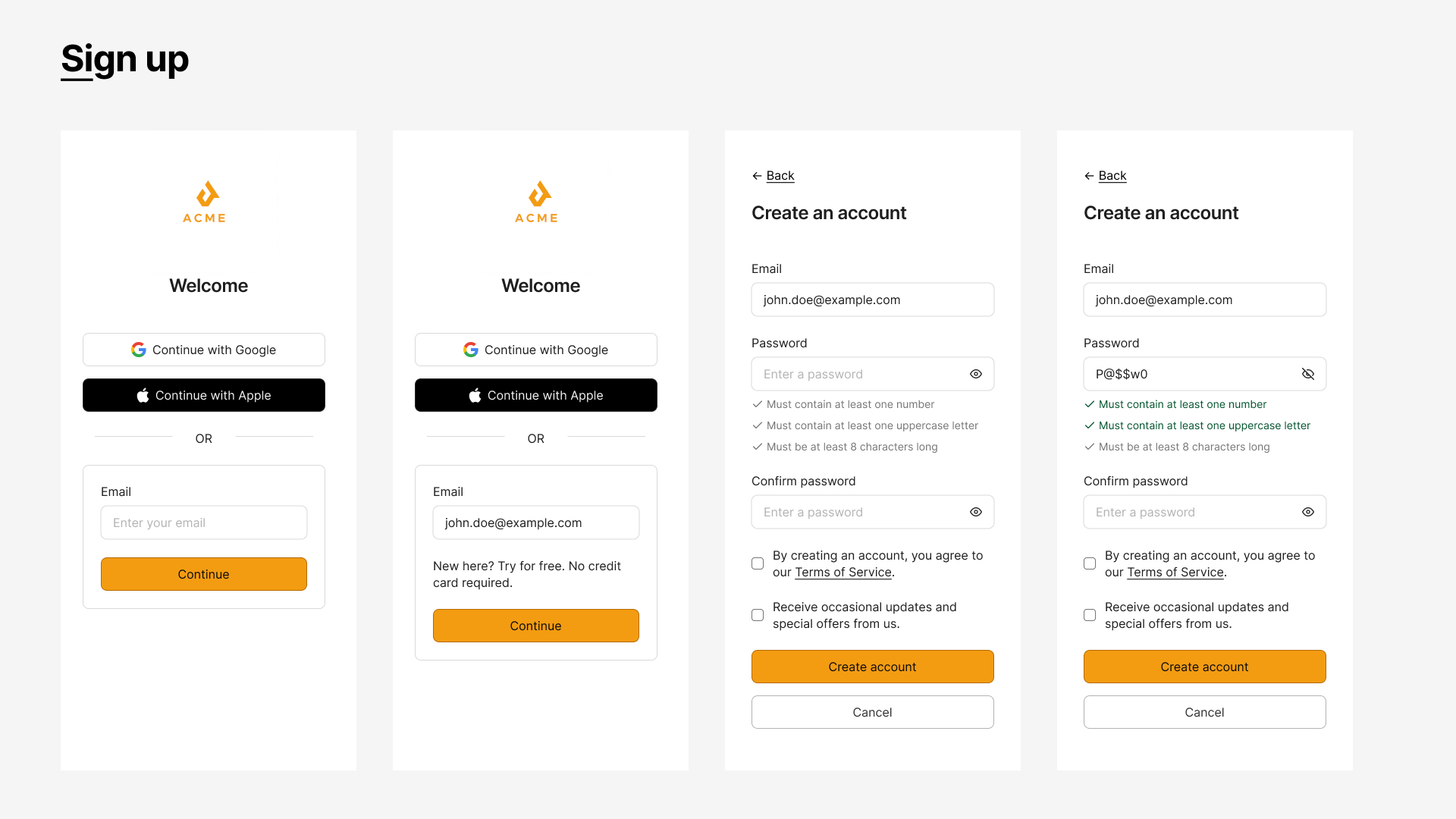
Things I Like
- Real-Time Password Validation
- Well-Placed Back Button with Icon
- Clear and Consistent Error Feedback
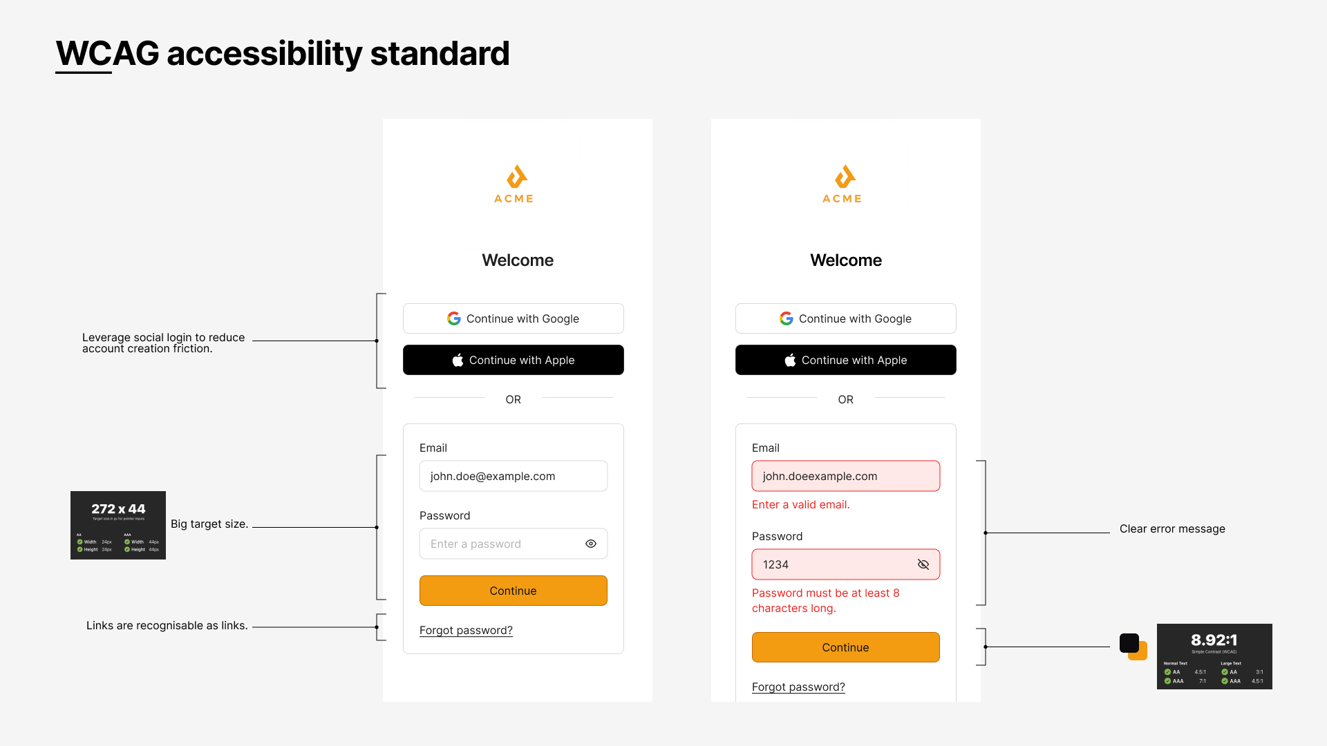
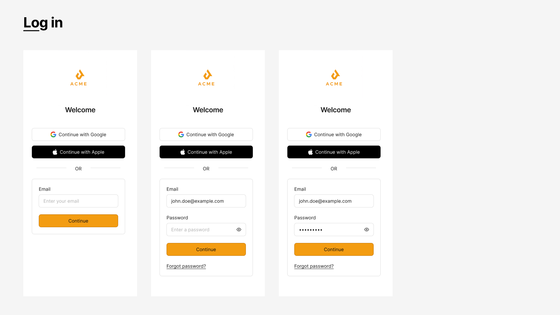
- Social Login Options with Proper Size
- Readable Layout and Visual Hierarchy
Areas for Improvement
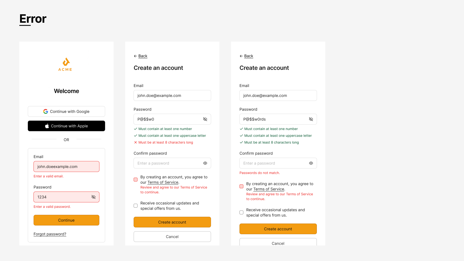
Error Message Placement:
- While the error messages are clear, placing them above the input fields (instead of below) or pairing them with ARIA live regions will improve accessibility for screen readers.
Replace Placeholder Text with Labels:
- Use labels above input fields instead of placeholders like "Enter your email." Persistent labels maintain context even when the user starts typing or auto-fills a field.
Checkbox Spacing and Size:
- The checkboxes for "Terms of Service" and "Receive updates" should have larger touch targets and more spacing for better usability, especially on mobile.
Password Toggle Feedback:
- Add dynamic feedback like “Show password” and “Hide password” to the visibility toggle to make its state clearer.
Focus Management on Errors:
- Ensure the form automatically shifts focus to the first field with an error to guide users and improve accessibility.
Suggestions for Enhancement
Progress Indicators for Multi-Step Forms:
- If the sign-up process includes multiple steps, a progress indicator (e.g., “Step 1 of 2”) would help users understand where they are and reduce drop-offs.
ARIA Labels for Social Login Buttons:
- Add descriptive ARIA labels like “Log in with Google account” for better accessibility with screen readers.
Accessible Error Highlighting:
- Use ARIA attributes to associate error messages with their respective fields, ensuring clear connections for assistive technology users.
Tooltips for Password Criteria:
- Add tooltips or an info icon to explain why specific password requirements are necessary for security.
Mobile-Friendly Spacing:
- Increase spacing between buttons, links, and checkboxes to improve usability on smaller screens.
Your design is already strong, but these adjustments can make it even better. Focusing on accessibility details like focus management, clear labels, and better spacing will ensure a smoother experience for all users.
You’ve done an excellent job of balancing usability and accessibility. This design reflects a clear understanding of inclusive practices, and with a few tweaks, it can set a great example for accessible design. Keep pushing yourself to explore these small improvements—they make all the difference!

Hi Jo Lee!
Great job, I really like this signup form design! The only thing that I would recommend is to provide larger touch targets on the checkboxes, and to be careful with their alignment.
You might also like
eWallet App Development Project

🖥 Desktop Checkout Flow Design

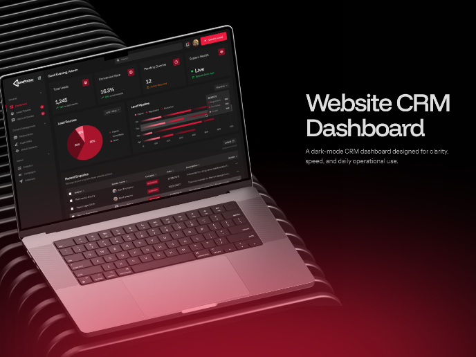
Website CRM Dashboard

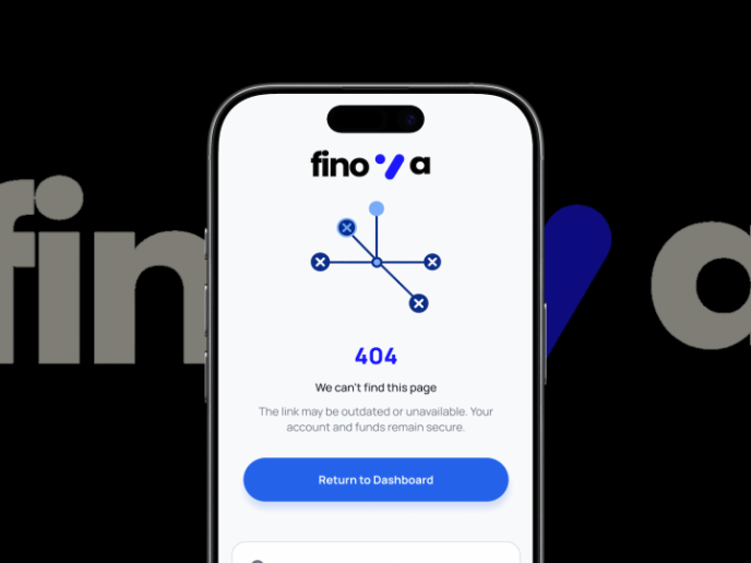
Helpful 404 Error Page for a Fintech Mobile App

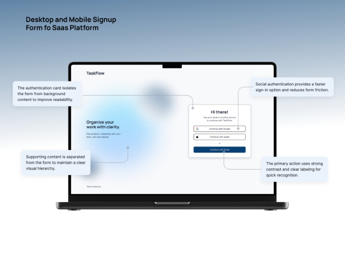
TaskFlow Authentication Flow

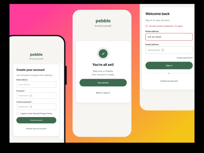
Pebble Accessible SAAS Signup Flow

Visual Design Courses

UX Design Foundations


Introduction to Figma

Design Terminology
