Food Delivery Mobile Application
This was a project for me to test my skills in figma.
Share
Reviews
2 reviews

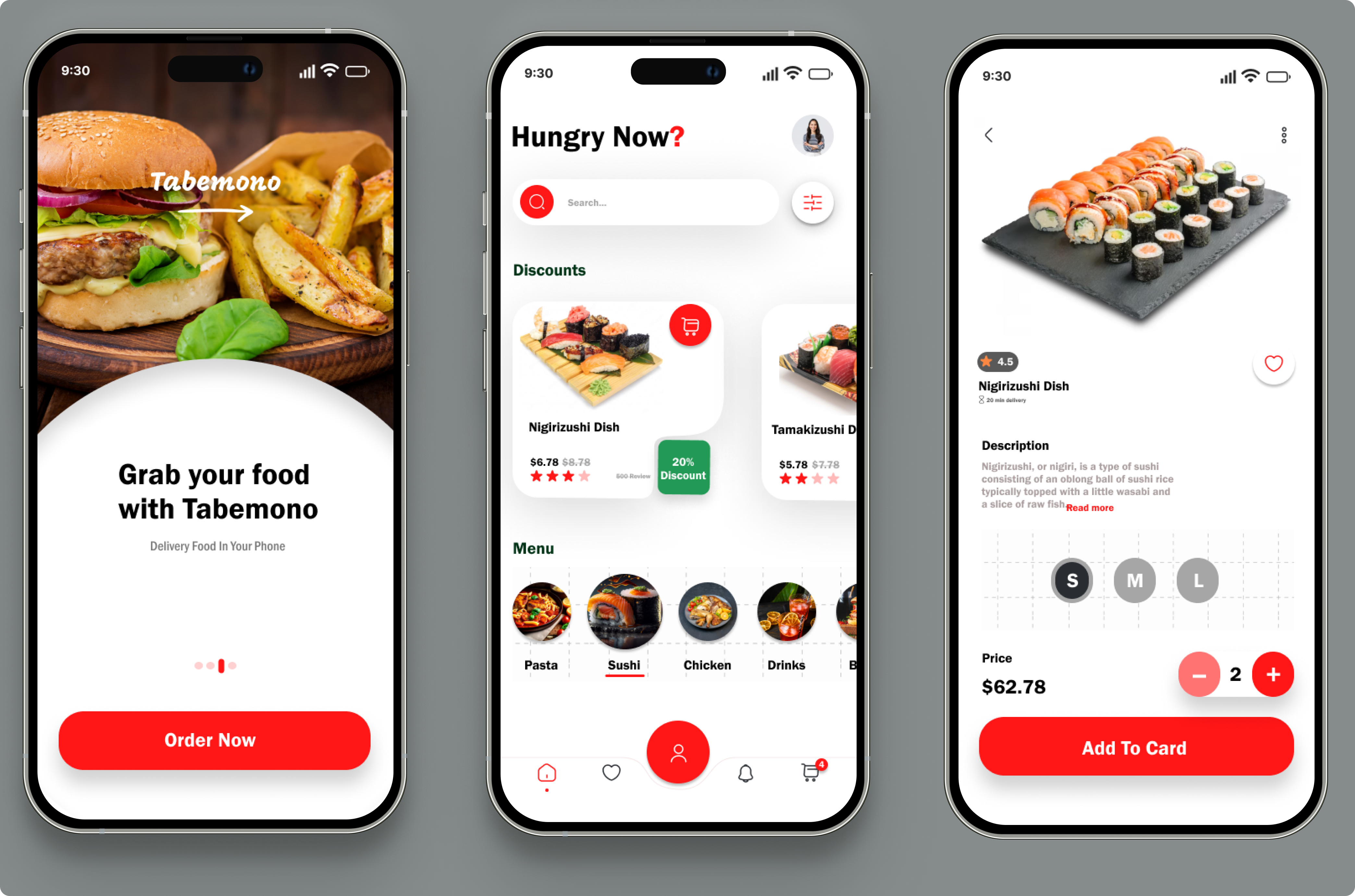
Based on the image, your food delivery app's UI looks neat! But what I'd love to see is more of your design process and understand the rationale behind your decisions. Also, it would be great to include out the other essential screens, like checkout and tracking, since they're 100% necessary for a delivery app. I recommend taking a look at our resource on best practices for project submissions here to make sure you're covering all the important aspects.
It's a great start, Ava! I really like the color palette, especially the use of red for food delivery apps. The microcopy's voice is also very friendly and easy-going. I agree with the previous comments that the screens without any design articulation don't really showcase the design process or how the design meets users' needs. Additionally, I think the shadows could be reduced to make the visual weight lighter. Some of the text is too small and should be reconsidered for better readability.
You might also like

Nestra from homepage to checkout process


Islamic E-Learning Platfrom Dashboard


Pulse — Music Streaming App with Accessible Light & Dark Mode

SiteScope - Progress Tracking App


Mobile Button System


FlexPay

Popular Courses

UX Design Foundations


Introduction to Figma

Design Terminology
