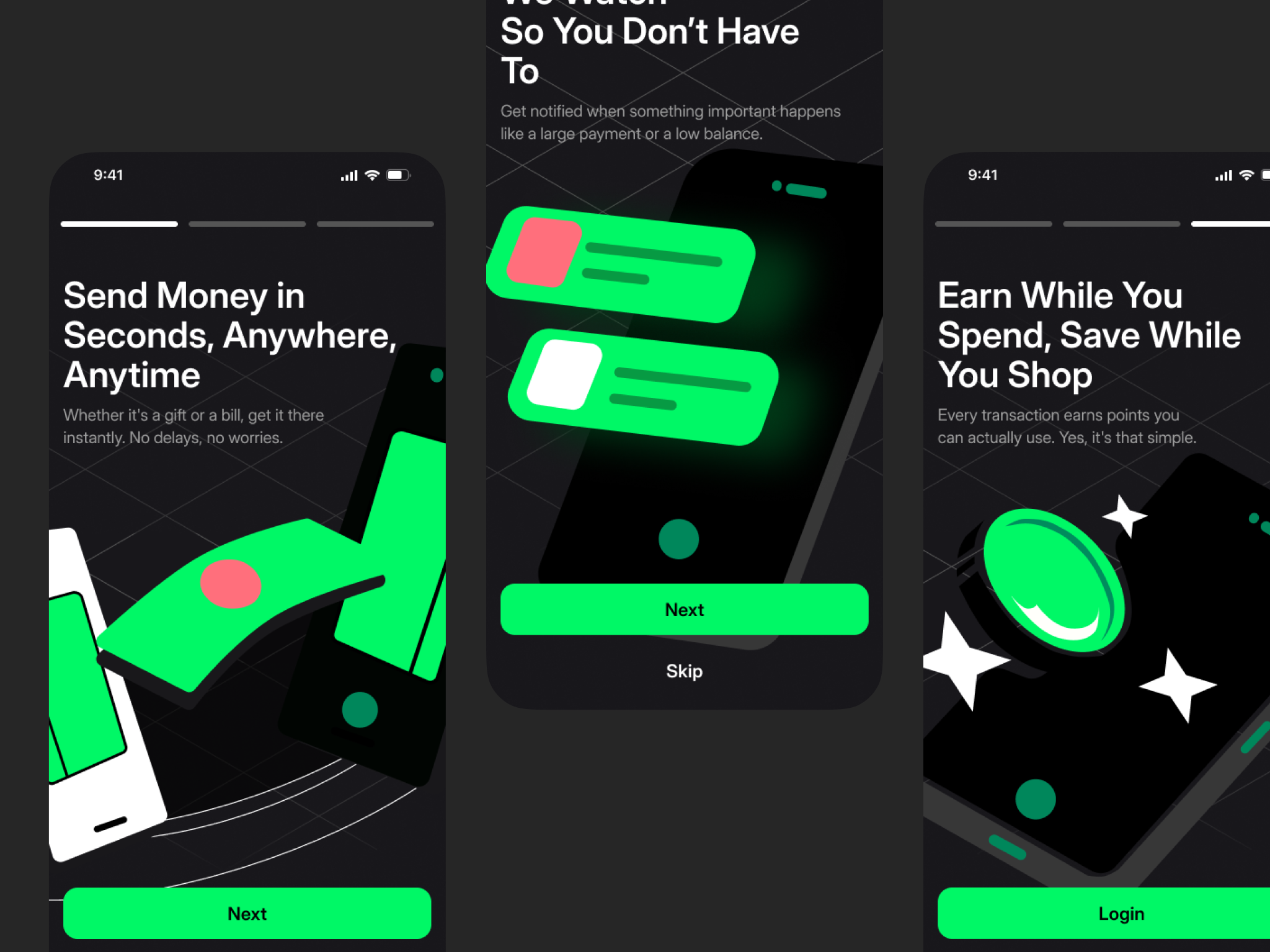
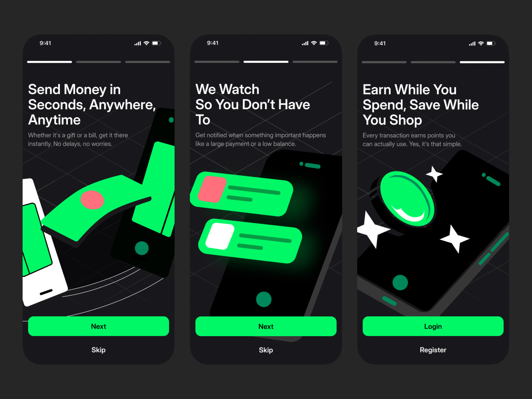
Financial Onboarding

This is exploration for implementation onboarding theory with
- Show the features
- Learn illustration
- and accessibility with the progress and skip button
Thank you for visiting this posting!
Tools used
From brief

Topics
Share
Reviews
3 reviews

Great job

I really like the illustrations, the progress bar, the text hierarchy. It all feels really energising and fun!
A couple of thoughts:
- I’d look at the green in the illustration. A darker shade could prevent it classing with the main CTA's.
- I reckon the main CTA on the final screen should be Sign Up instead of Login. Most people landing here will be new to the app, so they’re more likely to sign up than log in to an existing account. Once a user has an account they’ll probably use face ID or another quick method.
Love the overall vibe though!

Great onboarding, Adi!
The only thing I’d reconsider is the color of the illustrations. I’d suggest reserving the primary color for clickable actions since, right now, the illustrations draw quite a bit of attention away from the text and buttons. You could try making them a bit more subtle to help the main actions stand out more.
15 Claps
Average 3.8 by 4 people
You might also like

Project
Loginino

The primary goal of this login page was to create a clean, intuitive, and accessible user experience that minimizes friction and guides user

Project
Notification microcopy - Project

This project focuses on writing clear, concise push notification microcopy for a mobile e‑commerce app. The goal is to improve the user expe

Project
El Mandoub-GovTech App

Mandoob is a Qatar-based, subscription-driven GovTech app that simplifies government procedures for individuals and businesses.The platform

Project
MalishaEdu Counselor Workspace

Context MalishaEdu is a student consultancy management platform used by counselors and branch teams to manage leads, applications, documents

Project
Goal Creation Flow


Project
Portfolio website

For this update, the objective of the portfolio is to achieve a cleaner and more structured layout while remaining fully aligned with the br
Interaction Design Courses

Course
UX Design Foundations

Learn UX design fundamentals and principles that create better products. Build foundational knowledge in design concepts, visual fundamentals, and workflows.

Course
Introduction to Figma
Learn essential Figma tools like layers, styling, typography, and images. Master the basics to create clean, user-friendly designs

Course
Design Terminology

Learn UX terminology and key UX/UI terms that boost collaboration between designers, developers, and stakeholders for smoother, clearer communication.