Financial Dashboard

The goal of this project is to analyze the performance of the user's financial portfolio, but also to recommend how best to optimize it to maximize the risk-return ratio creating a dashboard.
Prototype
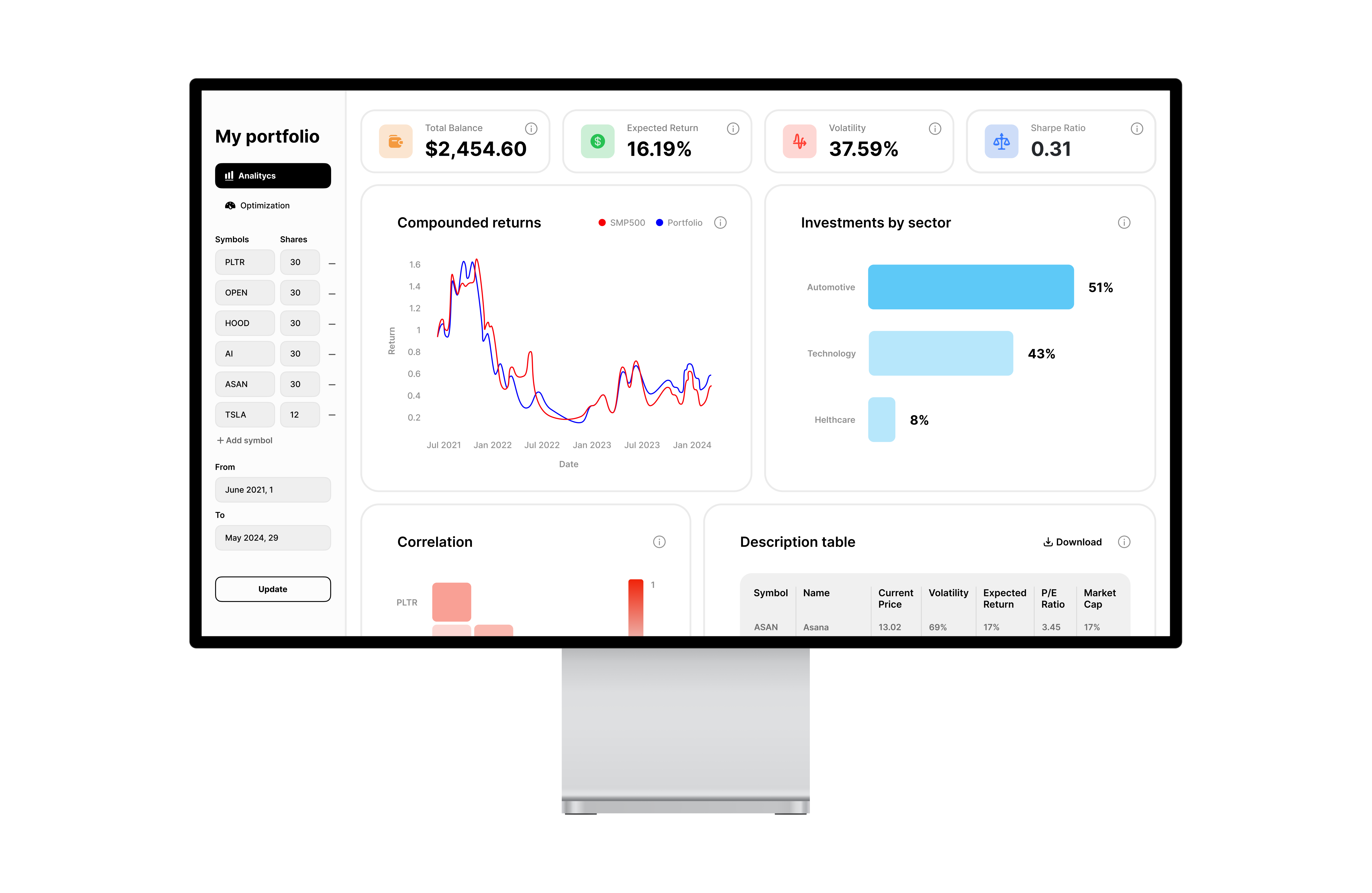
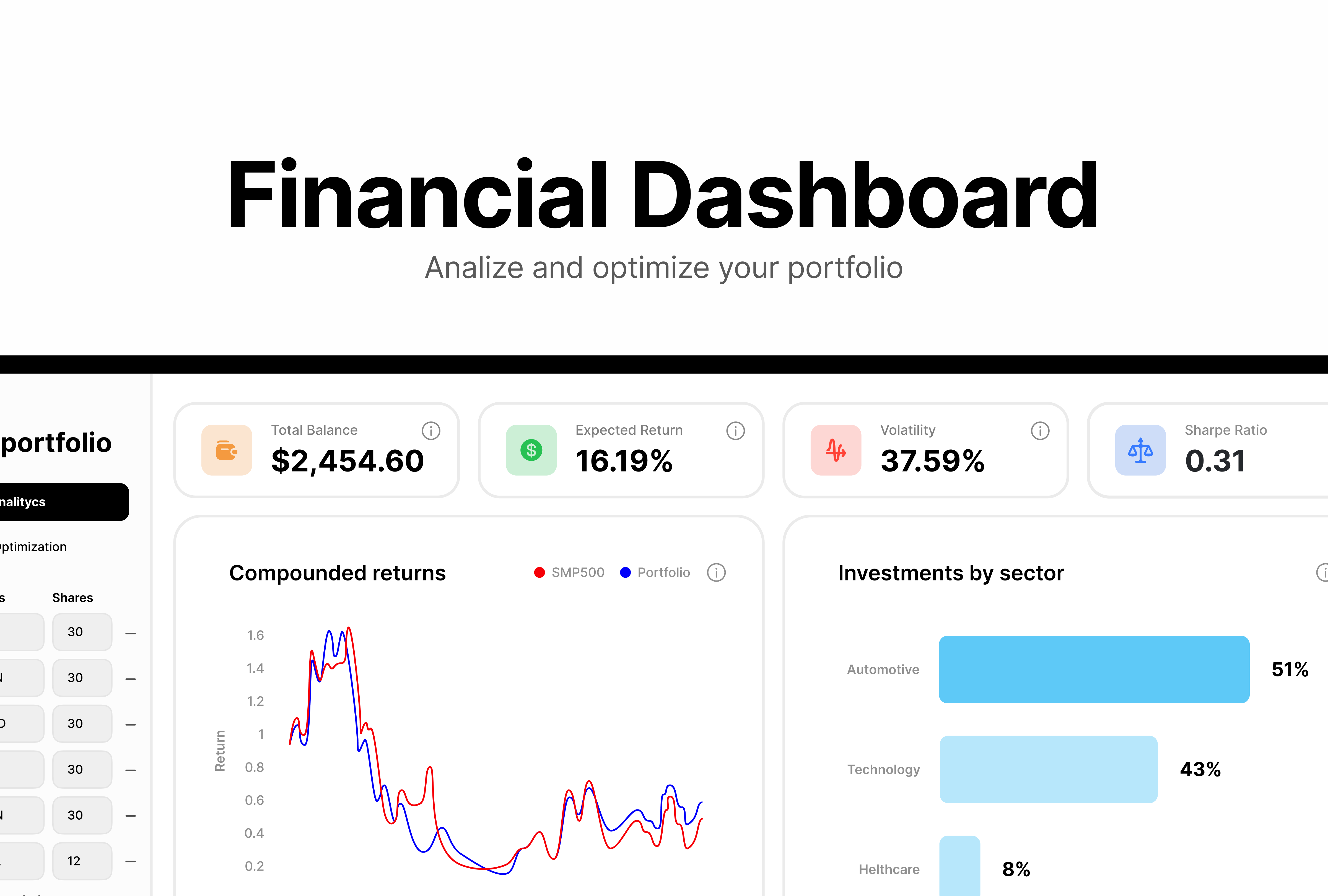
The prototype involves 2 parts. On the left, you can edit and update preferences such as portfolio symbols and shares, type of charts, and time interval to be analyzed. On the right, there are graphs and metrics that display the data of the entered portfolio.
Graphs
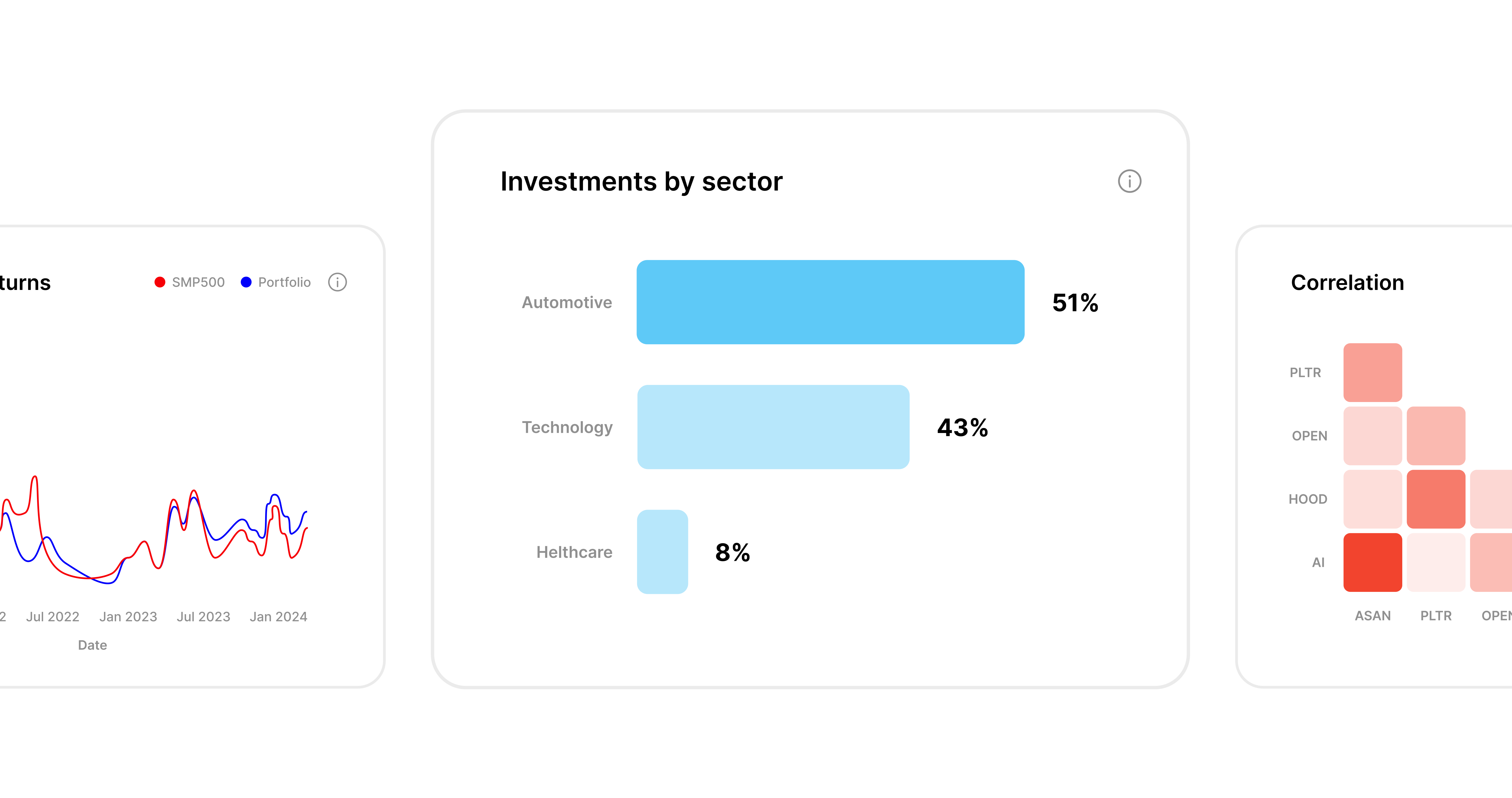
Each graph is designed to display information in the best way possible using data visualization concepts and colors.
Reviews
1 review

This is great! It's interesting to have the ability to add or remove stocks in the side nav. I am unsure how this may fit users' mental models, but it is a unique take on the space inside this dashboard.
You might also like

Pebble Accessible SAAS Signup Flow


QuickScan Onboarding


Nestra from homepage to checkout process


Islamic E-Learning Platfrom Dashboard


Pulse — Music Streaming App with Accessible Light & Dark Mode


Mobile Button System

Popular Courses

UX Design Foundations


Introduction to Figma

Design Terminology
