Filling in trip details

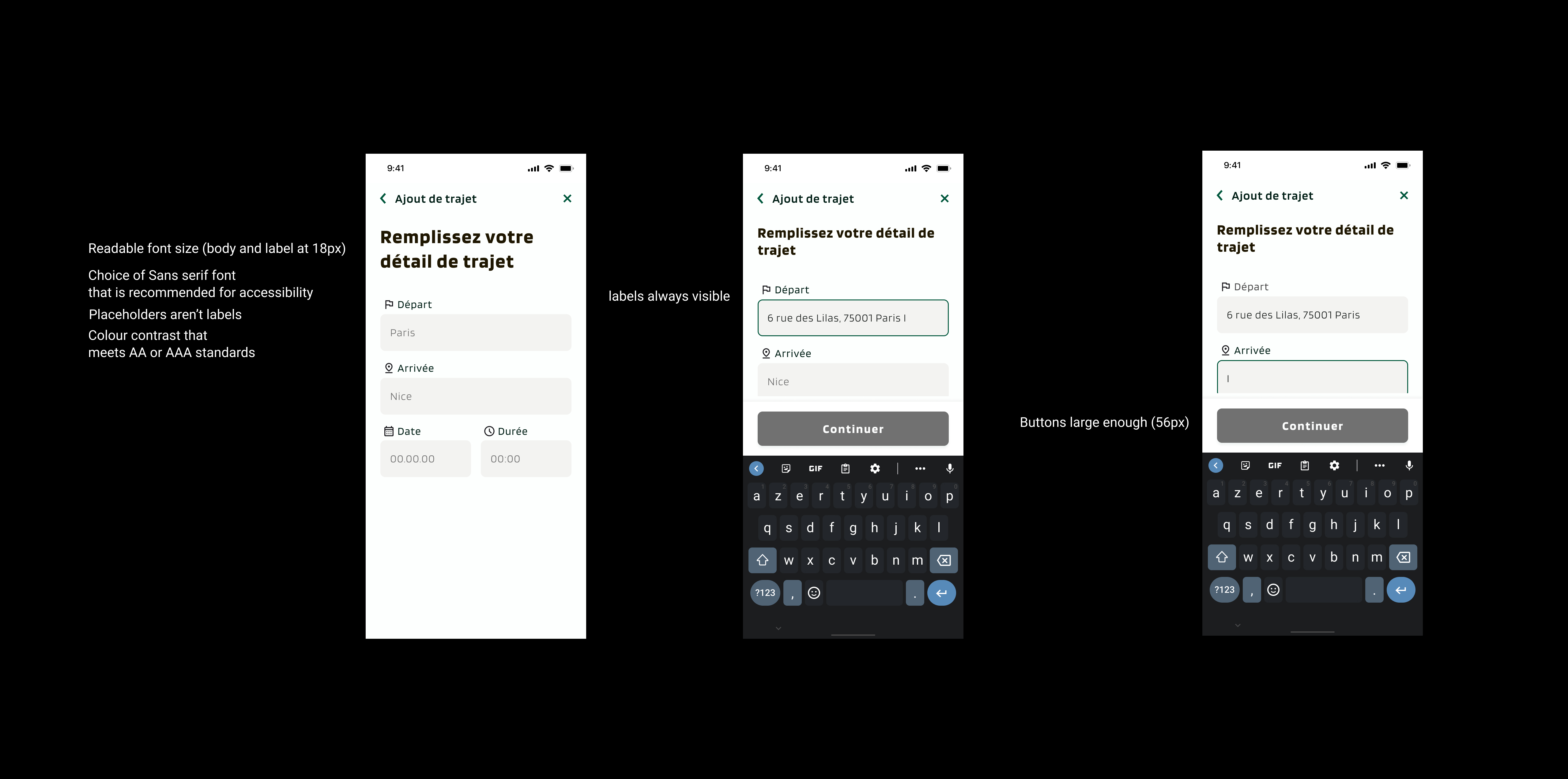
Readable font size (body and label at 18px)
Choice of Sans serif font (recommended for accessibility)
Placeholders aren’t labels
Colour contrast that meets AA or AAA standards
labels always visible
Buttons large enough (56px)
From brief

Share
Reviews
1 review
Good effort on the “Filling in Trip Details” flow! The layout and overall structure look clean and intuitive. A few things to improve:
- Some of the text, especially secondary/help text or placeholder text, appears light and may not meet contrast standards. Consider using a darker shade for better readability and for users with visual impairments.
- Check the interactive elements (buttons, links, error messages) for sufficient contrast and focus states, to ensure compliance with accessibility guidelines (e.g., WCAG).
- Ensure all form fields clearly indicate required vs optional, and error states are prominent.
- Consider adding more feedback for the user: e.g., when the form field is filled, show a check mark or change of state; when a step is complete maybe collapse or visually mark it.
- Error states: what happens if the user inputs invalid data? Are the error messages clear, are they inline, and do they offer instructions to fix?
- Button states: make sure hover, active, disabled, focus are all designed. Right now I see the normal state looks good but the other states aren’t clear.
Keep it up, just a few tweaks and it’ll be even stronger!
2 Claps
Average 2.0 by 1 person
You might also like
Project
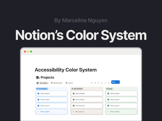
Notion - Accessibility Color System

This project focuses on redesigning Notion’s color system to balance aesthetics with accessibility. The initial evaluation showed that while
Project
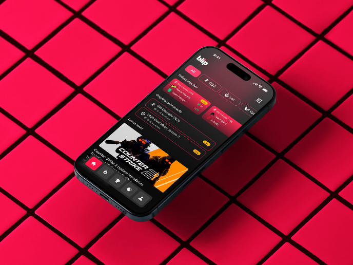
Blip - Esport app design (Light & Dark UI)

Bonjour, comrades! Today I present the case of Blip - an esports hub app for gamers where you can check esports news, learn about upcoming t
Project
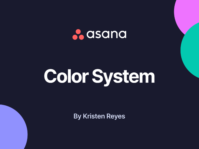
Reimagining Asana's Color System
I created a color system based on Asana's current project management tool. Accessibility and the emotions the colors evoke were the primary
Project
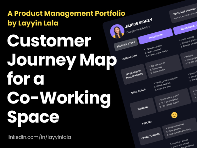
Customer Journey Map for a Co-Working Space
In this project, I made a Customer Journey Map (CJM) for a co-working space. The goal of this project is to understand how customers feel an
Project
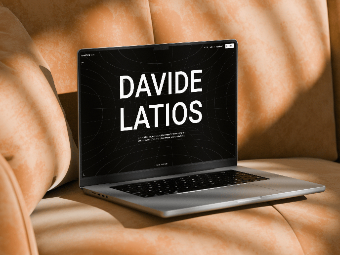
Latios - Free Portfolio Template for UX/UI Designers

Overview I built Latios because I kept seeing the same problem: designers with solid experience getting stuck trying to launch their portfol
Project
Responsive Main Screen

Visual Design Courses

Course
UX Design Foundations

Learn the essentials of UX design to build a strong foundation in core principles. Gain practical skills to support product development and create better user experiences.

Course
Introduction to Figma
Learn essential Figma tools like layers, styling, typography, and images. Master the basics to create clean, user-friendly designs

Course
Design Terminology

Learn UX terminology and key UX/UI terms that boost collaboration between designers, developers, and stakeholders for smoother, clearer communication.