Fashion Landing Page


From brief

Topics
Share
Reviews
2 reviews

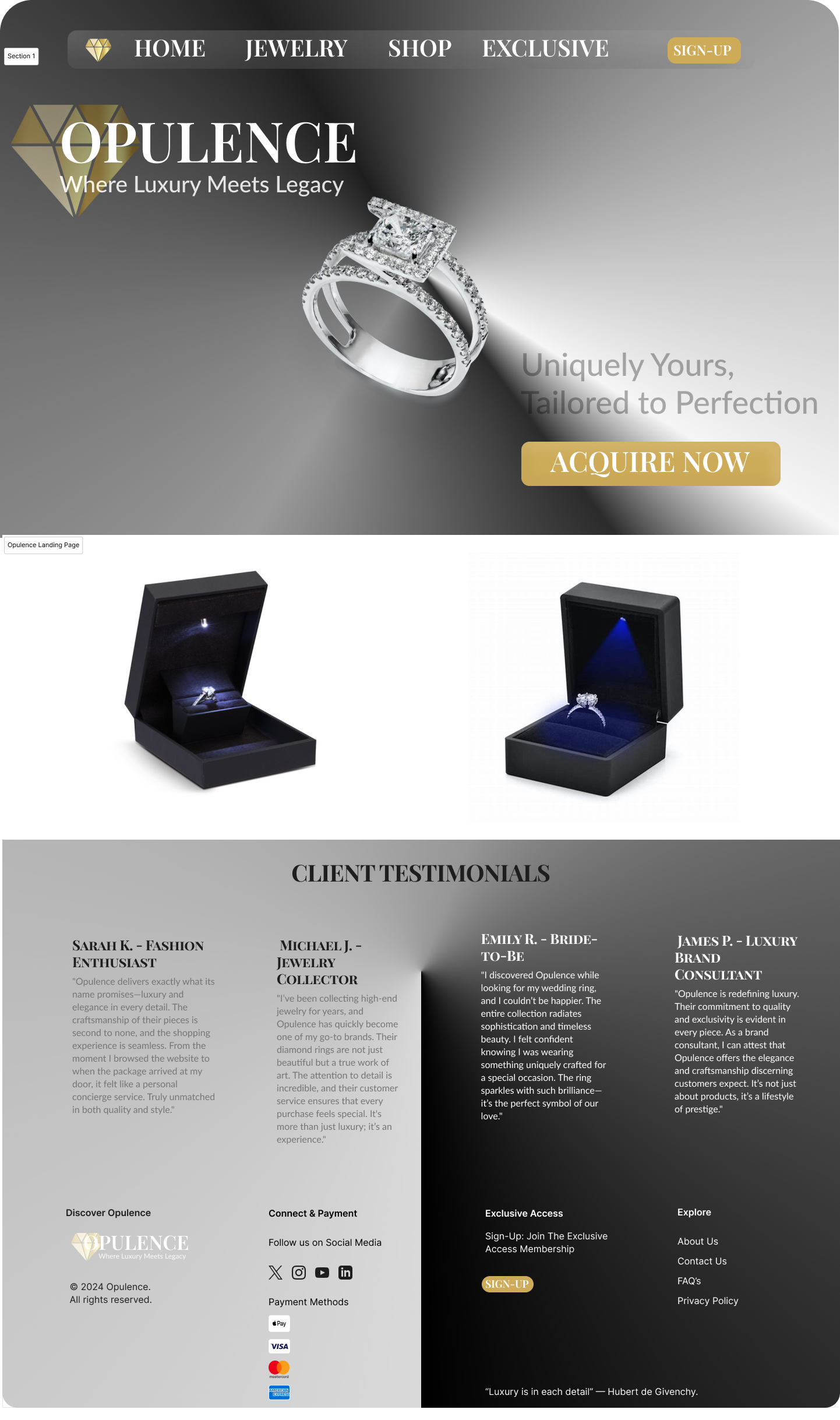
I like the rationale of wanting to convey luxury to the customer and keeping the colour palette subtle with strong colours. The rings in their boxes also show the product as a high-end expensive product and lets the customer know what to expect from this brand. With that in mind, there are some changes I would make to the UI. The navigation bar on top is quite bulky in comparison to other websites. There are also some spaces issues where the spacing is not consistent throughout. It would also be a good idea to add some text or a price next to the rings for the client to understand what they are buying and how much they would pay - just to manage their expectations. I can see you've done a good job in considering the layout and being careful to craft the image of luxury, but a little more practice on the UI side of things can make this a more viable landing page.

I can see the direction your taking your ideas but here are some ideas for improvement.
- Colour palette - Explore existing colour palettes and choose one which is more user friendly. There are also tools which can help with colour contrast.
- Contrast - the grey body text conflicts too much with the background and would not pass colour contrast tests.
- Font choice. Perhaps do some research into font pairings and think about legibility especially for the navigation text.
However a good start and good luck with the development of your design!
You might also like

Accessible Signup Form


Entrant - Analytical Dashboard


Transit Cairo — Digital Mobility Redefined


Babylon Balance - Designing Financial Clarity Through Constraint


Entrant Accessible Signup and Login Forms

CJM x Mindspace case study - Ester Cinelli

Content Strategy Courses

UX Writing


Common Design Patterns


Building Content Design Systems
