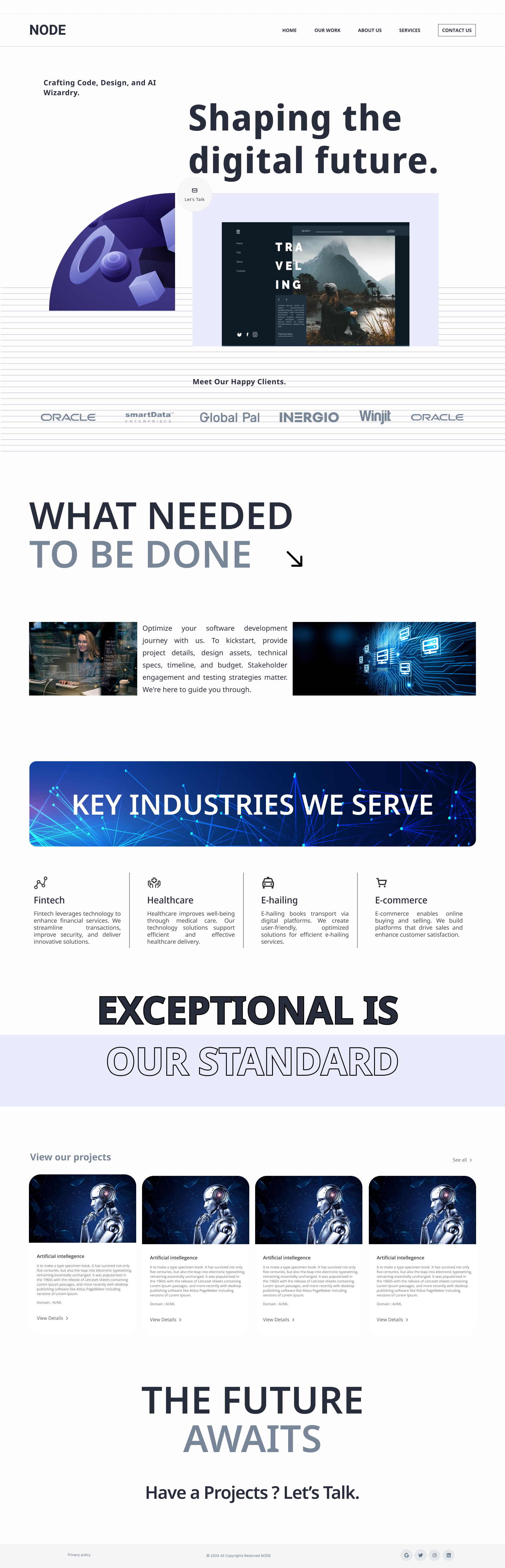
Experimental UI Design: Clean and Modern Landing Page for NODE

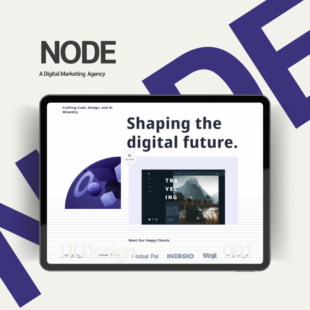
This landing page for NODE was designed as an experimental UI project to explore clean, modern, and visually appealing interfaces. The goal was to focus purely on user interface design, avoiding complex UX workflows. The hero section features bold typography, futuristic visuals, and a clear “Let’s Talk” button to draw attention. Trusted client logos were added to build credibility.
The “What Needed to Be Done” and “Key Industries We Serve” sections were designed with a simple layout, using short descriptions and icons for a clean, organized look. Project cards with visuals, short text, and “View Details” buttons were added to showcase work effectively.
The design uses a minimal color palette of blue, gray, and white, paired with clean fonts and enough white space for balance. Futuristic visuals match NODE’s tech theme, and the responsive design ensures usability on all devices. This project purely explores UI design to improve visual clarity and presentation.
Reviews
1 review

Firstly, thanks for submitting the designs. I will provide feedbacks based on UX and UI
Certainly! Here's the rewritten feedback with reasons included for each suggestion:
UX Feedback:
CTA in Header and Navbar:
- A fundamental principle of landing page design is to include a call-to-action (CTA) in the header. This ensures that the primary action you want users to take is immediately visible and accessible. Additionally, reflecting the CTA in the navbar keeps it persistent, allowing users to act at any point during their journey.
Element Placement (Left vs. Right):
- Users' eye movement generally starts from the left and scans towards the right. To align with this natural behavior, the element currently on the left should be moved to the right, while the message is placed on the left. This arrangement makes the content easier to consume and more effective in guiding attention.
"Let’s Talk" Button:
- The "Let’s Talk" button is styled more like a floating action button (FAB), which can be misleading as FABs are typically associated with secondary or auxiliary actions. It should be redesigned to look and function like a proper button for clarity and better usability.
Logo Links:
- Placing links behind the logo creates visual clutter and makes the logo harder to perceive. This can confuse users and detract from the overall branding impact. Removing these links or repositioning them elsewhere would resolve this issue.
UI Feedback:
Buttons on the Landing Page:
- Including buttons on the landing page is essential to guide users toward key actions. Buttons provide clear affordances and help improve the page’s interactivity and conversion potential.
Footer Contrast and Size:
- The footer's color contrast is too low, making it difficult to read, especially for users with visual impairments. Additionally, its size is too small, reducing its visibility and accessibility. Increasing the contrast and slightly enlarging the footer would enhance readability and usability.
"Contact Us" Section:
- Adding a "Contact Us" section ensures that users can easily reach out after reviewing the content. This helps establish trust and provides a direct path for potential engagement or inquiries.
There are more to improve, you can reach out to me anytime if required.
Keep practicing. All the best :)
You might also like
Accessible Signup Form

Auction

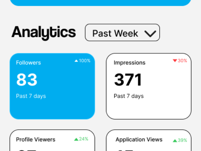
Entrant - Analytical Dashboard

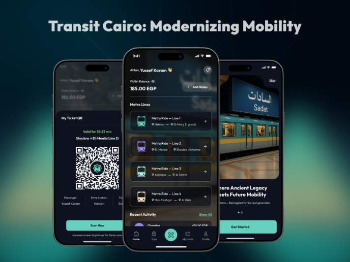
Transit Cairo — Digital Mobility Redefined

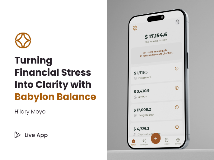
Babylon Balance - Designing Financial Clarity Through Constraint

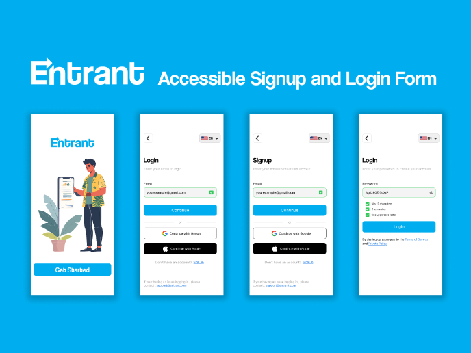
Entrant Accessible Signup and Login Forms
Popular Courses

UX Design Foundations


Introduction to Figma

Design Terminology
