Expensya Accessible signup form

How I Approached the Redesign — Simple Explanation
When I started reviewing the signup process, my main goal was to make the form easy, clear, and comfortable for everyone to use — including people with disabilities.
To do that, I looked at every step of the signup flow and asked myself:
- “Is this step clear?”
- “Is this easy to understand?”
- “Does anything feel unnecessary?”
- “Could someone get confused here?”
- “Would this be hard to use for someone with low vision, cognitive difficulty, or someone using a keyboard only?”
Based on these questions, here is the logic behind each improvement I made.
1. Cookie Popup: Make the Flow Smooth
I noticed the cookie notice only appears after the user clicks “Sign Up.”
This breaks the natural flow.
My logic:
If something interrupts the user while they’re trying to sign up, it adds stress.
It should appear earlier so the user can focus on the signup form when they're ready.
2. Email Field: Stop Showing Errors Too Early
When I typed an email, deleted it, and the field instantly showed an error, it didn’t feel right.
My logic:
Users shouldn’t see an error when they didn’t do anything wrong.
An empty field is not a mistake.
Show the error only when the user actually tries to continue or when they type something clearly incorrect.
This makes the form calmer and less stressful.
3. Focus States: Make Inputs Easier to See
The focus color didn’t match the input border, which made it harder to see when the field was selected.
My logic:
Some people navigate forms using only the keyboard.
If the focus highlight isn’t clear, they don’t know where they are on the page.
So I fixed the contrast and made the focus state clearly visible and consistent.
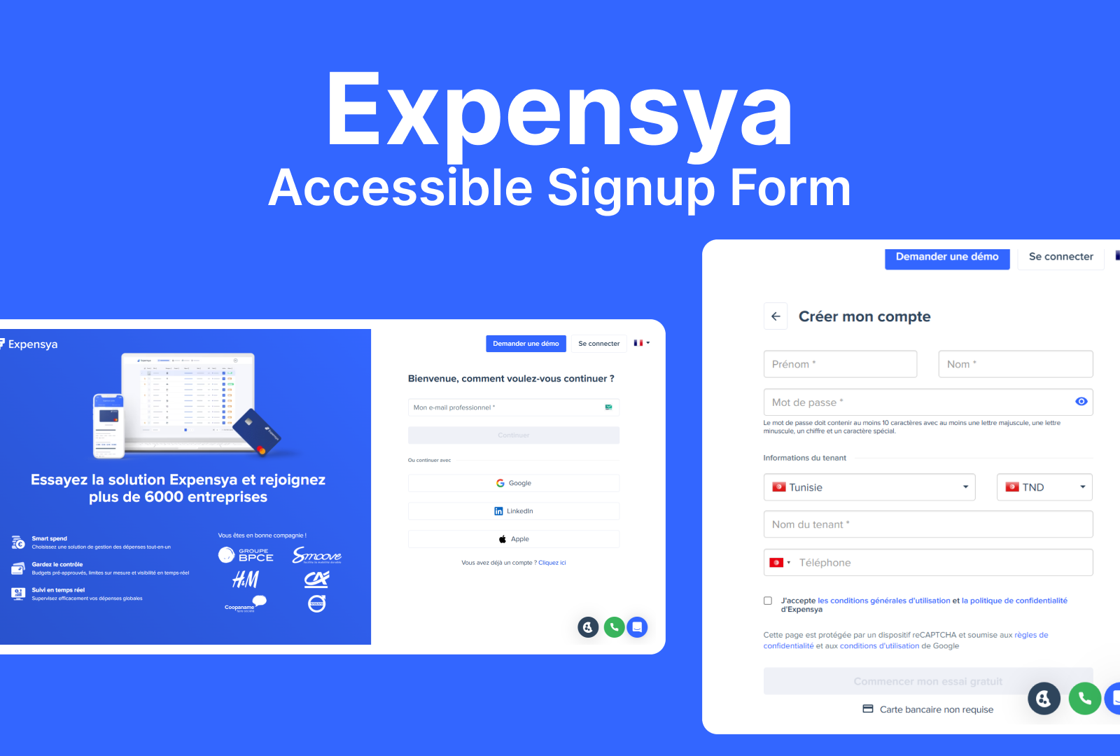
4. Too Many Fields: Reduce Unnecessary Work
The form asked for first name and last name separately, and honestly, this felt like extra work.
My logic:
If the system doesn’t truly need both fields separately, they can be combined.
Fewer fields = faster, easier, and less tiring for users.
5. Password Field: Make Rules Clear & Fix the Eye Icon
The password instructions were not clear. It said “small character,” but that can mean many things.
Also, the eye icon that shows/hides the password worked in the opposite way than expected.
My logic:
People rely on familiar patterns.
When the icon behaves differently, the experience becomes confusing.
And unclear instructions make it harder to create a password correctly.
So I made the rules crystal clear and aligned the eye icon with standard behavior.
6. Country + Currency: Combine What Belongs Together
Country and currency were in two separate fields even though they depend on each other.
My logic:
If currency is based on country, don’t make the user choose twice.
This reduces confusion and speeds up the process.
7. “Tenant Name”: Replace Confusing Words
The label “Tenant Name” felt unclear. Most users won’t understand what this means.
My logic:
Labels must be instantly understood.
If users hesitate, the label is not doing its job.
I suggested replacing it with a clearer term like “Company Name.”
8. Phone Number: Add a Format Example
The phone field gave no example of how to write the number.
My logic:
People need to know the expected format — especially if the form requires country code.
Examples reduce errors and save time.
Overall Logic Behind My Design Decisions
Across the whole redesign, I followed three simple principles:
1. Make it predictable
Users should always know what’s going to happen next.
No surprises. No sudden errors. No unexpected popups.
2. Make it understandable
Clear labels, simple instructions, helpful hints.
If something feels confusing, it needs improvement.
3. Make it easy
Less typing, fewer steps, better visibility, and smoother flow.
The form should feel light and effortless.

Reviews
2 reviews

I can see you approached this task very consciously and systematically. It shows in the way you think about user problems. Your logic behind individual decisions makes sense, especially regarding validation (errors on empty fields are really irritating) and combining fields that are related to each other.
However, I have some friction with the screens themselves. I'm definitely missing way more screens from the project. The second screen shows "Input Different Status", but without context it's hard to assess whether these states (Default, Hoover, Active) are properly designed. I'm missing a "before/after" view of the entire form. I'd like to see how the redesigned form looks with all your improvements applied together.
As for the described thinking. Great that you remembered about accessibility and keyboard navigation. This is often an overlooked aspect. The only question: were all these changes actually implemented in the design you presented?
Overall, the direction of thinking is very good. You can see you have a holistic approach to UX and don't focus only on aesthetics. I would advise though to show projects in full context. It's easier to evaluate the final result of your work that way. ✌️😊

Great work, Mohamed, congratulations on the project.
Here are a few small adjustments to consider:
The first point is the gray card containing the informational text. The lateral padding is quite large, which affects the visual hierarchy. Reducing this padding can help balance the layout and make the content feel more structured.
Some placeholders repeat the same text several times, such as “Company Name.” Using the exact same label repeatedly can create a sense of redundancy for the user. You can mitigate this by using synonyms or, even better, by adding example content in the placeholders, as you did in other input fields.
Also, “phone number” appears in lowercase, which breaks the visual consistency of the screen, since all the other titles start with uppercase letters.
Overall, the project looks really good, great job!
You might also like

Smartwatch Design for Messenger App


Bridge: UI/UX Rebrand of a Blockchain SCM Product


Pulse Music App - Light/Dark Mode


Monetization Strategy


Designing A Better Co-Working Experience Through CJM


Design a Settings Page for Mobile
Visual Design Courses

UX Design Foundations


Introduction to Figma

Design Terminology
