Empty state design of an online learning app

Empowering Learning Through Thoughtful Design
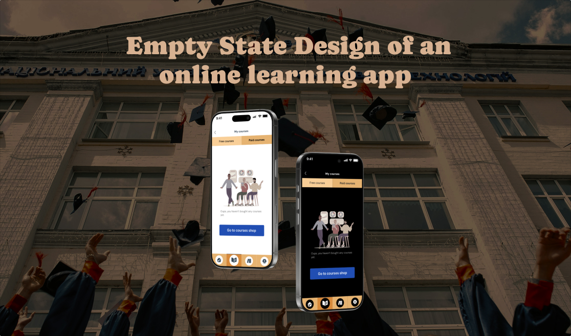
The online learning app is a meticulously designed platform with branding and aesthetics rooted in thoughtful symbolism and user-centric principles of UI design. The color palette—orange-yellow, yellow, and blue—was chosen with deliberate intent. Orange-yellow and yellow evoke the iconic school bus, universally associated with education, learning, and the journey of discovery. These colors inspire familiarity, optimism, and energy, creating an environment that encourages engagement. Blue complements this palette by introducing a calming effect, promoting focus and clarity, crucial for an educational setting. Together, these colors harmonize to create an interface that is both visually appealing and purpose-driven.
To further enhance the app's design, high-quality illustrations sourced from the Blush plugin were integrated. These illustrations bring warmth and personality to the interface, fostering a friendly and approachable atmosphere.
I also created a dark mode interface to ensure the usability in low-light settings, reducing eye strain and maintaining a sleek look.
Creating a Friendly User Experience with Thoughtful UI Language
The app’s UI is crafted to feel approachable and empathetic. Phrases like “Oops” and “Sorry” are intentionally used to turn empty states or errors into moments of reassurance. This conversational language softens potential frustration, making interactions feel more personal and supportive. By focusing on user comfort and understanding, the app ensures a smooth and friendly experience, perfectly aligned with its educational purpose.

Reviews
1 review

Nice project description to take us through your thought process for the color choices, and I like that you've added a dark mode as well. I would recommend slightly bigger fonts for the copt you've added as this may be too small for mobile. The empty state on the "Paid Courses" is actually a great marketing opportunity so instead of "Oops you haven't bought any courses" - you could use this space to entice the use to shop. Something such as
- Heading: "You have no paid courses yet."
- Paragraph: "Improve your knowledge today and buy a course."
- Button: Buy a course now and get 5% off
You can work the copy to show the user why buying a course is good for them.
You might also like

Pulse — Music Streaming App with Accessible Light & Dark Mode


Islamic E-Learning Platfrom Dashboard

SiteScope - Progress Tracking App


FlexPay


Mobile Button System


CJM for Co-Working Space - WeWork

Content Strategy Courses

UX Writing


Common UX/UI Design Patterns & Flows


Building Content Design Systems
