Empty State Design for Education App - Udemy

There are two scenarios for using the "My learning → All courses" page.
In the first scenario, a user who has not taken any courses may redirect here and may not know where to start.
In the second scenario, the user may already have experience with the platform, and completed courses may be stored in a separate "Archived" tab.
These two types of users are entirely different, and their scenarios should be handled differently as they require solving different tasks.
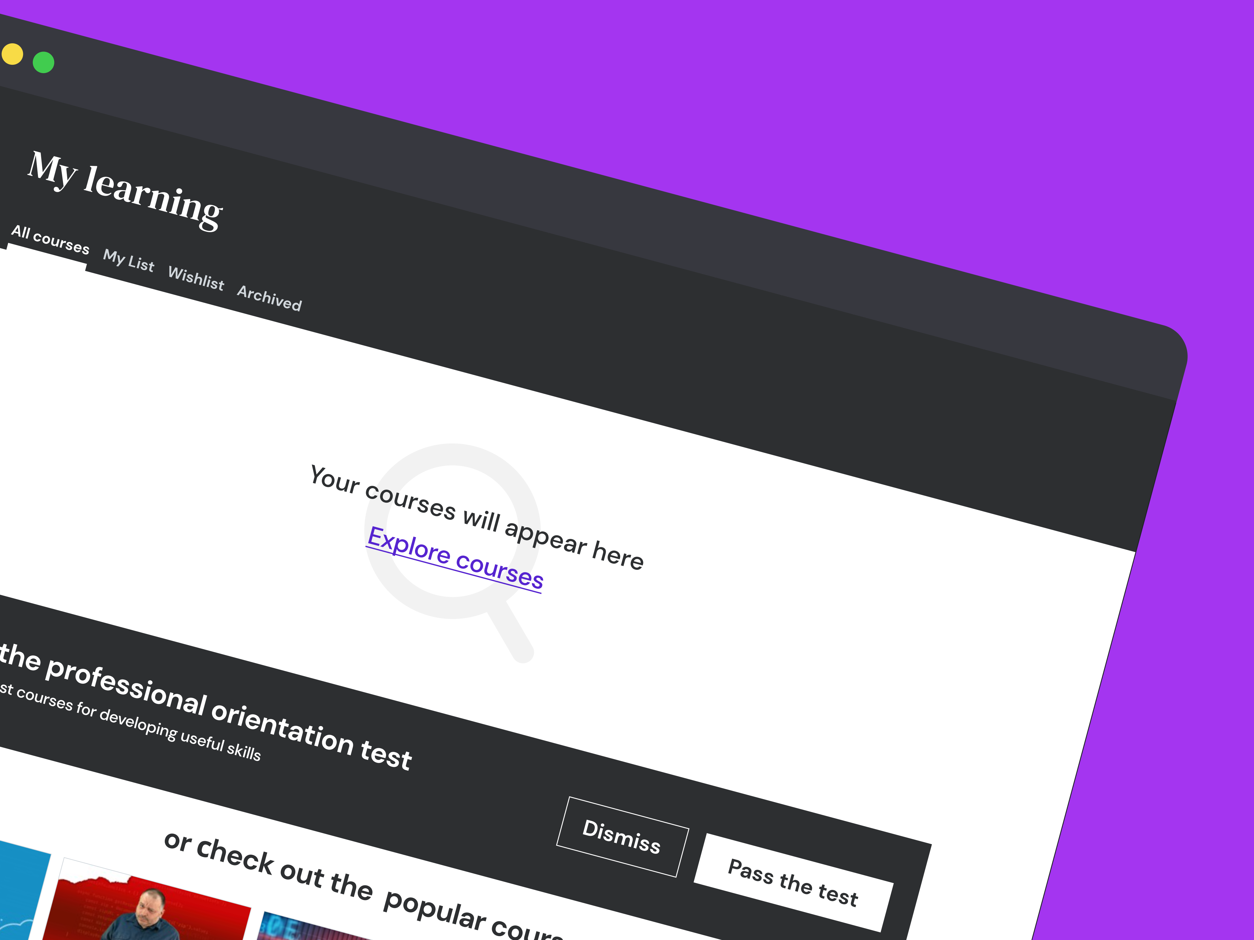
Let's consider the first scenario, where the user has no experience and no courses started, and the user needs assistance with selection and a starting point.
We can offer popular categories or courses, but the best solution would be to understand the user's needs and preferences. This can be achieved through a simple test.
Therefore, for users who do not have any archived courses, I would propose the following solution.

Reviews
3 reviews
The concept behind the empty state page for active courses is excellent! However, there are a couple of areas that could use some improvement:
• The message is a bit lengthy and could be simplified for better clarity. Consider something like: "Your courses will appear here."
• 'Browse Now' is a good button label, but it could be even clearer and more engaging with a slight tweak: 'Explore Courses'."
Overall, you're thinking in the right direction - keep it up!

Your project introduces a promising concept aimed at enriching user experience through interactive design. Guiding users through a test to suggest appropriate courses has immense potential for engagement, particularly when tailored to individual user needs.
However, some areas require improvement, notably in UX writing. The phrase "Pass the Professional Test" might inadvertently evoke negative emotions, potentially undermining motivation. I would recommend exploring alternative copy for a more positive user experience.
Consider improving the wireframe visibility in your presentation. Adding a light border against the white background would offer better definition and clarity to the wireframes.
Explore the Psychology of UX Writing lesson to gain valuable insights into communication patterns. With dedication and attention to detail, you're on the right path to creating a captivating user experience. Keep up the excellent work!

Hi Dmytro, excellent concept for Udemy’s empty states! 🎯 Guiding new users through a simple test to personalize course suggestions is very engaging. One suggestion: simplify the messaging for clarity (e.g., "Your courses will appear here") and tweak CTA labels to be more inviting (e.g., "Explore Courses"). Overall, thoughtful and user-centered work—well done! ✅
You might also like

Pulse — Music Streaming App with Accessible Light & Dark Mode


Islamic E-Learning Platfrom Dashboard

SiteScope - Progress Tracking App


Mobile Button System


FlexPay


CJM for Co-Working Space - WeWork

Content Strategy Courses

UX Writing


Common UX/UI Design Patterns & Flows


Building Content Design Systems
