Empty Space / Course collection
This is 1 of the first empty spaces I am currently working on. In my design process I went with the color orange because it associates with Engineering. To keep user’s engaged, I added playful titles to the lessons and used a 16px for the typography. For the cards and buttons I focused on consistency by making sure the radius is the same size throughout the whole layout to make it feel reliable.
To ease the tension form an error 404 pop up; I added a playful twist on wordplay and have the options for “help” to make recovering less stressful. I added the Home page CTA to so that user’s can move on from this page by going “Home” or allowing them to contact a support team if problems persist. The CTA button also has the same radius as the other buttons in the previous page to stay consistent with the layout design so that user’s can feel comfortable enough to rely on this website.
Reviews
2 reviews
Hi Krishael 👋 I like the consistency you kept with button radius and the playful tone — it adds friendliness to the empty states. One suggestion would be to refine contrast for better readability and maybe simplify typography to strengthen cohesion. Adding a clear CTA/subtitle could also guide users more smoothly. Great start, keep it up!
Hey Krishael, first off, great job completing the design brief!
I really appreciate the effort you’ve put into selecting a base color—it sets a nice tone for the design. However, I’d recommend double-checking the contrast between the orange background and white text, as it might be challenging to read in certain areas. Ensuring strong contrast will improve accessibility and readability.
Regarding the typefaces, consider reducing the variety used to create a more cohesive and unified look and feel across the design. Simplifying the typography can help establish a stronger visual identity.
Lastly, for the first empty state, it might be helpful to include a subtitle or a call-to-action to guide users on their next steps. This small addition could make the interface more intuitive and engaging.
Great work overall—I’m excited to see how these refinements can take your design even further!
You might also like
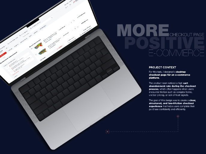
🖥 Desktop Checkout Flow Design
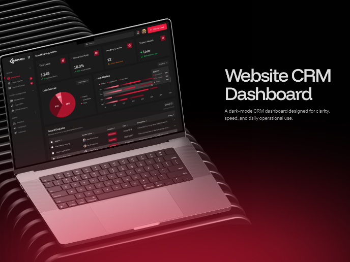
Website CRM Dashboard
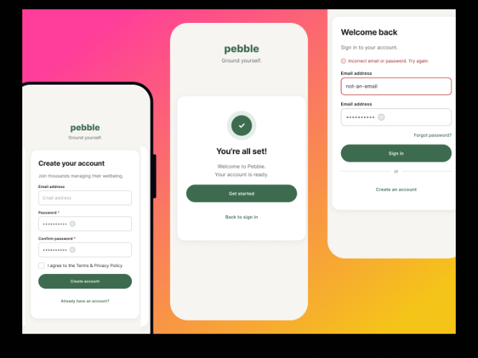
Pebble Accessible SAAS Signup Flow
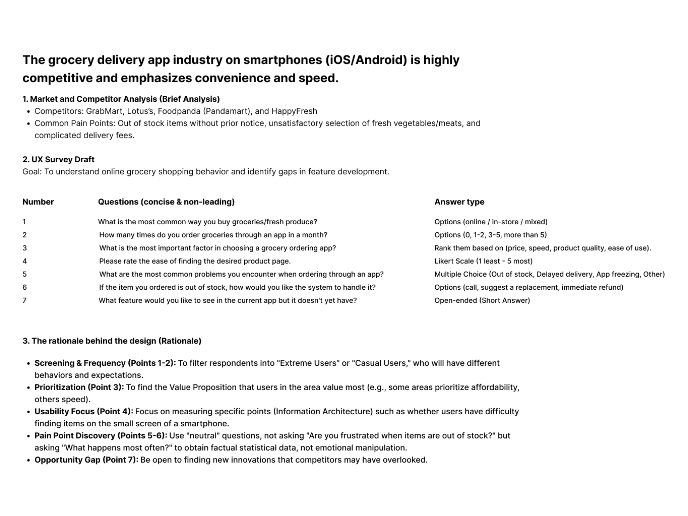
Create a UX Research Survey
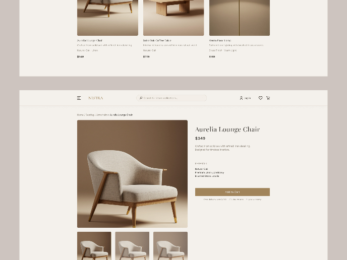
Nestra from homepage to checkout process

QuickScan Onboarding
Content Strategy Courses

UX Writing

Common UX/UI Design Patterns & Flows

