Ekobase - Landing Page

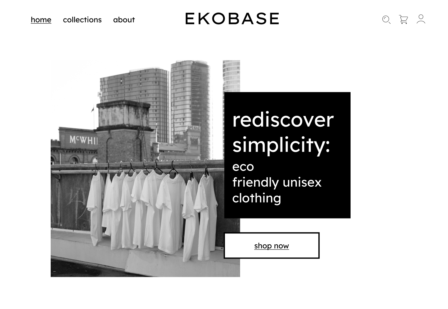
Designed a minimalistic landing page for an eco friendly unisex fashion brand.
Updated my website according to the feedback that I received.

Reviews
2 reviews

Nice concept Marek! Love the eco take on a fashion landing page. Some points that could help improve your design I've found:
- Wordmark feels too large for the header navigation creating a cluttered appearance. Consider decreasing wordmark size and aligning to the left of the container, allowing appropriate padding. This would assist with spacing out menu navigation items.
- Header navigation feels off balance due to the inconsistent gutters between edges and elements. Consider matching them to something like 72px.
- Lack of visual hierarchy in the headline copy. Consider utilising different text sizing between sub-headlines and main headlines to enable greater scannability. Also avoid "Orphan words" on one line unless for special effect.
- Call-to-action microcopy could be confusing due to use of "Return". Recommend using clear unambiguous language to describe the next action i.e "Shop Basics Now"
- Good consistent use of colours and palette to create a congruent feel and communicate a simplistic style.
- As it's an eco product, I would think about including a specific section highlighting some green/eco credentials that the customer would care about. These could be icons with copy or just tell a story on the process that makes it unique.
Hope these help! Keep it up.

Your design shows great taste and an artistic eye. However, there are areas for improvement: the visual hierarchy in the navigation bar needs revisiting. Consider centering the page titles to enhance clarity. Using outline icons could better complement the minimal style you're aiming for. Additionally, the left half of the screen appears more crowded than the right, which affects the overall balance of the design.
Hello Abdelrahman, I have changed the design according to your feedback. Thank you very much for the tips!
9 Claps
Average 3.0 by 3 people
You might also like

Project
Pulse — Music Streaming App with Accessible Light & Dark Mode

Platform & DeviceFor this project, I designed Pulse, a mobile music streaming application for iOS devices (using the provided mobile templat

Project
Islamic E-Learning Platfrom Dashboard

Visual Language & Color I wanted the interface to feel like a quiet room you'd actually want to sit in and study. The warm neutrals - off-wh
Project
SiteScope - Progress Tracking App

🧩 Project OverviewThis project showcases the design of a mobile login and sign up experience for a construction progress tracking app. The

Project
Mobile Button System

As my first ever ux design attempt, I tried to go with a simplified approach with only a few button types and states. I kept the color palle

Project
FlexPay

The onboarding was designed to reduce financial anxiety, create a sense of instant reward, and encourage early action. Instead of overwhelmi

Project
CJM for Co-Working Space - WeWork

This project presents a customer journey map for WeWork, created to understand the end-to-end experience of a remote professional using a co
Content Strategy Courses

Course
UX Writing

Learn to write microcopy that communicates clearly and concisely to improve user experience, build trust, and boost conversions across digital products.

Course
Common UX/UI Design Patterns & Flows

Learn how to use tried and tested UX/UI design patterns and flows to solve recurring design problems faster and build interfaces that feel intuitive

Course
Building Content Design Systems

Master systematic approaches to creating consistent, reusable content across your entire product ecosystem