Education App - Design


Designing an Education App: A UX/UI Perspective
Designing an education app requires a deep understanding of user needs, accessibility, and engagement to create a seamless learning experience. As a designer, the goal is to ensure an intuitive, interactive, and visually appealing platform that enhances learning outcomes.
1. User Research & Understanding the Audience
- Identify primary users: Students, Teachers, and Parents.
- Understand their pain points: Navigation ease, progress tracking, and interactive learning.
- Define key use cases: Course enrollment, study material access, assessments, performance tracking, and teacher-student interaction.
2. Information Architecture & Navigation
- Create a clear, structured layout with easy access to courses, study materials, and progress reports.
- Design an intuitive dashboard that provides quick insights on learning progress.
- Implement role-based navigation to tailor experiences for students, teachers, and parents.
3. UI/UX Design Considerations
- Minimalistic and Clean UI: Ensure a clutter-free experience using light backgrounds, readable fonts, and well-defined typography.
- Color Psychology: Use engaging yet soft colors to maintain focus and reduce eye strain.
- Interactive Elements: Include buttons, cards, and hover effects for an engaging UI.
4. Key Features & Functionality
✅ Course Management: Easy access to structured lessons, video lectures, and downloadable resources.
✅ Assessments & Quizzes: Interactive quizzes with instant feedback for student engagement.
✅ Progress Tracking: AI-powered analytics to track student performance & suggest improvements.
✅ Live Classes & Recorded Sessions: Seamless integration of video content for flexible learning.
✅ Gamification: Leaderboards, rewards, and badges to motivate students.
✅ Push Notifications & Reminders: Alerts for assignments, exams, and new content updates.
5. Accessibility & Responsiveness
- Mobile-first approach for learning on the go.
- Support for multiple languages to cater to diverse users.
- Dark mode for comfortable reading in different environments.
- Offline access for study materials in low-internet areas.
6. Prototyping & Testing
- Create wireframes and interactive prototypes to visualize user journeys.
- Conduct usability testing with students and teachers to refine the experience.
- Iterate based on feedback and analytics.
Reviews
1 review

Hey Manish! I've taken a look at your education app design and have some thoughts to share about making it even better:
Navigation & Layout:
- The sidebar menu uses nice, clear icons but could benefit from slightly larger touch targets for better usability
- Consider making the Quick Links grid 2x2 instead of 3x2 to allow for larger, more tappable cards
- Love the consistent use of icons throughout - helps with visual recognition
Profile Section:
- The last login timestamp could be moved to a less prominent spot since it's not critical info
- The contact details in the profile card are well-organized but could use a bit more breathing room
- Think about adding a quick action button near the profile for common tasks
Visual Design:
- The color scheme works well but the purple accents could be a touch brighter for better contrast
- Nice use of cards to separate content areas
- The logout confirmation modal is clean but the buttons could be more distinct from each other
Small Improvements:
- Add a search function in the header for quick access to features
- Consider grouping related Quick Links together (e.g., Reports with Performance)
- The "Teacher" badge could be integrated more smoothly into the header
Overall, it's a solid foundation! The interface is clean and straightforward, though a few tweaks could make it even more user-friendly. Let me know if you'd like me to elaborate on any of these points.
You might also like
Scottagram


Pebble Accessible SAAS Signup Flow


Create a UX Research Survey

QuickScan Onboarding


Nestra from homepage to checkout process

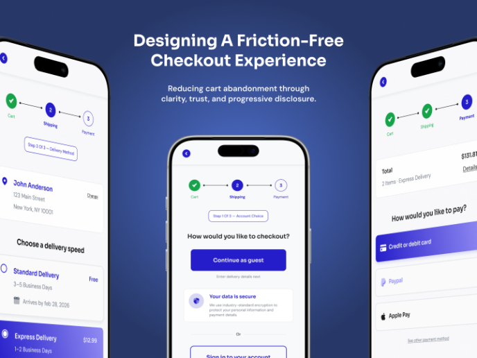
Mobile E-commerce Checkout Redesign — Reducing Cart Abandonment Through UX

Popular Courses

Introduction to Figma


Design Terminology


Apple Human Interface Guidelines