DONE - Digital Work Management Tool

Introducing DONE, your ultimate digital work management tool designed to streamline your productivity and conquer your tasks with ease.
With DONE, you can bid farewell to the chaos of scattered to-do lists and jumbled schedules. Our intuitive interface empowers you to organize, prioritize, and track your tasks effortlessly, ensuring nothing slips through the cracks. Whether you're managing projects, collaborating with team members, or tackling personal goals, DONE is your trusted companion every step of the way.
Featuring a sleek and user-friendly design, DONE offers seamless navigation and customization options tailored to your unique workflow. Say goodbye to overwhelm and hello to clarity as you effortlessly navigate through your tasks and projects, with every detail neatly organized and easily accessible at your fingertips.
But that's not all – DONE goes beyond mere task management. With powerful integrations, real-time collaboration tools, and insightful analytics, you'll unlock new levels of efficiency and productivity like never before. Stay connected, stay focused, and get things DONE with confidence.
Whether you're a busy professional, a creative entrepreneur, or a multitasking parent, DONE is your go-to solution for turning dreams into achievements. Say hello to a future where productivity is effortless, and success is within reach. Say hello to DONE.

Reviews
2 reviews

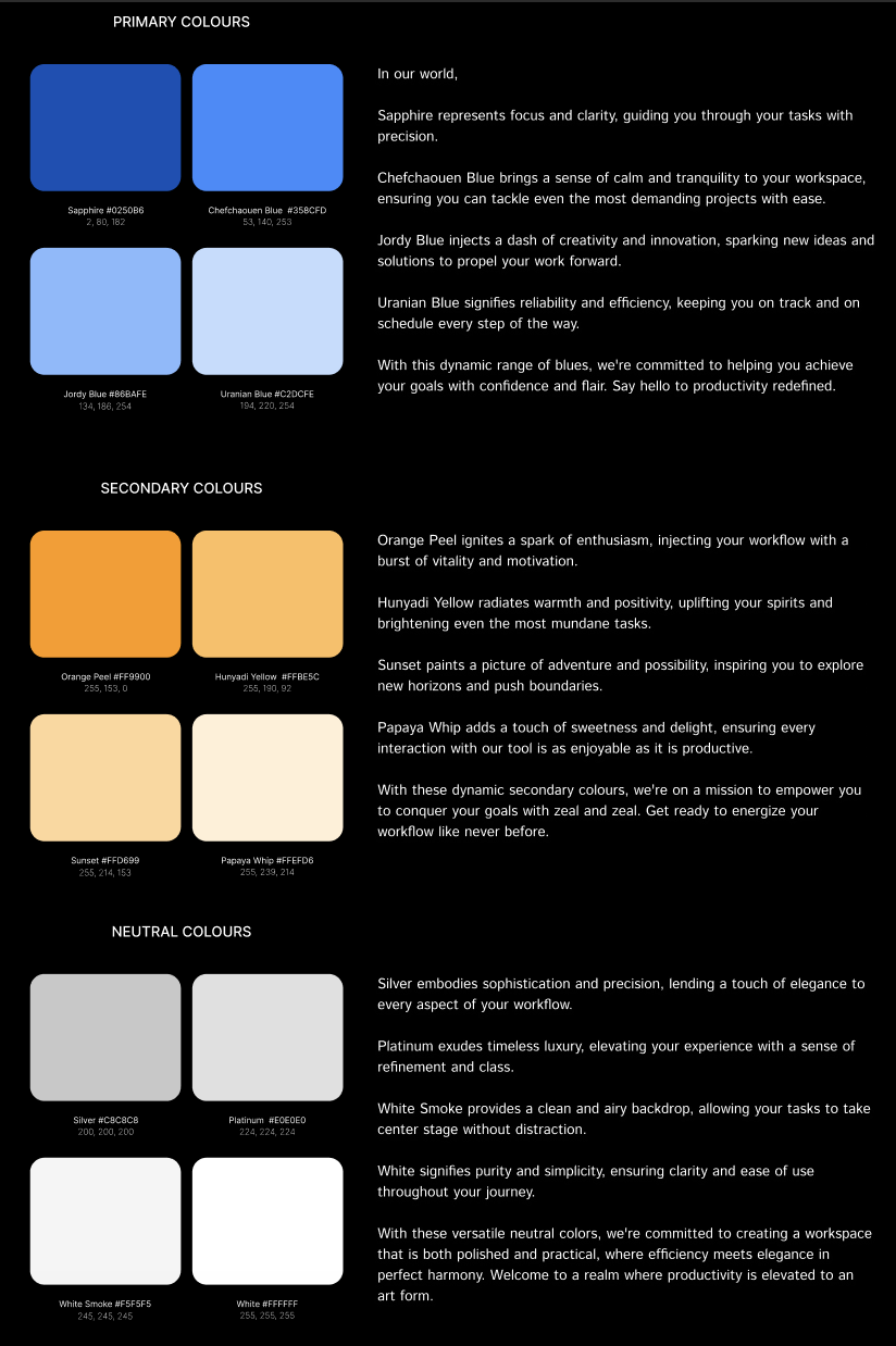
I can see you know your color theory pretty well. I appreciate that you labeled your colors clearly and provided more than one system for the values. One thing to consider on your labeling though: for the second set of values, it’s not immediately clear what color system those numbers correlate to. A good Designer should be able to figure that out, but a good color palette should also be clear and leave no doubt.
I think your presentation is a big area you can grow. Including the project brief in your description would really help frame the context. For your colors, I need to see you’ve thought through how they will be used in a product, not just how they register in color psychology.

Hey!
While the colors you chose align well with your brand's description and identity, I think it's essential to visualize them in a design context to assess their effectiveness, I would like to see a screen using these colors. Using orange as a secondary color complementary to blue can mistakenly evoke a warning state if not used thoughtfully. Consideration should be given to incorporating color states for error, warning, and success to ensure clarity and consistency in user feedback.
Regarding the naming of colors, I would simplify it to variations of a single blue/orange/grey and add tones to each for darker and lighter usage. Again, the usage of the background and text greys should be validated through design examples to understand their practical usage.
Ensuring sufficient contrast ratios and evaluating color combinations against WCAG guidelines is essential and I did not see it.
The presentation could be enhanced with some screen design examples.
You might also like

edX Sign-Up Page Redesign


Beautify Login page WCAG principles


Design Prioritization Workshop


Notion Login Page Accessibility Optimization


Sanyahawa - Landing page Design


Healthy Dashboard

Visual Design Courses

UX Design Foundations


Introduction to Figma

Design Terminology
