Doctor Search
https://stephgraphic.com/uxui-case-study-find-a-doctor-sutter-health
Reviews
1 review
You clearly understood the brief. The problem was real — people couldn’t find doctors easily. You showed that with user stories and backed it with research.
Your survey and testing were on point. You didn’t just collect data — you used it to guide your design. For example, most users thought they had to fill every field. That insight shaped your redesign, and it shows.
Heatmaps and click tests made your point stronger. Users focused on a few key fields. So removing unnecessary ones made sense. Good decision.
The new UI is clean. Doctor cards are easy to scan. Location, specialty, and health plan are visible upfront. Showing distance helps users choose faster. Mobile design is well done — not just a resized version.
Now, what’s missing:
- There’s no before/after comparison. That would make the impact clearer.
- Usability test results are scattered. Summarize them on one slide to show patterns.
- No mention of accessibility. Even a simple note would help.
- Some design choices need explanation. Why cards? Why that filter layout? Add short reasons.
Overall, strong project. You found real problems, tested your assumptions, and improved the experience. Just make the storytelling sharper. That’ll take it to the next level.
You might also like
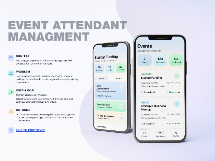
Events Managment App
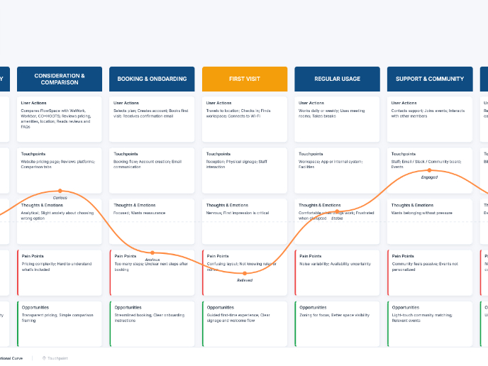
Customer Journey Map — Offsite Co-Working Experience
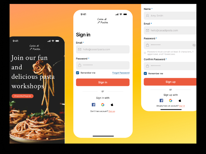
Mobile Onboarding: Casa di Pasta
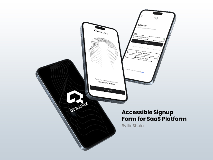
Accessible Signup & Login Experience — Brainex
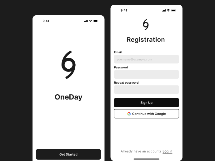
Accessible Signup Form
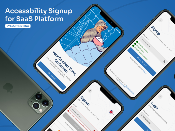
Accessible Signup Form
Popular Courses

Reducing User Churn

UX Design Foundations


