Digital Wardrobe Coach - Landing Page

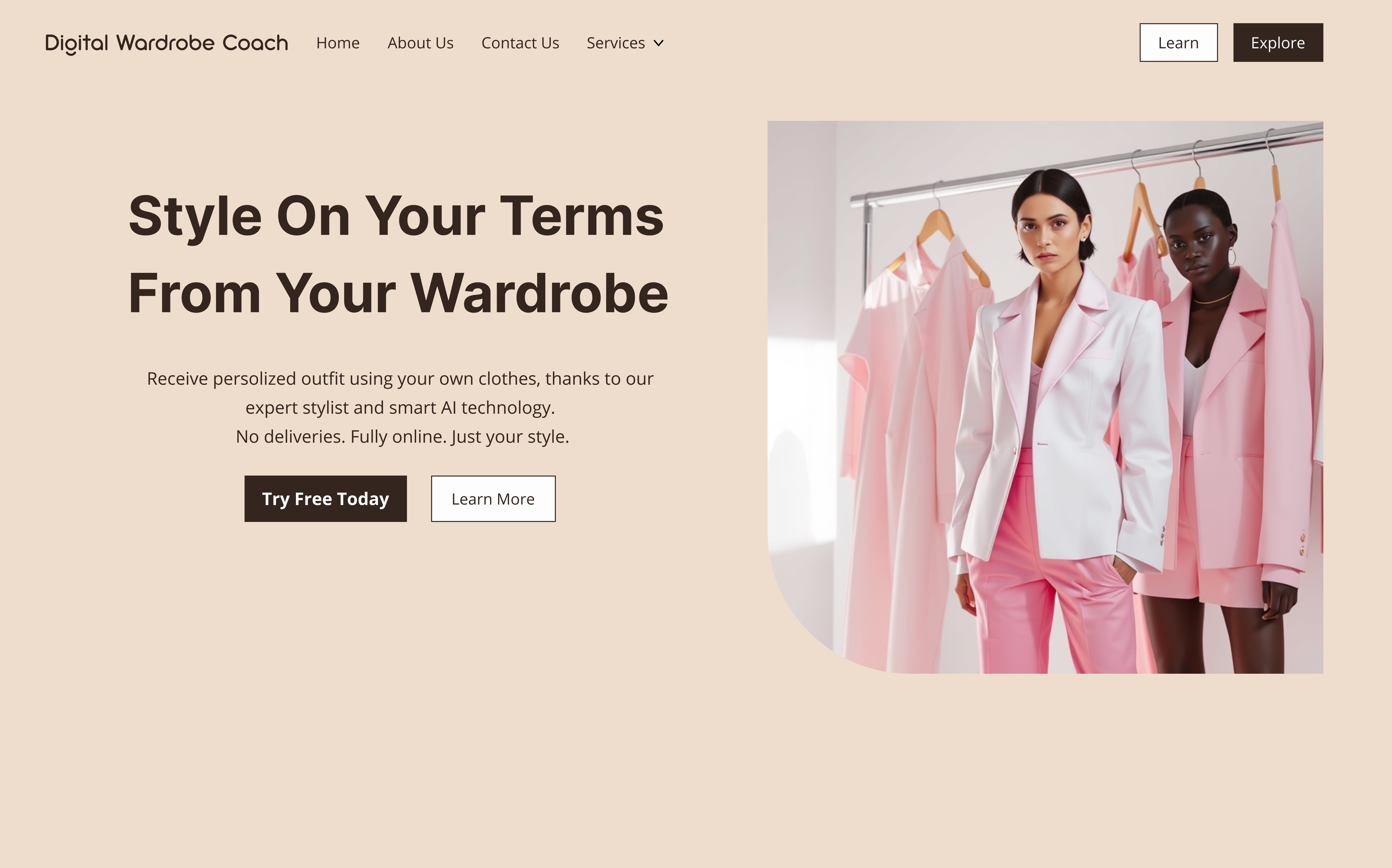
My project, which I called The Digital Wardrobe Coach Landing Page, was designed to merge functionality with emotional appeal. Inspired by competitors like Wishi and Stitch Fix, I avoided delivery dependency and impersonal AI by highlighting personalized, wardrobe-based styling.
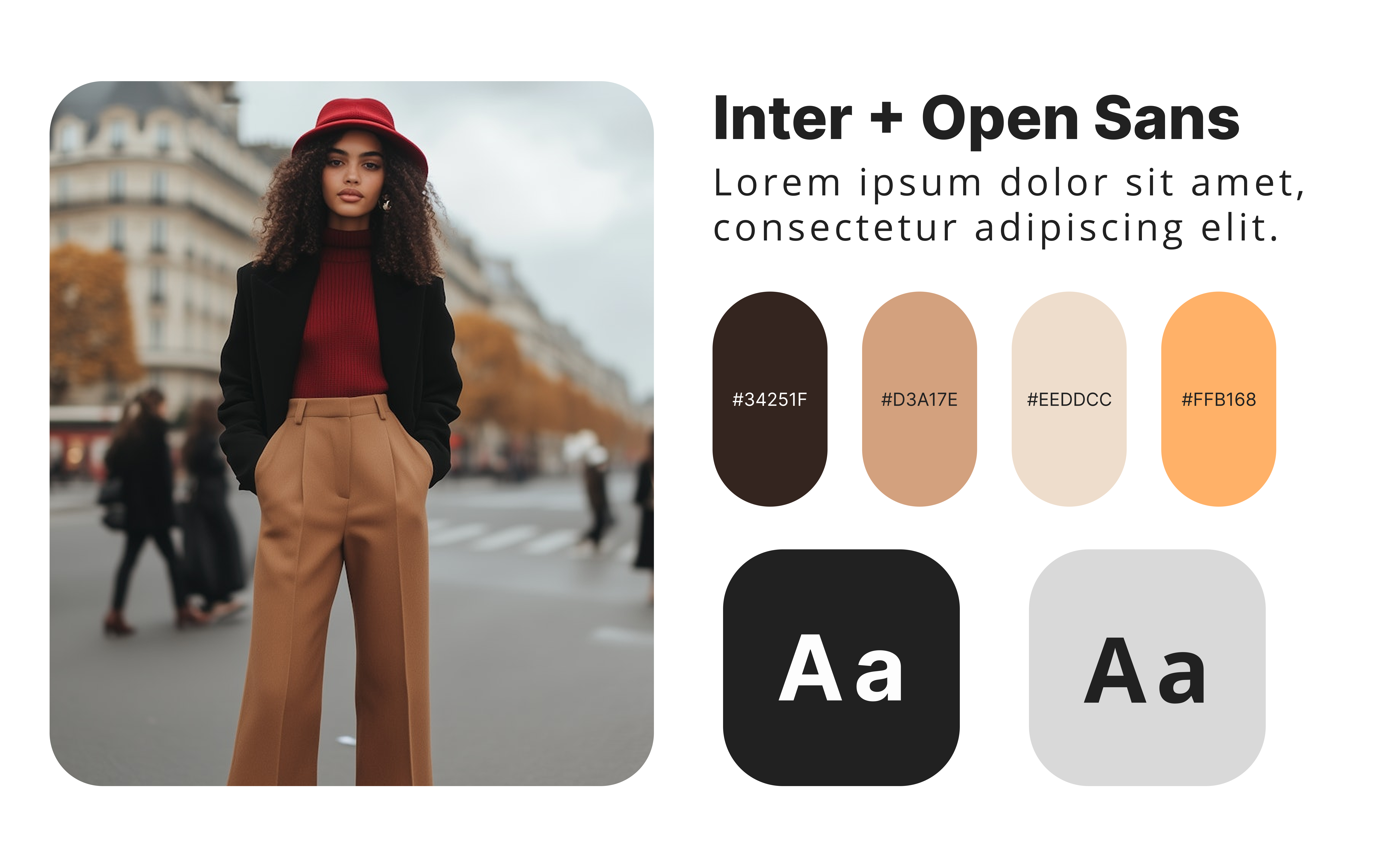
A minimalist layout, calm color palette, and human-AI balance enhanced trust and clarity. Each section: hero, how-it-works, testimonials, and FAQ was structured to guide users toward conversion while reinforcing the unique value proposition. Visuals (closet, outfit, calendar) supported understanding, and clear CTAs ensured engagement.
The main goal for this project was therefore to build confidence in styling online, fully on the user’s terms. Every design and copy choice served that singular conversion-focused mission.
Check out my landing page here >>
Tools used
From brief

Topics
Share
Reviews
1 review

Hi Ivan, this one is off to a great start! A few things that instantly caught my eye:
• The imagery already stands out with that cutting-edge image border (one or two rounded corners against the rest). So why limit the buttons with borders? I think they’d blend more naturally with the overall aesthetic if you went borderless.
• There’s a typo in the hero text. I mean, it’s easier than ever to write and paste copy these days, so I guess the least we can do is double check the proofreading part 😅
• I dig the multiple alignments in the hero text but I’m still undecided. It feels like you’re subtly poking at brutalist style while still keeping things orderly… but other visual cues tell me it might be something else 🤔
• I’m all for exploration, but these CTAs got me a bit confused: Learn, Explore, Try Free Today, Learn More, Start, Sign Up. Grammatically, they imply different things. Are you trying to communicate the same action in multiple ways?
• The Why We Stand Out section is a tricky one. A few alignment issues with the check and cross marks, and I’m not sure if the indentation in the feature list is necessary. If you're going for that super clean, borderless table look, maybe the items could be placed closer to their respective groups (headings, lists, feature rows). Otherwise, I’d explore more structured table designs.
• There are a couple of things further down the page that could be improved, but I’ll leave it here for now ✌🏼
You might also like

eWallet App Development Project


🖥 Desktop Checkout Flow Design


Website CRM Dashboard


Helpful 404 Error Page for a Fintech Mobile App


Pebble Accessible SAAS Signup Flow


Music Player UI - Light & Dark Mode

Content Strategy Courses

UX Writing


Common UX/UI Design Patterns & Flows


Building Content Design Systems
