Design for skincare app Solmar

The app features an elegant and minimalistic user interface, designed to feel both modern and inviting. I selected a cheerful yellow (Hex: #FFDD93) as the brand’s primary color to evoke feelings of happiness and warmth—like sunshine in summer, uplifting us both inside and out.
The color palette includes a deep background tone (#333333), a bright highlight (#FFDD93), a rich primary text color (#242424), and a light secondary text color (#F8F8F8). Together, these choices not only achieve WCAG Level AA contrast compliance but also create a visually harmonious and user-friendly experience.
For typography, I opted for a sans-serif typeface—Intel Medium—because of its clean, modern, and highly accessible appearance. The font sizes are thoughtfully applied:
- 12px for captions and helper text
- 16px for body copy and standard buttons
- 18px for key buttons and headings
Overall, the mood of the app encourages users to shop for skincare and bodycare with ease and joy—much like the carefree feeling of picking out a new sunscreen just before a tropical getaway to Indonesia.
Tools used
From brief

Topics
Share
Reviews
1 review

Alisa, your design is polished, accessible, and visually appealing. The warm yellow primary, deep background tone, and clear typography create an inviting mood that fits a health-and-beauty brand. You also justify each color and type choice, which shows thoughtful craft. That said, the brief specifically calls for a Dark Mode and positions the project within the entertainment industry. A skincare shopping experience does not align with that domain, and the submission does not illustrate how the UI transitions to a true dark-mode palette. Maybe you can get back to it again and :
- Re-frame the concept around an entertainment product (e.g., a music-streaming, movie-ticket, or event-discovery app) so your color rationale maps to that audience and context.
- Present side-by-side light and dark screens, explaining how each brand color adapts to maintain AA contrast, hierarchy, and emotional tone.
- Document any component-level adjustments—e.g., elevated card backgrounds, highlight states, or typography tweaks—to show how dark mode remains coherent and legible.
The current work is strong in isolation, but addressing both dark-mode mechanics and the entertainment focus will ensure it directly meets every part of the brief.
You might also like
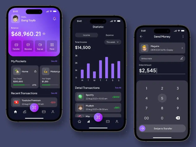
eWallet App Development Project

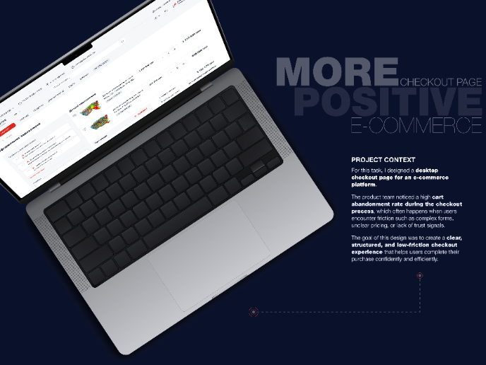
🖥 Desktop Checkout Flow Design

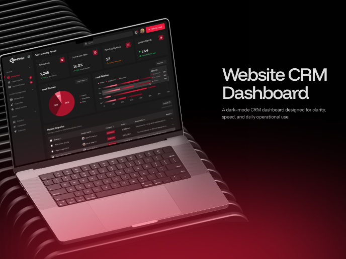
Website CRM Dashboard

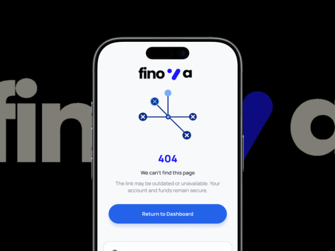
Helpful 404 Error Page for a Fintech Mobile App

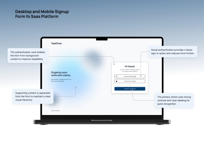
TaskFlow Authentication Flow

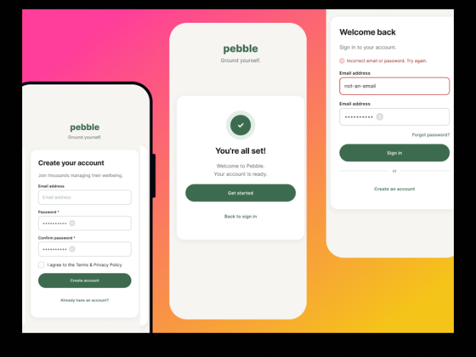
Pebble Accessible SAAS Signup Flow

Visual Design Courses

UX Design Foundations


Introduction to Figma

Design Terminology
