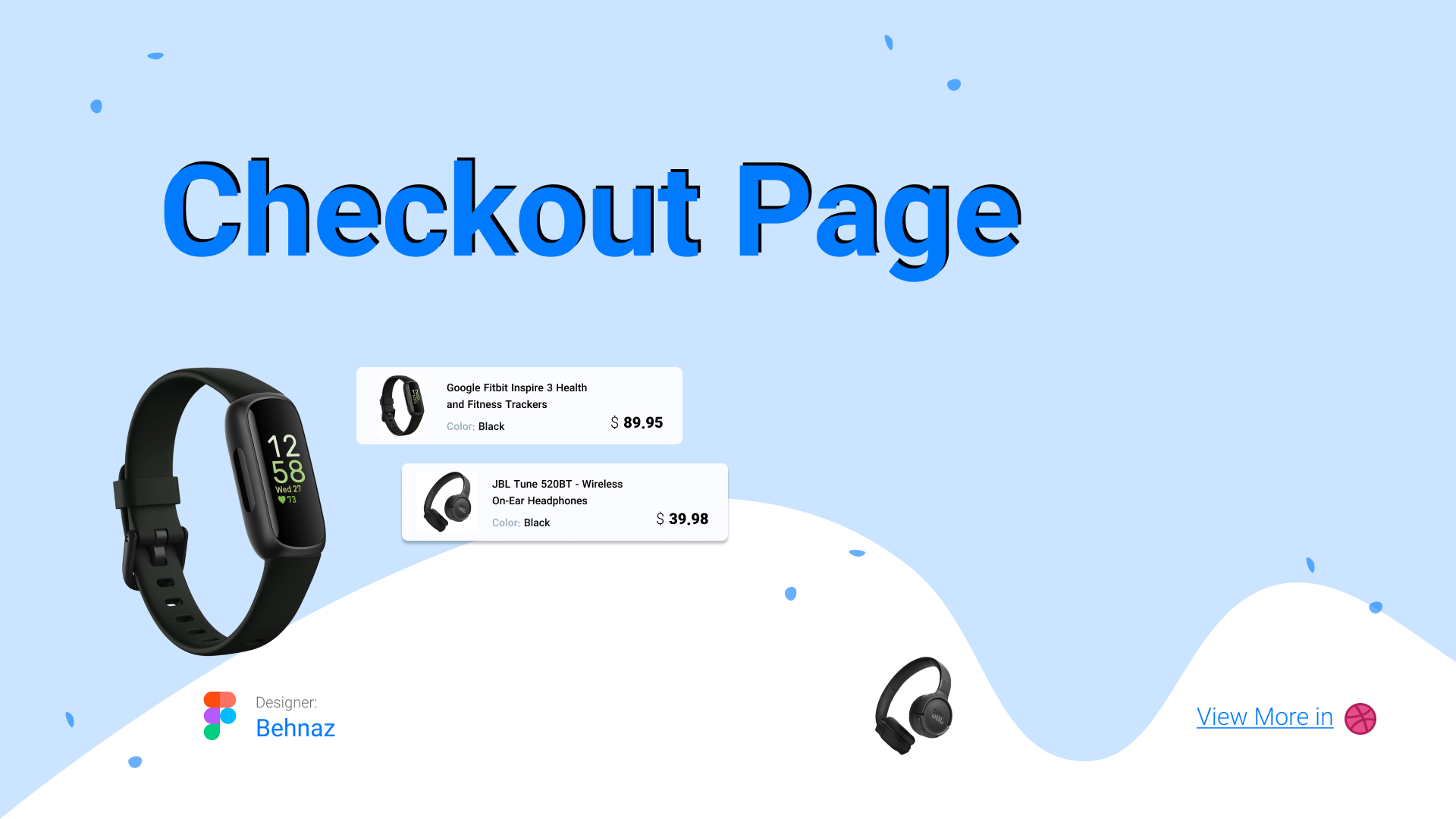
Design a Checkout Page
designed a checkout flow for a desktop e-commerce platform.
The goal was to make the process clear, simple, and trustworthy.
What I did:
- Created an easy step-by-step checkout flow.
- Designed a clean, intuitive form with no friction.
- Added helpful microcopy to guide users.
- Explained the design choices to support trust and usability.
- Showcased the design using mobile templates.
- Bonus: included a user flow of the checkout process.
This ensures usability, scannability, visual clarity, and a clear presentation of the design.
Reviews
4 reviews
What I like the most about your approach to the checkout flow is how you placed “Order Details” into chunks under dropdowns for contact, delivery, and payments. It makes things clearer than showing everything by default. Whether it’s easier to use or not would need testing 😄 since I’m not sure if everyone will recognize the caret as a cue that more fields are hidden under a single word. Still, visually it looks neat and tidy.
On typographic alignment and consistency, the “Order Details” heading is slightly indented compared to “Shopping Cart.” Is that intentional? Also, the “subtotal” label under “Order Summary” is written in lowercase, while the others use uppercase. I can’t tell if that’s deliberate or a mistake.
The visual hierarchy is working, but I’d argue the section headings and prices could use something softer than pure black. Toning them down would keep clarity without everything competing at the same level.
Behnaz, the layout checks out and is ready to ship!
Behnaz, your checkout flow looks super clear and trustworthy—maybe just refine small details like alignment and text consistency, but overall it’s a solid, user-friendly design!
Behnaz has designed a clean and clear checkout page that makes purchasing simple and trustworthy. The step by step flow is easy to follow, with intuitive forms and helpful guidance for users.
Microcopy supports clarity and confidence, and the visual hierarchy ensures information is easy to scan.
Including a user flow and mobile templates shows a thoughtful approach to usability and presentation.
Awesome work with the clean and scannable UI, there is clear information architecture, your user flow is apparent, and the steps to complete checkout are simple and understandable.
I would've loved to see some more of the design process and design rationale here in the case study. It also could be nice to have an interactive prototype, a user flow deliverable, or an idea for how this could look on different screen sizes. Your cover image for this could also use some more structured design, right now not much lines up with other elements and it looks a bit messy.
You might also like

Smartwatch Design for Messenger App

Bridge: UI/UX Rebrand of a Blockchain SCM Product

Pulse Music App - Light/Dark Mode
Uxcel Halloween Icon Pack

Monetization Strategy

Designing A Better Co-Working Experience Through CJM
Interaction Design Courses

UX Design Foundations

Introduction to Figma


