Dark Mode Design for Music App

I designed this music app that allows you to convert a playlist from one music app to another. I chose to use a color palette that combines a very dark background with bold, neon-like accent colors, creating a look that is both modern and energetic. I aimed to implement a color scheme that was both visually engaging and subtle, ensuring it would not distract from the user experience.
I chose a deep almost-black blue as the main background color to provide a sense of depth while making the other colors pop with the contrast. I also went with a luminous electric cyan as the primary accent colors to add a jolt of energy and give it a futuristic feel. I used a brilliant violet as my secondary accent color to compliment the cyan and give the theme a creative and artistic vibe.
Overall, I enjoyed designing this entire experience and look forward to receiving any feedback. Feel free to view my full project and share any thoughts. Thanks for viewing!


Reviews
4 reviews

Great job!
Love the presentational image!
The 'Continue' Button could be located more to the bottom, so it is closer to the users thumbs and easier to press when on a phone.
When having a more complexed color palette for an app like this; I would recommend having a more clear typography hierarchy and maybe add on or two steps higher on the font-weight.
CTA color is "greenish" and "white". And text is also white... it becomes a little bit confusing. Which again, puts a bigger importance of typography & hierarchy.
The cards seems to have a lot of inconsistency in spacing, border radius etc; which makes me question if you're created them as components?
Keep up the great work!

Kalena Blackman designed a music app that lets users transfer playlists between platforms.
The interface uses a deep blue background with neon cyan and violet accents, creating a modern, energetic, and futuristic feel.
The design balances bold colors with usability, keeping the focus on the music experience.

Nice work, Kalena — the dark mode feels modern and energetic, and with a bit of refinement on accessibility you’ll make it even stronger, so keep pushing in this direction!

Kalena, you lost me at “to implement a color scheme that was both visually engaging and subtle, ensuring it would not distract from the user experience.” Yet the chosen colors are almost-black blue as the main background and neon-like accents 😅 Surely, it’s modern, energetic, and engaging, but not subtle and possibly distracting for users, especially those who have visual impairments with high contrast like that.
I think the goal is still possible to achieve by switching the neon-like accents with softer tones like muted teal or pastel violet, keeping the gradients you already use since they actually balance the design well. Or maybe the aim itself could be adjusted. Instead of aiming for subtle and non-distracting, it could simply be about creating a modern, energetic, and engaging UI. In that case your design already achieves the goal 💯
Except for that, I agree with everything you said and I believe this kind of app is one of the most sought-after features, especially as we stretch ourselves across Spotify, Apple Music, SoundCloud, and so on.
You might also like

eWallet App Development Project


🖥 Desktop Checkout Flow Design


Website CRM Dashboard


Helpful 404 Error Page for a Fintech Mobile App

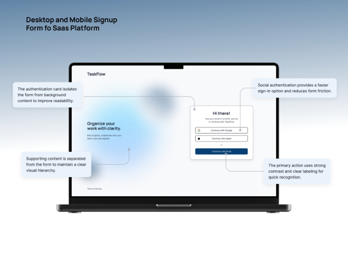
TaskFlow Authentication Flow


Pebble Accessible SAAS Signup Flow

Visual Design Courses

UX Design Foundations


Introduction to Figma

Design Terminology
