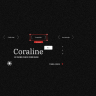
Coral Island - Typography system
Chosen typeface: Comfortaa
- Comfortaa features distinct, wide letterforms with a generous x-height, contributing to its readability.
- It comes in three weights: Light, Regular, and Bold. This range allows for flexibility in design, providing options for different levels of emphasis.
- Comfortaa is a geometric, rounded typeface. Its letters have a clean, modern appearance with smooth, rounded edges and a consistent stroke width.
Why
- The rounded, geometric shapes of Comfortaa convey a welcoming and playful tone, which can align well with the vibrant, adventurous spirit of a game like Coral Island.
- Its clean lines and modern look can help create a visually appealing and professional landing page that appeals to a broad audience.
- Comfortaa's high legibility ensures that important information on the landing page, such as game descriptions, features, and calls to action, are easy to read at various sizes.
Tools used
From brief
Topics
Share
Reviews
3 reviews
I appreciated your font choice and the explanation you provided. However, the interface example appears a bit chaotic. The hierarchy could be improved, and using italics for "Search here" seems unnecessary. Additionally, I have concerns about the alignment of the logo typeface with the selected typeface for the website. Does the main website typeface accurately reflect the brand identity? Maybe, it makes sense to consider other variants. Thank you for your work!
Great job!
Hello Quynh Anh,
This is thoughtful work on the Coral Island Typography System. I appreciated how you selected Comfortaa specifically to match the game's playful, adventurous tone rather than defaulting to a generic sans-serif. What struck me most was your reasoning that rounded, geometric letterforms convey a welcoming spirit while maintaining legibility at scale. It shows you understand that typography isn't decorative as it's a core part of brand voice and user experience. Second, the three-weight system demonstrates planning for real-world application across different UI contexts and emphasis levels. Lastly, you justified every choice with both functional (readability, hierarchy) and emotional (playful tone) reasoning, which is the mark of mature design thinking.
Your systematic approach to typography as a strategic design system and not just font selection. shows sophisticated understanding of how type drives user perception and interface clarity. Looking forward to seeing more from you!
Cheers,
Karen
You might also like

Smartwatch Design for Messenger App

Bridge: UI/UX Rebrand of a Blockchain SCM Product

Pulse Music App - Light/Dark Mode

Monetization Strategy

Designing A Better Co-Working Experience Through CJM

Design a Settings Page for Mobile
Visual Design Courses

UX Design Foundations

Introduction to Figma


