Cookidea Waitlist

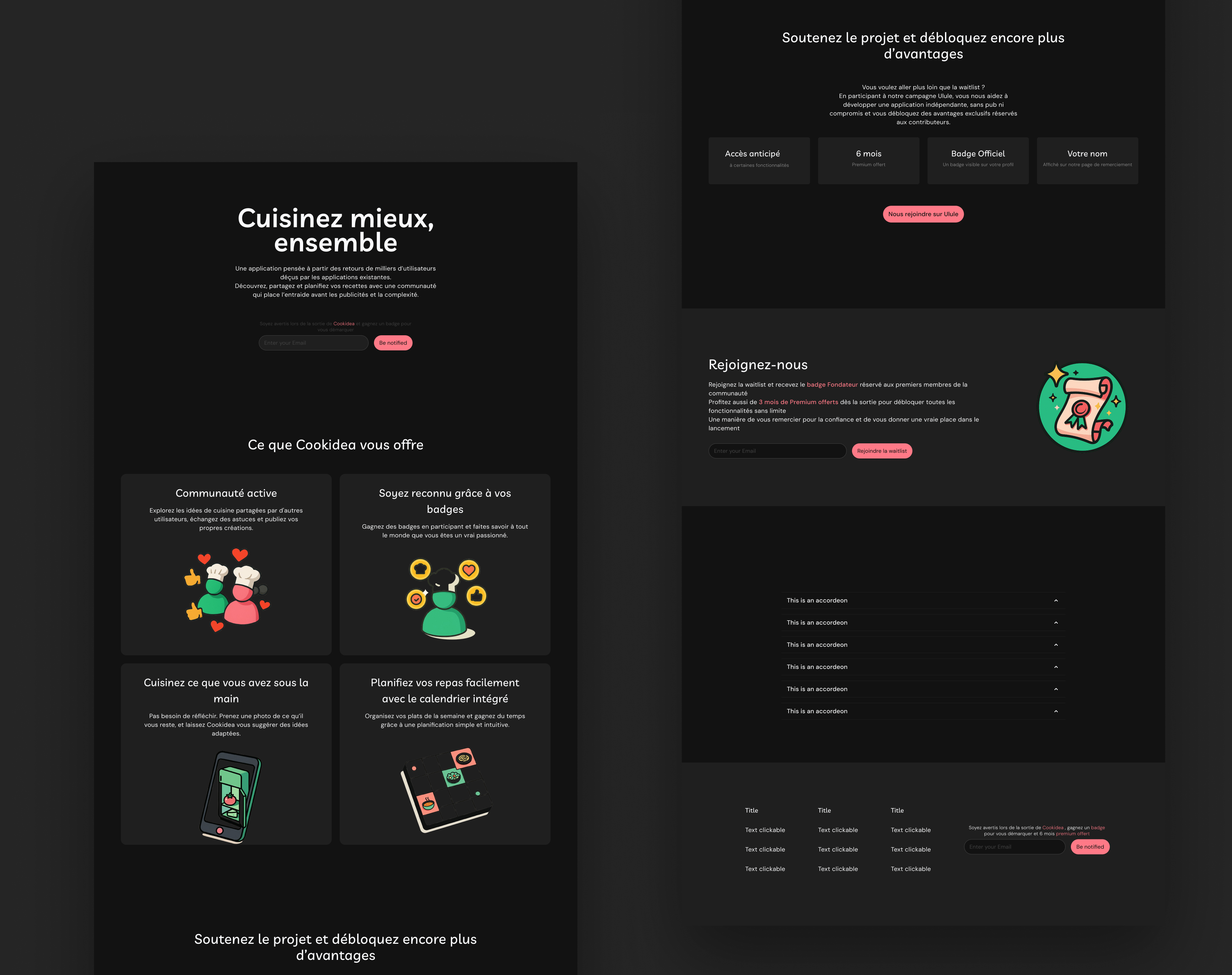
This is a waitlist screen I designed for Cookidea, a real product I'm currently working on.
The goal is to introduce the concept in a simple and engaging way while encouraging users to sign up with their email.
I paid special attention to visual hierarchy, contrast, and clarity to ensure an effective first impression.
The design is available in both light and dark modes, to provide a consistent experience regardless of the user's preferences
.

Reviews
1 review

Aymen, I think you achieved the goal of creating an engaging and encouraging landing page/waitlist.
Here are a few things I noticed and liked:
• the layout is clean and visually scannable.
• the custom illustrations help convey the idea more clearly.
• there’s a nice flow, you ask for the email up top, provide context about the product, then ask again in the middle. Repetition matters!
But then again, why stop there? 😄
• why leave the accordions as placeholders only?
• and why not add another illustration in the supporter section? Right now, it’s just grey boxes and text. I think this area deserves more visual love, it could really help attract more Cookidea supporters.
You might also like

edX Sign-Up Page Redesign


Beautify Login page WCAG principles


Design Prioritization Workshop


Sanyahawa - Landing page Design

Uxcel Halloween Icon Pack


eWallet App Development Project

Visual Design Courses

UX Design Foundations


Introduction to Figma

Design Terminology
