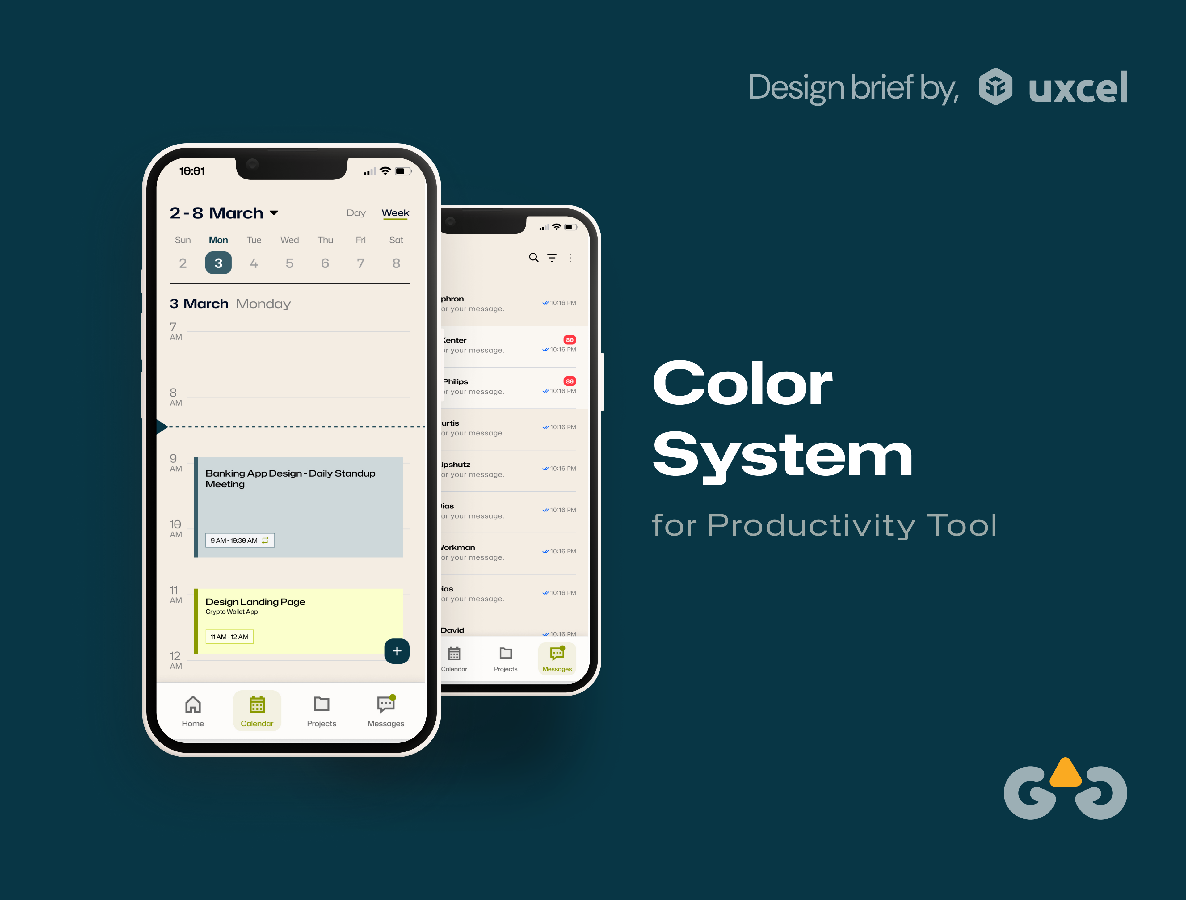
Color System for Productivity Tool
"Work Snap" is a playful and efficient work management platform designed specifically for mobile devices, targeting Gen Z users. The app embodies speed, simplicity, and a casual tone to resonate with the preferences of a digitally native audience. Its design focuses on a vibrant color system, easy usability, and compliance with accessibility standards to ensure inclusivity and functionality.
The WorkSnap color system is designed to reflect its core attributes: energy, creativity, and approachability.
Targeted Device - Mobile
Design Decisions
- Gen Z Focus: The color system aligns with Gen Z's preference for bright, energetic, and slightly unconventional color schemes that stand out yet feel relatable.
- Contrast for Clarity: Neutral colors balance the vibrancy, ensuring content and actions are easy to locate.
- Emotional Balance: The interplay of energetic and calming colors fosters a sense of playful productivity, keeping users engaged without overwhelming them.
- Accessibility First: Ensuring all users, including those with visual impairments, can fully interact with the app aligns with the platform's inclusive mission.
- Mobile-First Design: The app’s layout, interaction patterns, and visuals are tailored for mobile screens, ensuring a seamless, thumb-friendly user experience.
Mobile-First Design and Scalability
- The app’s layout, interaction patterns, and visuals are tailored for mobile screens, ensuring a seamless, thumb-friendly user experience. While the current focus is on mobile devices, we plan to scale the platform to desktop devices in the future to accommodate a broader range of use cases and ensure seamless cross-device accessibility.
WorkSnap’s design captures the essence of productivity while embracing a fun, casual identity that motivates Gen Z to work efficiently and collaboratively on their mobile devices.
Tools used
From brief
Topics
Share
Reviews
1 review
Hi Gauri,👋
Great job on your project "Work Snap"! 🤩👏
I recommend considering using a different base (Primary) color that will draw more attention. Also, you may want to use colors according to the function, for example, use a color that expresses info-status(in your color system) to highlight the day(Today) and the primary color for the CTAs.
Overall, This is a well-thought-out project! Fantastic effort, Gauri! 🙌🥳
You might also like
EntertainHub App (Dark / Light Mode)
💊 Healthcare Desktop & Mobile App UX/UI Design
Fitness Challenges App
Personal Wellness Dashboard
Events Managment App
SaaS Signup Design
Visual Design Courses

UX Design Foundations

Introduction to Figma

