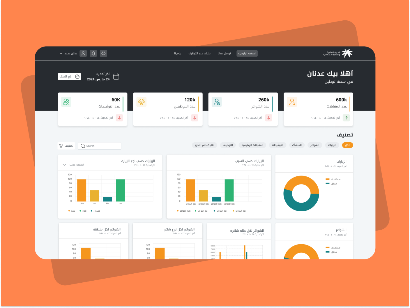
Color System for Productivity Tool
View Project
(Click the link above to view the color system presentation in full.)
Reviews
2 reviews
Great start, Ahmed! I really liked how you presented your work. The only tip I have is to take it up a notch by giving more context for each decision. Even just a brief explanation of why you made certain choices or how they're being used would be super helpful. You've shown some visual examples at the end of the presentation, but adding short notes about each decision would make it even better.
Awesome job overall!
I appreciate your effort on this project, but there are a few areas that need improvement. You missed opportunities to explain the rationale behind your color choices, and your choice of colors stayed unclear to reviewers. Some texts have such low contrast that I had to squint to read them. The "Cancel" button, which is a destructive action, is white with an orange outline. This color choice does not effectively communicate the destructiveness of the action.
There are two columns of buttons, which I assume are meant to show button states, but there are more than five within one system, making it unclear. Additionally, your accessibility check lacks clarity. It merely shows some colors without indicating compliance values.
I recommend visiting the brief's page and clicking "View Projects" to get inspiration and understand the level of detail required for excellent work.
Thank you for your effort and keep up going!
You might also like

Pulse — Music Streaming App with Accessible Light & Dark Mode

Islamic E-Learning Platfrom Dashboard
SiteScope - Progress Tracking App

Mobile Button System

FlexPay

CJM for Co-Working Space - WeWork
Visual Design Courses

UX Design Foundations

Introduction to Figma


