Color System for Productivity Tool

Click link to see full project.
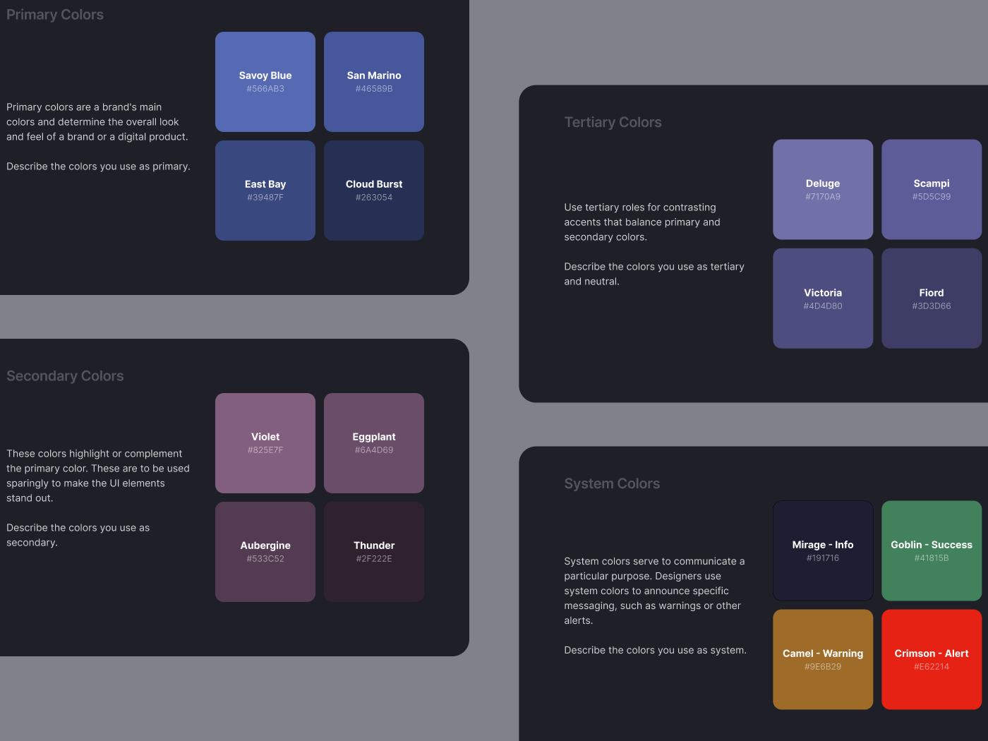
The color palette for this project includes shades of blue, eggplant, and violet to create a fresher look while maintaining trust and sophistication. Together, these colors create a harmonious and engaging visual experience, enhancing the usability and aesthetic appeal of the design. Additionally, the palette adheres to, and exceeds the WGAC regulations for accessibility.

Reviews
2 reviews

The analog palette is nice.
Perhaps analog contrast may not work well for people with color perception disorders. But you solved that with the system colors.
Only I would check the color Mirage - Info, how it will work with a dark background. Because of the low contrast, you'd probably need to add a stroke to elements with that fill color.
And you could add a part to the presentation with how these colors work with each other, not just white text and a dark background.
Good luck :)
The color choices seem interesting. Uncommon shades of blue and eggplant can really make the interface stand out. However, more thought should be given to ensuring that all colors, not just the primary ones, comply with WCAG requirements. Additionally, without a demonstration of how the colors can be applied in an interface, the work seems incomplete. I believe with more effort, this work would truly shine.
Keep it up!
You might also like

Entrant Accessible Signup and Login Forms

A/B Testing for Bumble's Onboarding Process

Dark mode Main page

CJM x Mindspace case study - Ester Cinelli


LUMÉRA - Checkout Flow


Tripit's Login and Sign Up Flow

Visual Design Courses

UX Design Foundations


Introduction to Figma

Design Terminology
