Color system for productivity tool


This color system for our productivity tool utilizes a vibrant palette of orange, evoking energy and motivation, complemented by the refreshing aqua-green, symbolizing growth and focus. These vibrant hues are balanced by the calming presence of blue, creating a sense of trust and reliability. This combination aims to create a visually stimulating and motivating environment that enhances user productivity and fosters a sense of calm and focus while working.

Reviews
3 reviews

Your colour system for the productivity tool shows strong attention to detail and thoughtful colour choices, but there are a few areas that need refinement to make it more functional and user-friendly. Below are specific issues and actionable feedback to help improve your design.
Identified Issues and Feedback
Contrast Issues in Light Mode:
- Problem: The contrast ratio for Aqua-Light (#08DBB8, 3.07:1) in light mode does not meet WCAG standards for text.
- Fix: Increase the darkness or saturation of the colour to ensure a minimum ratio of 4.5:1 for text readability.
Neutral Grays Are Limited:
- Problem: Grayscale colours like Neutral-Elements (#D7D7D7) and Neutral-Text (#4E5356) may not provide enough mid-tone flexibility for elements like dividers, cards, or tooltips.
- Fix: Add more intermediate grey shades (e.g., 150, 350 levels) to enhance usability for subtle UI distinctions.
System Colors (Alert, Success, Error):
- Problem: The system colours are not well-differentiated in light mode. For example, System-Success (#7AFFD4) and System-Info (#94CDFD) are visually similar and could confuse users with colour blindness.
- Fix: Use distinct hues for these colours (e.g., make success a more vivid green or Info a deeper blue).
Dark Mode Palette:
- Problem: The colours in dark mode, while high in contrast, lack subtlety for larger UI elements. The vibrancy can feel overwhelming when used extensively.
- Fix: Slightly desaturate or darken colours like Aqua-Light and Daylight-Light to reduce strain in dark mode.
WCAG Contrast for Typography:
- Problem: The typography readability is not clearly demonstrated on certain backgrounds. For example, lighter shades like Brand-Lightest (#D8D9FF) might be hard to read on white backgrounds.
- Fix: Add usage examples for text overlays and adjust colour brightness as needed.
Lack of Visual Context:
- Problem: The design lacks mockups or examples showing how colours are applied to actual UI elements like buttons, headers, or forms.
- Fix: Include at least 2–3 mockups to demonstrate real-world usage, which will highlight potential readability or usability issues.
Prioritized Fixes
- Adjust Aqua-Light contrast (critical for accessibility).
- Expand grayscale options for flexibility in subtle UI elements.
- Differentiate system colours for clarity and inclusivity.
- Demonstrate text readability on all background colours.
By resolving these specific issues, your design will improve in both usability and accessibility.

Hello André! Thanks for your submission, The presentation is to the point and clean. I really liked you made it sort of as "variants" and presented the values of every single one, and the contrast check. some thought:
- would love to see the rationality behind this, did you research, benchmark, or analyse competitors? Did the colour come to you in a dream? What made you choose these colours?
- how would you use the colours? There are some contrast issues with the darker shades of green for example in dark mode, would that be used for text? or for elements? or is that specific colour used only in light mode?
- because of what I mentioned in the point above, I would love to see some design (simple ones) screens where the colours are used in the productivity tool/software wtv.
- especially with the system colours, maybe you need light and darker shades so you can use it on warning/error chips... but also to better scalability both on light and dark modes.
Great start! If you ever change anything on this project please answer my comment and let me know so I can see it again! <3

Thanks for your sub, Andre!
You did a great job here! What i would like you to think about is the darkest green on dark mode, i think the contrast is not good. Also i would love to see some of your decisions and why you took it.
Great vibes only!
Cristian
You might also like
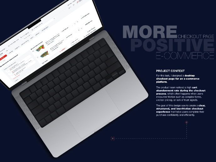
🖥 Desktop Checkout Flow Design

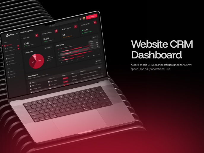
Website CRM Dashboard

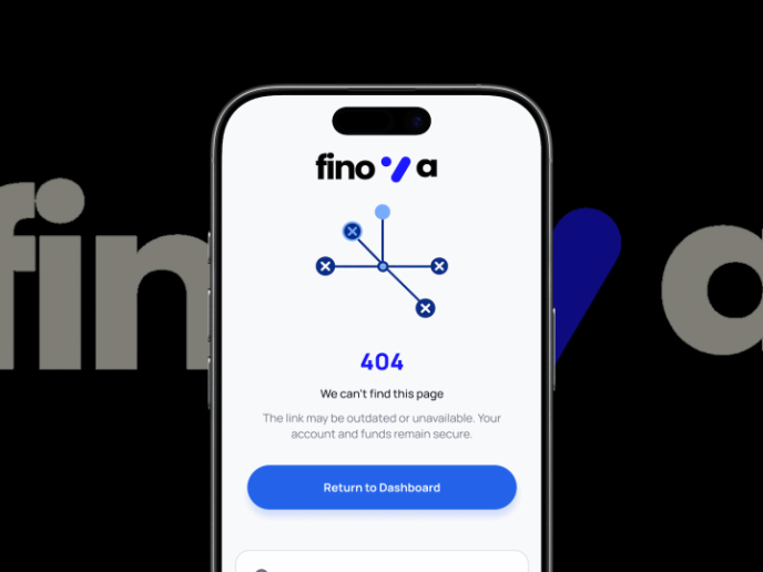
Helpful 404 Error Page for a Fintech Mobile App

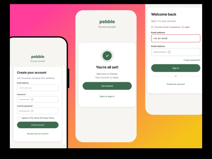
Pebble Accessible SAAS Signup Flow

Music Player UI - Light & Dark Mode

Create a UX Research Survey

Visual Design Courses

UX Design Foundations


Introduction to Figma

Design Terminology
