Color System

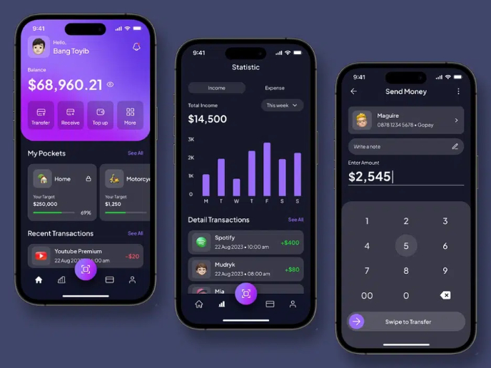
I created a color system for a productivity app platform I came up with for this project. The goal was to design an interface that feels both intuitive and inspiring. My approach was to choose colors that provide a range of feelings, from the calm and cool focus needed for deep work, to the warm and enthusiastic energy required for celebrating milestones. By balancing these hues, I created a palette that I feel can subtly guide a user's journey, helping to prioritize tasks, and signal important statuses. In this presentation, I'm happy to share my color system and provide a glimpse into my small UI design on mobile, where you can see how these colors come together. I hope you like!
Tools used
From brief

Topics
Share
Reviews
5 reviews

Great work! Solid presentation.
I was expecting a more colourful start page; that combines what I'm going to see through out the presentation.
The background behind the phone, at page 13, has a "transparency" checker which I think you could've deleted.
You could've added some comments about design tokens, naming conventions etc for better handover processes.
Keep up the great work!

Great job, Sidney 👏

Good job Sidney. The color system feels well thought out and connects nicely to different moods like focus and celebration. I like how you showed the colors in a small UI example, it makes the palette more practical.
You could also test how the colors work for accessibility to make the system even stronger. Nice work.

You’ve done a solid job covering the basics, you defined primary, secondary, neutral, and system colors, tied them to emotions, and even applied them in a small UI example. That shows you understand the structure of a color system and how color can influence user states like focus and motivation.
Where this falls short is in the rigor. Right now, the system feels more like a concept board than something that could scale in a real productivity platform. The WCAG mention is good, but you didn’t prove compliance with contrast tests. Tertiary colors are missing, and each palette family only shows single swatches instead of a usable scale (light → dark). The brand principles that should anchor the palette aren’t clearly articulated either. Finally, the UI example is too limited to demonstrate how the colors actually behave across branding and multiple components.
To elevate this: anchor the palette in clear brand principles, prove accessibility with actual ratio results, expand each family into a scalable token set, and apply them across more UI components. Also, clean up the naming conventions so they read like a professional system (primary/500, neutral/100, etc.) rather than ad-hoc labels. With those refinements, this would shift from a good exploration into a product-ready color system.
I hope this feedback gives you clear direction on where to take the next iteration, you’ve got a strong foundation, and with a bit more systemization and proof, this can really stand out.
Thanks for sharing your work.

Solid work mate! Keep up the good work!
You might also like

edX Sign-Up Page Redesign


Beautify Login page WCAG principles


Design Prioritization Workshop


Sanyahawa - Personal Portifolio_login page

Uxcel Halloween Icon Pack

eWallet App Development Project

Visual Design Courses

UX Design Foundations


Introduction to Figma

Design Terminology
