Color System

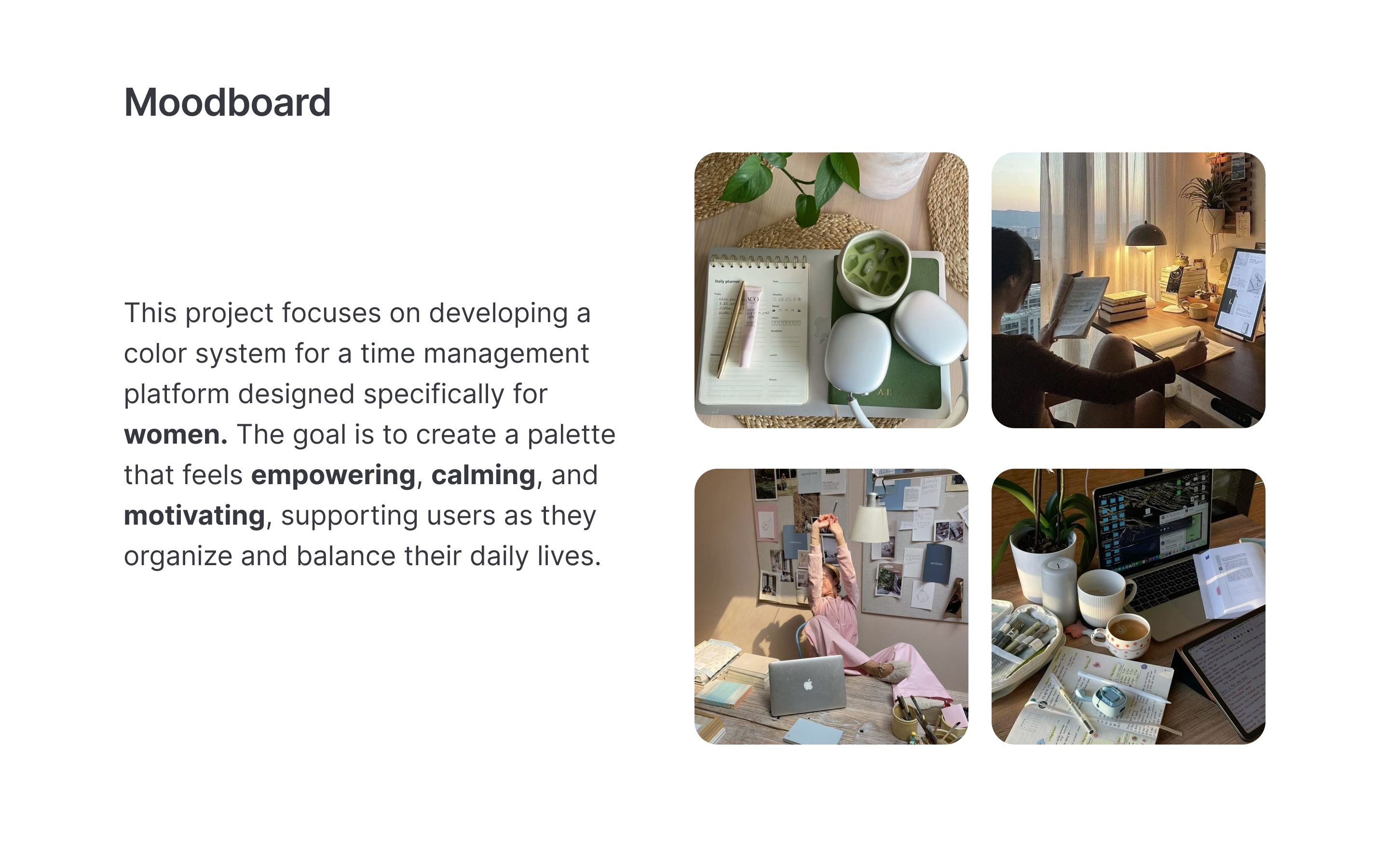
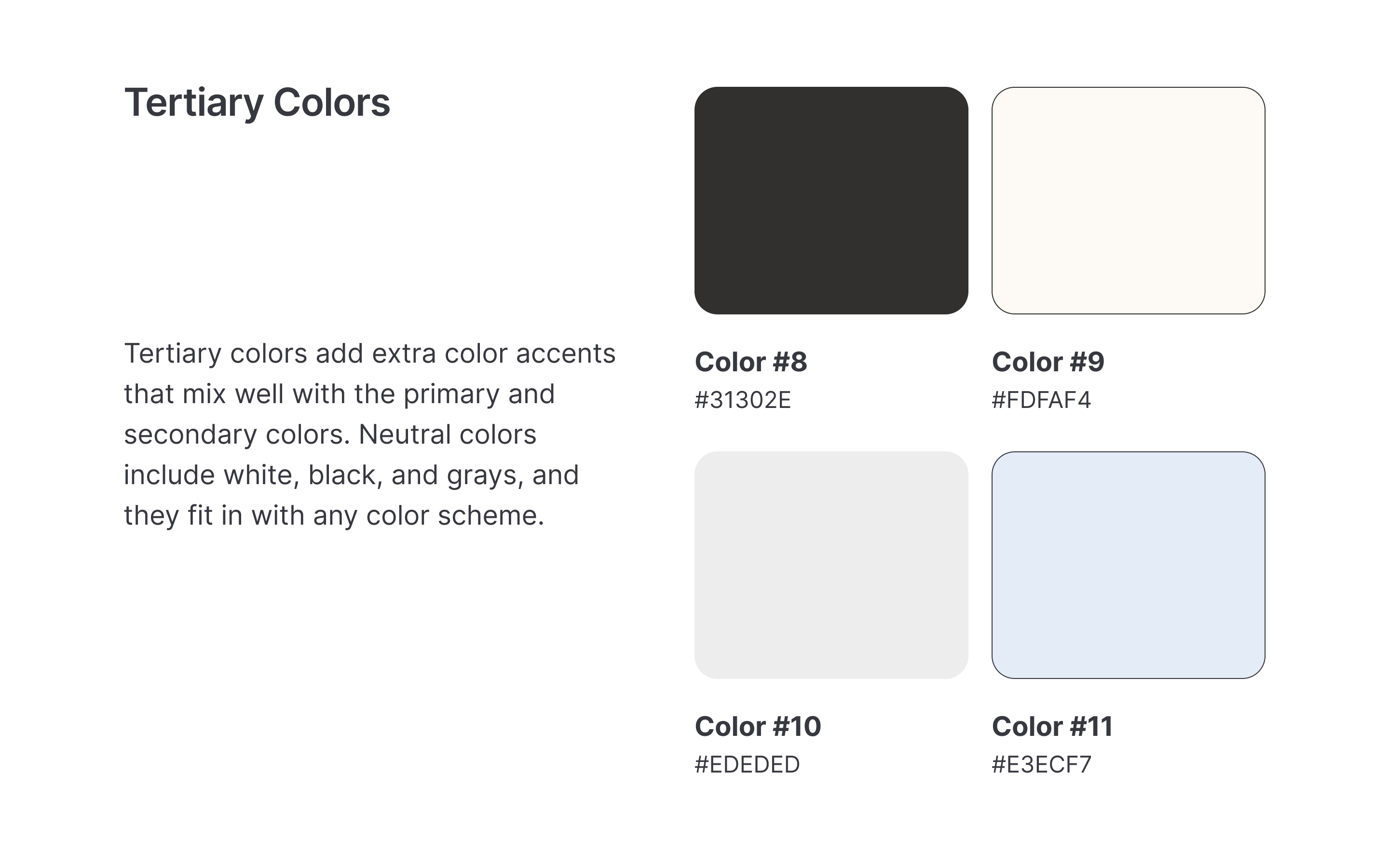
I tried to design a color system for a productivity app tailored to women, inspired by a moodboard that evokes a sense of calm, balance and spontaneinty.

Reviews
6 reviews

Hi there,
I just went through your Color System project on Uxcel, and I’m genuinely impressed by the thoughtfulness and structure you brought into building a scalable and accessible color foundation. Crafting a well-organized color system is such an essential—but often underestimated—part of creating cohesive, professional digital experiences, and you’ve handled it with a lot of clarity and care.
🌟 What You Did Really Well
1. Logical Structure and Organization:
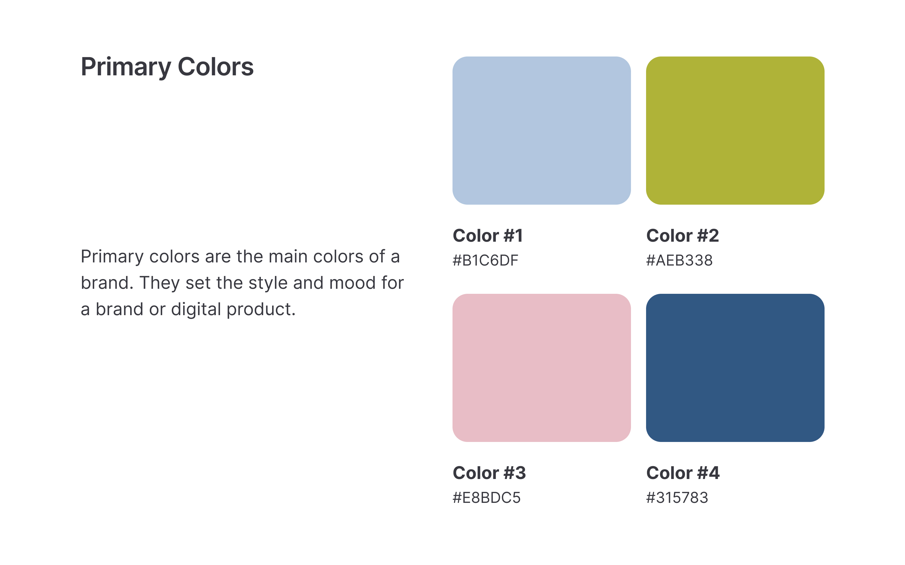
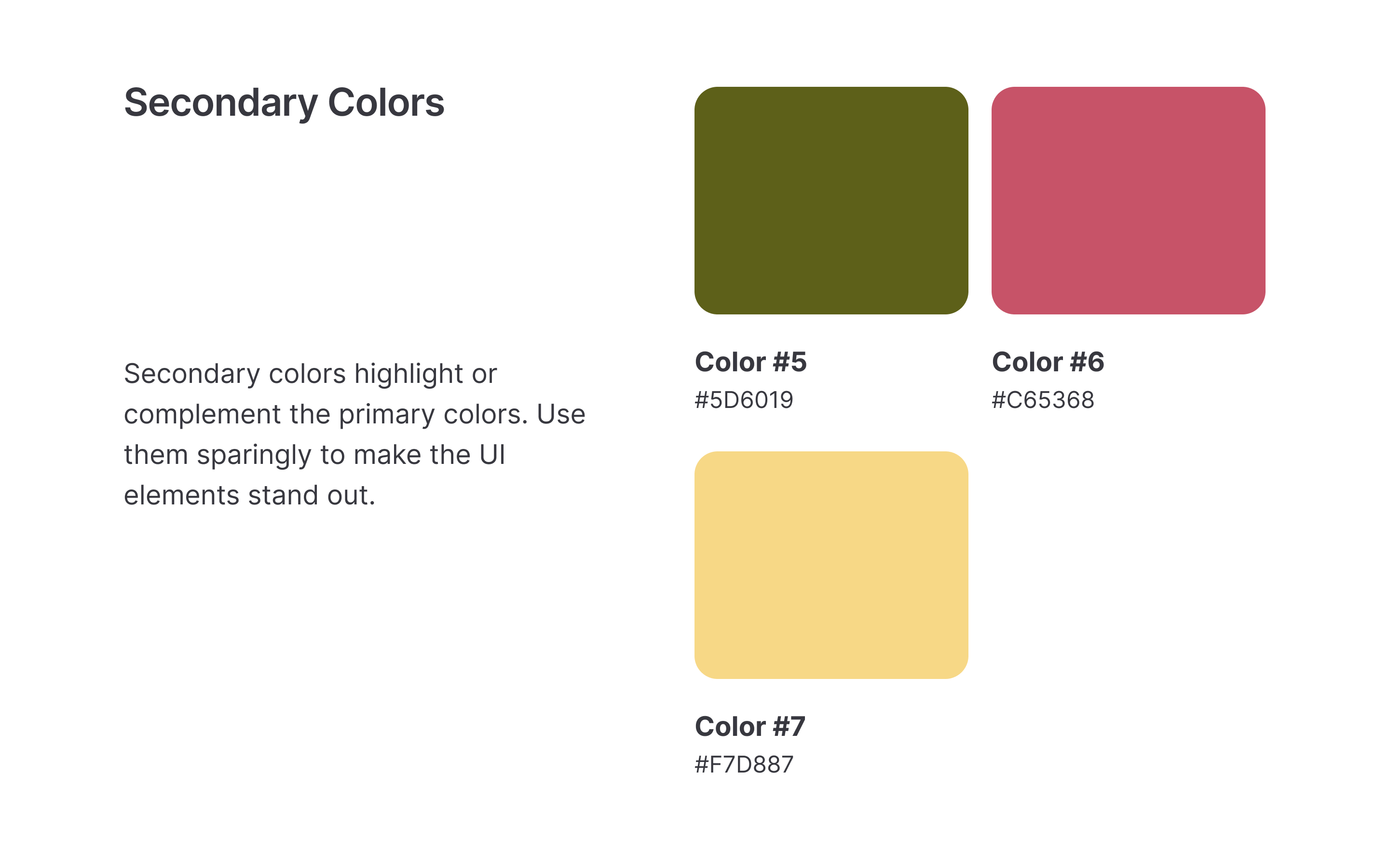
It’s immediately clear that you approached this system systematically. By breaking down the palette into primary, secondary, neutrals, and supporting colors, you’ve set up a structure that’s easy to scale and maintain over time. It’s the kind of system that will serve any design team well, especially as projects grow in complexity.
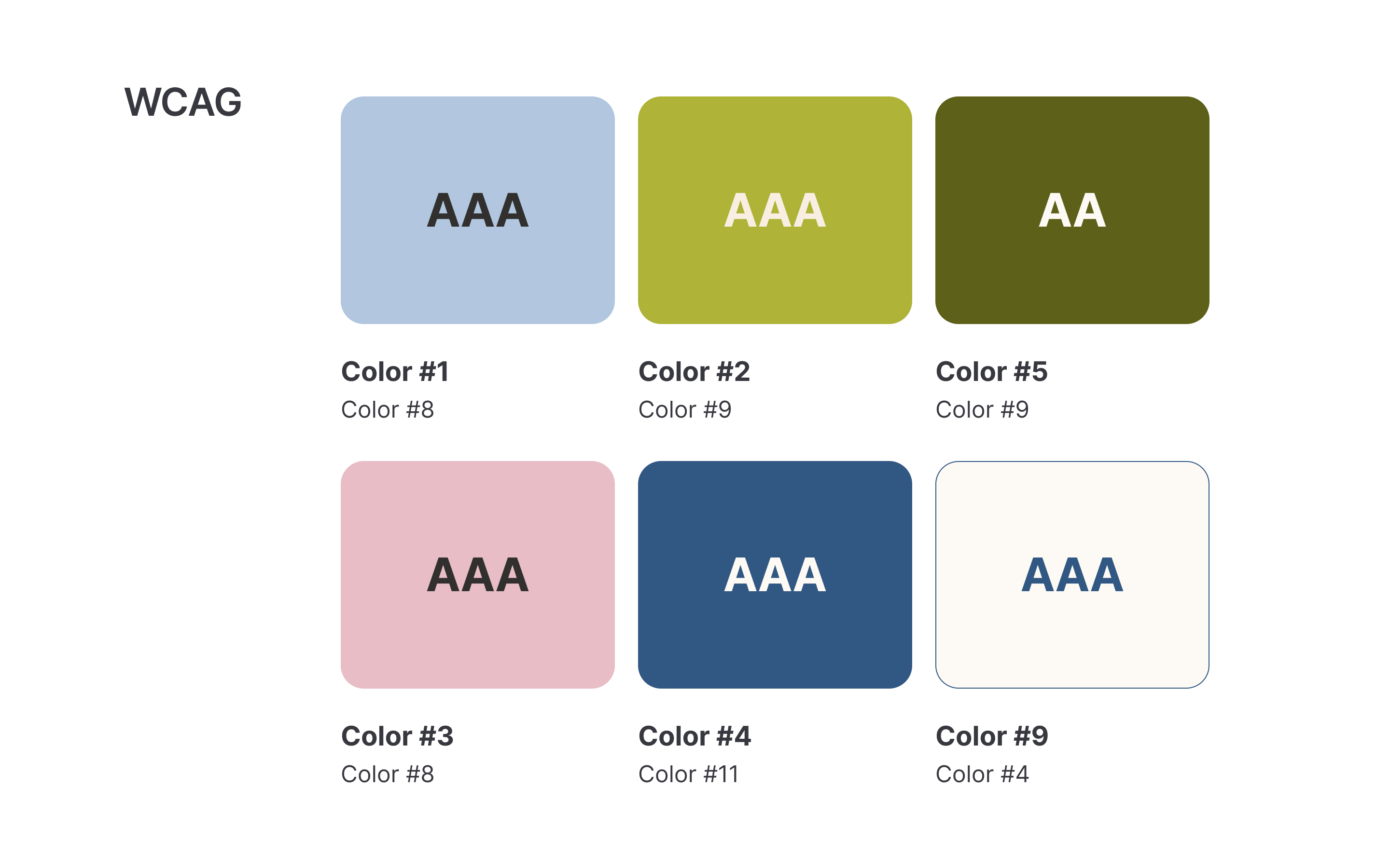
2. Accessibility Awareness:
I really appreciated that you took color contrast into account. Designing color systems with accessibility in mind from the start shows maturity and empathy for all users, not just the majority. It’s these foundational details that prevent expensive redesigns later on—and more importantly, it ensures that more people can fully experience the product.
3. Versatility and Practicality:
Your color selections feel versatile enough to work across a variety of UI elements—from backgrounds to buttons to states like hover and active. It’s clear you weren’t just picking beautiful colors—you were thinking about how they would function across real-world applications, which is so important.
4. Clean Visual Presentation:
Your layout and the way you presented the swatches and their intended use cases is clear and professional. This makes it easy for a developer, another designer, or a stakeholder to quickly understand how the system is meant to be used, which helps foster consistency across teams.
💡 A Few Ideas for Further Growth
1. Add Semantic Color Tokens:
To make the system even stronger, you could map your colors to semantic roles (e.g., Success Green, Error Red, Warning Yellow) rather than just visual names. This makes the system more intuitive for development teams and aligns color usage with purpose, not just appearance.
2. Introduce Light/Dark Mode Variations:
If you ever plan to expand this project, consider showing how your color system would adapt to a dark mode version. It would demonstrate the flexibility of your system and your forward-thinking approach, given how common dark mode support is becoming.
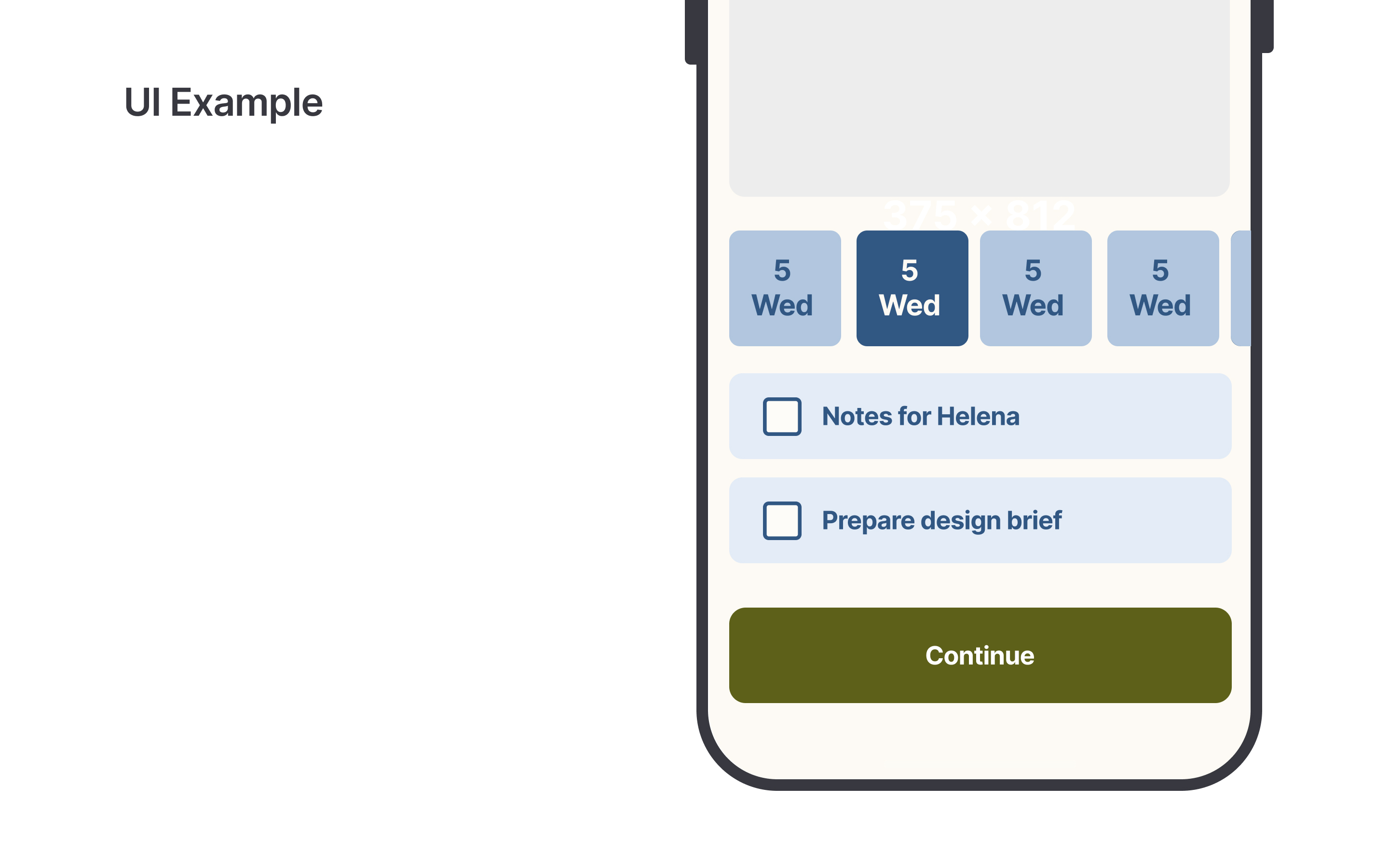
3. Provide Application Examples:
Adding a few simple mockups (like a login screen, dashboard, or error state) using your color system could help show the palette in action. It gives your work even more practical context and makes it easier for stakeholders to visualize the impact.
4. Mention Brand Alignment:
If this was tied to a fictional or real brand, a short explanation of how the colors reflect the brand’s identity (e.g., bold and energetic, calm and professional) would deepen the connection between visual choices and strategy.
✨ Final Thoughts
You’ve built a thoughtful, accessible, and scalable color system that’s both functional and beautiful—a tough balance to strike! By adding a few layers like semantic tokens or real-world examples, this project could become an even stronger showcase of your system design skills.
It’s clear you understand that colors aren’t just decoration; they’re part of how users experience, understand, and trust an interface. You’re thinking like a systems designer, and that’s exactly the mindset that makes UX and product teams stronger.
Thanks for sharing your work—it’s inspiring to see this level of care put into something so foundational!
Warmly,

Hey Jasmina ✨
I find it incredible that you actually made a moodboard to build your colour scheme... and it shows! It feels so girlhood-coded, I immediately got the vibe you were aiming for. Beautiful work.
You made such a smart choice using off-white and off-black for the neutrals, it gives everything a much softer and more balanced look. Amazing job there
Also, I couldn’t help but smile seeing my name (Helena) pop up in your project ☺️ loved that little detail, ehehe!
I do think the colours work really well, but maybe with a few small tweaks here and there, they could feel even stronger. Also, I’d love to see more UI examples to really get the full picture of how the palette plays out in the interface.
You really nailed the feeling! Keep up the beautiful work. 🥰

Good Work!

great work!!!

I love this! I think you created a really balanced and appealing color system with some great UI to show it to us. Great pitch.

Pro-level quality—keep it up!
You might also like
Events Managment App

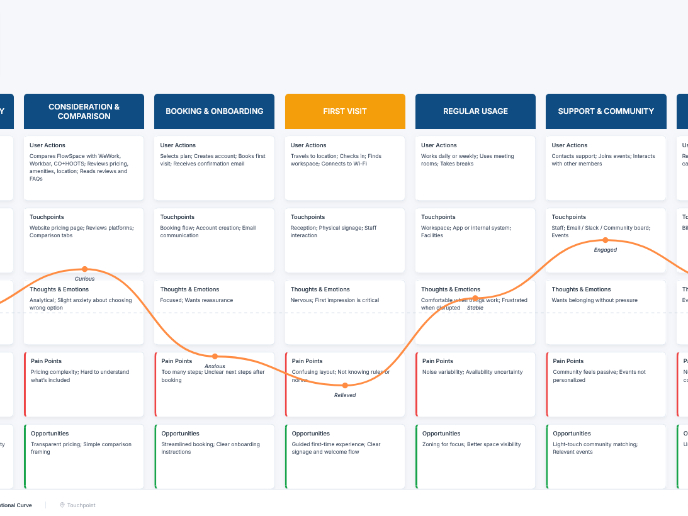
Customer Journey Map — Offsite Co-Working Experience

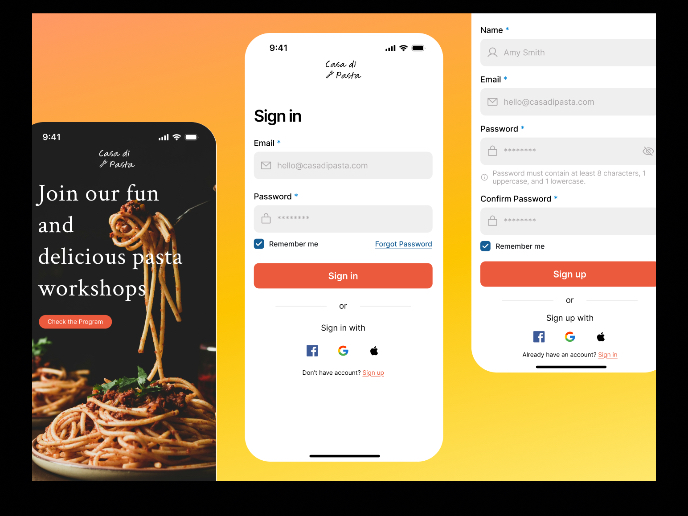
Mobile Onboarding: Casa di Pasta

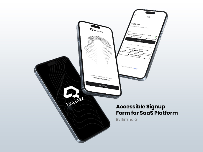
Accessible Signup & Login Experience — Brainex

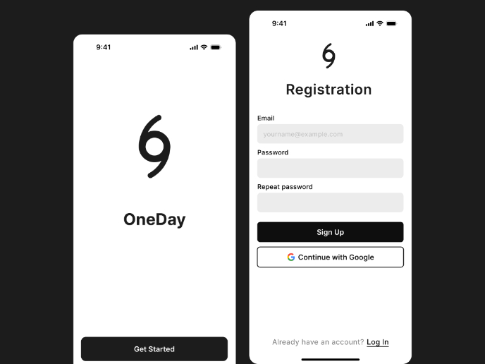
Accessible Signup Form

Accessible Signup Form

Visual Design Courses

UX Design Foundations


Introduction to Figma

Design Terminology
