ClickUp - Color Palette

Design Scenario
You are a user interface designer for the digital project management tool ClickUp (its competitors include Asana and Monday.com). You are currently at the stage where you need to create a color palette that aligns with the brand’s principles and values.
Design Task
Formulate the brand principles and values to describe how you want your brand to be perceived by users, and what emotions it should evoke. Create a color palette in Figma that, in your opinion, best represents the product, meets user expectations, and complies with WCAG color contrast ratio requirements. Explain the rationale behind your chosen color palette.
Completion Criteria
- Does the color palette align with the brand values?
- Does the color palette comply with accessibility requirements?
- Is the color palette visually appealing to users and does it evoke the intended emotions?
- Are the chosen colors explained with clear and logical reasoning?
Tools : Figma
Challenge Process
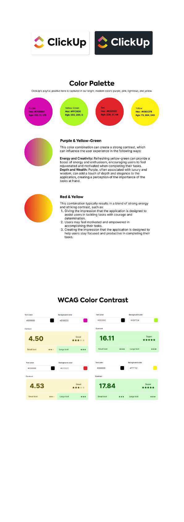
To begin this design challenge, the first thing I did was determine a set of colors that work well together. I selected Purple, Yellow-Green, Red, and Yellow as the core colors for the palette.
WCAG Color Contrast
In accordance with WCAG color contrast guidelines, this color combination ensures an adequate contrast ratio between layout elements, meeting accessibility standards. This allows users with varying levels of vision to clearly distinguish and recognize key elements within the application.
Therefore, the design not only considers visual aesthetics, but also places user sustainability and accessibility as a priority—creating an inclusive and user-friendly experience for all.

Reviews
0 reviews
You might also like

PLANTIST


Lumen

NORTHSIDE - Coworking space Customer Journey Map


Accessible Signup Form for Monkey Survey


Crave Corner - Bakery App Design

Uxcel Halloween Icon Pack

Visual Design Courses

UX Design Foundations


Introduction to Figma

Design Terminology
