Coffee site mockup

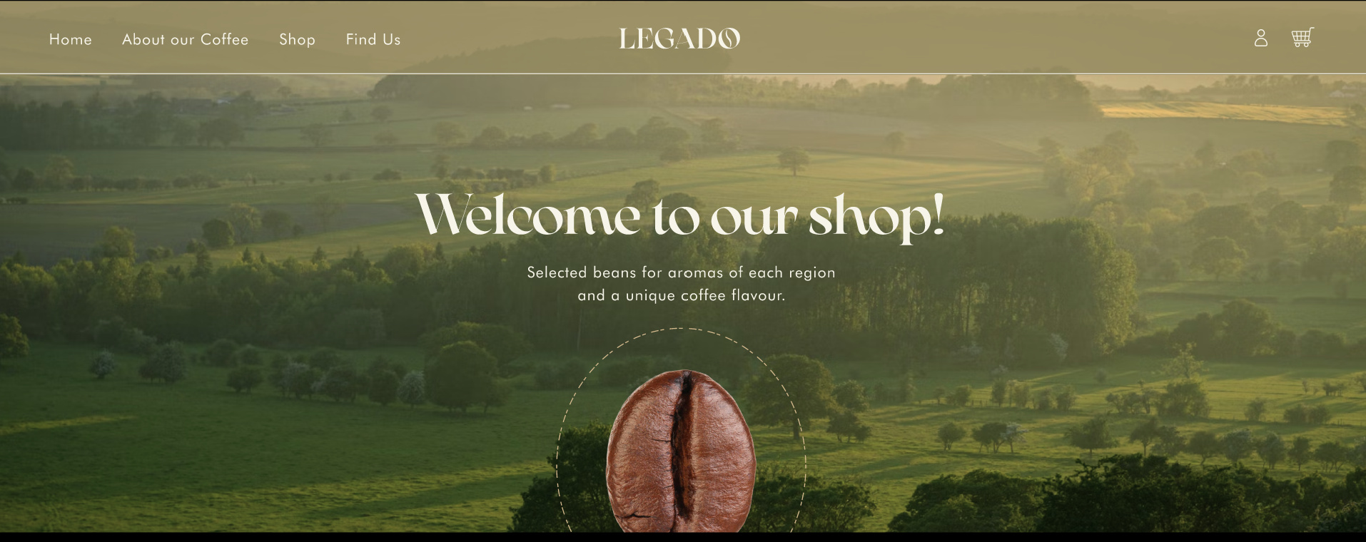
In this project I wanted to design a landing page using storytelling while keeping things user-friendly and accessible. I put it together using Figma and photos from Unsplash.
Please feel free to give me any suggestions of how I could improve it!
Reviews
5 reviews

Hey Lorena! Great work, I Love the warm earthy tones, the colours are gorgeous and it makes me almost "smell" the coffee, that is amazing and hopefully what you intended :)
The storytelling of the whole "small trip to Coffee Land" I had while scrolling is on point and I like how you used big breaks so I was not overwhelmed with information. Besides that, I think sometimes there was too much clear space, maybe evaluate better how to balance the typography with the area around it.
For example, the first paragraph after the Hero is too small for the space you have and it gets lost. Also, it is not a standard guideline to align whole paragraphs to the right side because of readability, so I would use the normal old way and align it to the left, or if it is a small text, you might make it centre align (but it is not my preference, to be honest.
Small thing, but it makes my eye twitch, the image of the hero section in the project description has the coffee bean centred to the ellipse but when I one the Figma prototype is slightly to the left, and I don't know why.
The hierarchy of the text: I think the paragraph font size could be a little bit bigger so it stands out more. Last, but not least, please review the copy, some of it has strangely written sentences (maybe you are like me and not an English native speaker so some of it gets lost in translation), for example:
"Family own company" is grammatically incorrect. It is a little confusing and might sound like it's intended to describe a company that is owned by a family, but it's missing the necessary hyphen and structure to make that clear. The phrase "family-owned company" is the correct way to describe a company that is owned by a family, as it clearly links the family and ownership together. Without the hyphen, "family own company" doesn’t convey a clear or proper meaning in English.
Okok that might be me stretching it... but I speak for myself, I translate from my own language (Portuguese, which is a latin language) to English and some stuff ends up with zero sense so I get it haha
But I LOVED it!! (I'm a little biased... I'm addicted to caffeine and I was "smelling" the coffee of your landing page haha)

Your coffee site mockup has a strong foundation and does a great job telling the brand story. It’s clear, user-friendly, and visually appealing.
Strengths:
- The imagery flows well and effectively supports the storytelling.
- Typography feels premium and aligns perfectly with the coffee brand.
- The layout is balanced, making the content easy to follow without feeling cluttered.
- CTAs like “Explore Our Products” are well-placed and inviting.
What can be improved:
Hero Section:
- Make the main CTA more prominent with action-driven text, like “Discover Your Perfect Brew.”
Readability:
- Increase text contrast in some sections to make it easier to read, especially on textured backgrounds.
Interactivity:
- Add hover effects or animations for buttons and links to create a more dynamic experience.
This mockup does a great job of capturing the vibe of a handcrafted coffee brand. A few small tweaks will take it to the next level. Well done!
great work, well designed
It looks great. I loved the friendly vibe, the colours and vibe were spot on.

Your project is truly impressive, and I love the colors and imagery you’ve chosen. The way the visual elements are integrated creates a cohesive and engaging experience as I scroll through your website. The design feels thoughtful and visually appealing, and the use of white space adds a sense of elegance and cleanliness to the overall look.
That said, there are a few areas where you could enhance the user experience. First, I recommend reviewing the content more closely, as I noticed a few typos and sentences that could be clarified to ensure the messaging is as strong as the design.
Second, while the buttons are well-placed, they could be more prominent. Increasing the text size or making other adjustments could help them stand out and improve usability. Similarly, the text in the hero section feels slightly small, which might make it harder for some users to read—scaling it up would improve accessibility and impact.
On a positive note, I absolutely love the typography you selected—it perfectly complements the design and adds a touch of sophistication. Overall, this is an amazing project with a lot of strengths, and with a few tweaks, it has the potential to be even more outstanding. Fantastic work!
You might also like

edX Sign-Up Page Redesign


Beautify Login page WCAG principles


Design Prioritization Workshop


Notion Login Page Accessibility Optimization


Sanyahawa - Landing page Design


Healthy Dashboard

Popular Courses

Design Terminology


Introduction to Design Systems


Color Psychology for UX/UI Design