Checkout Page for E-Commerce Platform


Checkout Overview
This screen presents the main checkout flow across four steps:
- Product Review
- Address Input
- Shipping Selection
- Payment
✅ Key Design Choices:
- Clear step indication to reduce cognitive load.
- Prominent CTA button ("Place Order") with color contrast to enhance visibility.
- Summarized cart items and cost breakdown to increase transparency.
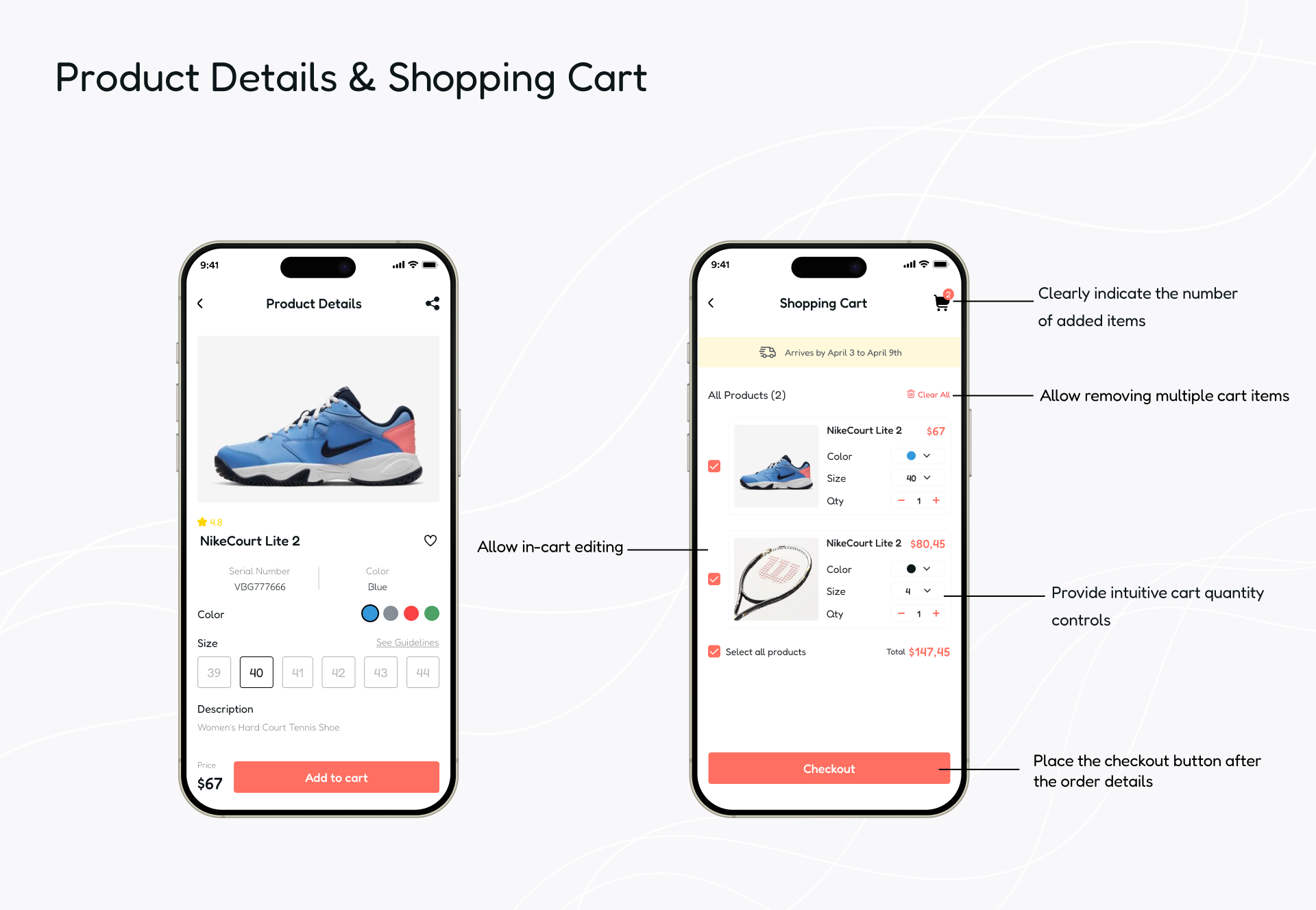
Product Details & Cart
Users can review selected products and adjust quantities or remove items easily.
✅ Interaction Highlights:
- Increment/decrement quantity with immediate feedback.
- Total price auto-updates to provide clarity.
- "Continue to Checkout" CTA placed at thumb-friendly zone.

Progress Tracker & Shipping Info
In this step, I introduced a checkout progress bar to set user expectations.
✅ Microcopy & Trust Elements:
- Labeling fields with helpful placeholder text (e.g., "Street address, PO box, etc.")
- Field validation for quicker error correction.
- "Secure checkout" indicators enhance user confidence.

Payment & Summary
This step includes payment entry and order review before finalizing the purchase.
✅ Key Features:
- Summary card to avoid surprises.
- Secure card entry fields with masked input.
- Microcopy under payment fields to reassure users their data is safe.
✨ Overall UX Improvements
- Reduced form complexity with progressive disclosure.
- Used minimal visual distractions and ample white space to keep focus.
- Applied consistent UI elements and feedback mechanisms (e.g., button states, input highlights).
🧠 Design Principles Applied
- Jakob’s Law: Familiar form patterns for faster user understanding.
- Hick’s Law: Simplified options reduce decision time.
- Aesthetic-Usability Effect: Clean visual hierarchy builds trust and perceived ease-of-use.

Reviews
1 review

Your checkout flow matches the design brief well.
You covered product review, address input, shipping, payment, and final review clearly.
The cart screen works fine. Quantity updates and price changes are easy to follow.
But the 'Select all products' checkbox feels a bit too close to the total price. Shifting it slightly up or adding a small divider would make it clearer.
The shipping step looks simple and clean. Good field labels.
But when a user already has saved addresses, one of them should be selected by default. Saves time and feels smarter.
The payment step is straightforward. Card input is easy.
Still, there’s no strong sign that payment is secure. Adding a small lock icon or a 'Secure checkout' label would fix that fast.
The review step shows the order clearly. Address, delivery, payment, items — all good.
But users can’t edit anything easily. Making the address, delivery, and payment sections tappable would help a lot.
The visual design is clean, minimal, and easy to scan.
On the review screen, the font size for order details could be a bit bigger. Right now, it feels small, especially for mobile users.
You understood the brief.
The flow is strong.
Just fix small things like spacing, default address, a security sign, easy edits, and bigger fonts.
You might also like

Islamic E-Learning Platfrom Dashboard


Pulse — Music Streaming App with Accessible Light & Dark Mode

SiteScope - Progress Tracking App


Mobile Button System


FlexPay


May.Da.Ma Candles & more

Interaction Design Courses

UX Design Foundations


Introduction to Figma

Design Terminology
